人気フォント セクションへようこそ。ここでは「よくダウンロードされ、よく使われている」実績ある書体をまとめています。 ロゴ、Web、SNS のどれにも使いやすい、外さない選択肢が見つかります。
どの トップフォント も、バランス・可読性・汎用性で高評価です。 モダン・サンセリフ、エレガントなスクリプト、ヴィンテージなセリフ、ミニマルなディスプレイなどを厳選しています。
-
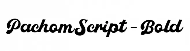
( Fonts by Faras Dina - Personal-use only. For commercial use please contact owner. )
A bold, elegant script font with high contrast and flowing curves.
 ダウンロード 55 ダウンロード数@WebFont
 -
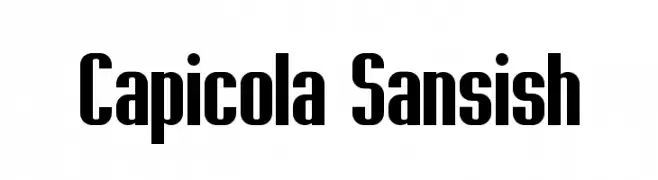
( Jeff Bensch - jbensch.deviantart.com )
A bold, condensed font with a modern and impactful style.
![Capicola Sansish フリーフォントのダウンロード]() ダウンロード 55 ダウンロード数@WebFont
ダウンロード 55 ダウンロード数@WebFont -
( Noto is a trademark of Google Inc. Noto fonts are open source. All Noto fonts are published under the SIL Open Font License, Version 1.1 )
A modern, extra condensed, and extra light font with tight spacing and thin strokes.
![Noto Serif Ethiopic ExtraCondensed ExtraLight フリーフォントのダウンロード]() ダウンロード 55 ダウンロード数@WebFont
ダウンロード 55 ダウンロード数@WebFont -
( Fonts by Kong Font - https://fontkong.com/ - Personal-use only. For commercial use please contact owner. )
A playful and dynamic script font with flowing, cursive letterforms.
![Quanto フリーフォントのダウンロード]() ダウンロード 55 ダウンロード数@WebFont
ダウンロード 55 ダウンロード数@WebFont -
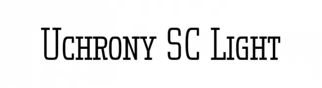
( Fonts by deFharo - Fernando Haro - Personal-use only. For commercial use please contact owner. )
A modern, clean font with tall, narrow uppercase letters and consistent lowercase design.
![Uchrony SC Light フリーフォントのダウンロード]() ダウンロード 55 ダウンロード数@WebFont
ダウンロード 55 ダウンロード数@WebFont -
-
( Fonts by Sign Studio )
A bold, playful font with rounded, bubble-like characters and high contrast.
![Mochita Display Regular フリーフォントのダウンロード]() ダウンロード 55 ダウンロード数@WebFont
ダウンロード 55 ダウンロード数@WebFont -
( Fonts by The Docallisme - Amry Al Mursalaat - Personal-use only. For commercial use please contact owner. )
A bold, playful font with rounded, energetic characters.
![ROAD TO JUSTICE フリーフォントのダウンロード]() ダウンロード 55 ダウンロード数@WebFont
ダウンロード 55 ダウンロード数@WebFont -
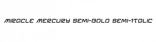
( Iconian Fonts - Daniel Zadorozny - www.iconian.com )
A modern, semi-bold, semi-italic font with a futuristic and dynamic style.
![Miracle Mercury Semi-Bold Semi-Italic フリーフォントのダウンロード]() ダウンロード 55 ダウンロード数@WebFont
ダウンロード 55 ダウンロード数@WebFont -
( Fonts by Pinisiart )
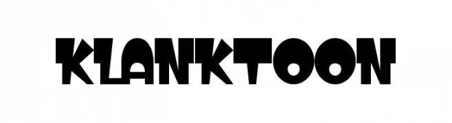
A bold, playful font with a cartoonish and whimsical style.
![KLANKTOON フリーフォントのダウンロード]() ダウンロード 55 ダウンロード数@WebFont
ダウンロード 55 ダウンロード数@WebFont -
( Fonts by Wahyu Eka Prasetya - wepfont.com - Personal-use only. For commercial use please contact owner. )
A bold, hand-drawn font with a playful and energetic style.
![Gelem フリーフォントのダウンロード]() ダウンロード 55 ダウンロード数@WebFont
ダウンロード 55 ダウンロード数@WebFont


今のトップフォントは?
は、クリーンな造形と広い適用範囲で支持を集めています。 ブランディングからランディングページ、ポスターまで活躍します。
ロゴで人気のフォントは?
幾何学系の サンセリフ(例: Poppins、Gotham 系のファミリー)は、スケーラブルでクリーンな印象に最適。 親しみやすさを出すなら スクリプト や手書き系も定番です。 見出しは力強く、本文はニュートラルに──この組み合わせが認知とバランスを高めます。
人気リストはどのくらいの頻度で更新される?
ダウンロード数やエンゲージメントに基づき定期的に更新します。 こまめにチェックして、次に流行るフォントを先取りしましょう。
💡 ヒント: このページをブックマークしておくと便利です。トレンドは速く、今のトップが明日のリブランディングを導くこともあります。