人気フォント セクションへようこそ。ここでは「よくダウンロードされ、よく使われている」実績ある書体をまとめています。 ロゴ、Web、SNS のどれにも使いやすい、外さない選択肢が見つかります。
どの トップフォント も、バランス・可読性・汎用性で高評価です。 モダン・サンセリフ、エレガントなスクリプト、ヴィンテージなセリフ、ミニマルなディスプレイなどを厳選しています。
-
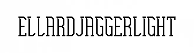
( Fonts by Edric Studio www.creativefabrica.com/designer/edricstudio/ - Personal-use only. For commercial use please contact owner. )
A geometric, angular font with tall, narrow letterforms and a modern, technical feel.
 ダウンロード 55 ダウンロード数@WebFont
 -
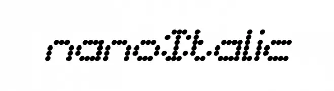
( weknow - Wino S Kadir - www.creativefabrica.com/designer/weknow/ )
A modern, dotted italic font with a digital aesthetic.
![nano Italic フリーフォントのダウンロード]() ダウンロード 55 ダウンロード数@WebFont
ダウンロード 55 ダウンロード数@WebFont -
( Font Nook - www.geocities.com/weakestlink11/ )
A whimsical font with cherub illustrations accompanying each character.
![Cupidity フリーフォントのダウンロード]() ダウンロード 55 ダウンロード数@WebFont
ダウンロード 55 ダウンロード数@WebFont -
( Fonts by Din Studio - Donis Miftahudin - Personal-use only. For commercial use please contact owner. )
A dynamic handwritten font with fluid strokes and expressive style.
![Melenias Personal Use フリーフォントのダウンロード]() ダウンロード 55 ダウンロード数@WebFont
ダウンロード 55 ダウンロード数@WebFont -
( Fonts by Jimtype Studio - Personal-use only. For commercial use please contact owner. )
A playful, casual handwritten font with smooth, rounded edges.
![FreshLemonade フリーフォントのダウンロード]() ダウンロード 55 ダウンロード数@WebFont
ダウンロード 55 ダウンロード数@WebFont -
-
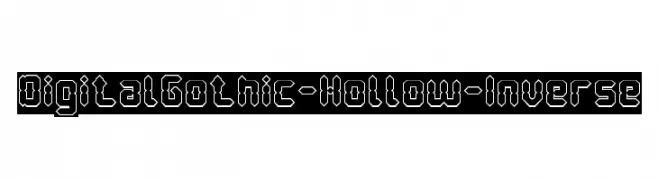
( weknow - Wino S Kadir - www.creativefabrica.com/designer/weknow/ )
A bold, geometric font with a hollow, digital style.
![Digital Gothic-Hollow-Inverse フリーフォントのダウンロード]() ダウンロード 55 ダウンロード数@WebFont
ダウンロード 55 ダウンロード数@WebFont -
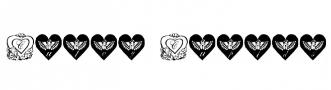
( Font Nook - www.geocities.com/weakestlink11/ )
A collection of decorative heart and cherub designs for embellishment.
![Cutey Cupids フリーフォントのダウンロード]() ダウンロード 55 ダウンロード数@WebFont
ダウンロード 55 ダウンロード数@WebFont -
( Fonts by Kat`s Fun Fonts - Personal-use only. For commercial use please contact owner. )
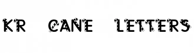
A playful, candy cane-inspired decorative font with bold, striped letters.
![KR Cane Letters フリーフォントのダウンロード]() ダウンロード 55 ダウンロード数@WebFont
ダウンロード 55 ダウンロード数@WebFont -
( Fonts by Iconian Fonts )
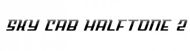
A bold, futuristic font with a halftone effect and slanted characters.
![Sky Cab Halftone 2 フリーフォントのダウンロード]() ダウンロード 55 ダウンロード数@WebFont
ダウンロード 55 ダウンロード数@WebFont -
( Fonts by Khurasan - Syaf Rizal - Personal-use only. For commercial use please contact owner. )
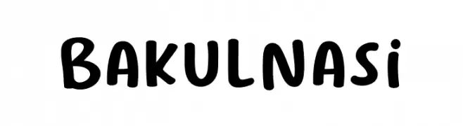
A playful, bold handwritten font with rounded, smooth letterforms.
![Bakul Nasi フリーフォントのダウンロード]() ダウンロード 55 ダウンロード数@WebFont
ダウンロード 55 ダウンロード数@WebFont


今のトップフォントは?
は、クリーンな造形と広い適用範囲で支持を集めています。 ブランディングからランディングページ、ポスターまで活躍します。
ロゴで人気のフォントは?
幾何学系の サンセリフ(例: Poppins、Gotham 系のファミリー)は、スケーラブルでクリーンな印象に最適。 親しみやすさを出すなら スクリプト や手書き系も定番です。 見出しは力強く、本文はニュートラルに──この組み合わせが認知とバランスを高めます。
人気リストはどのくらいの頻度で更新される?
ダウンロード数やエンゲージメントに基づき定期的に更新します。 こまめにチェックして、次に流行るフォントを先取りしましょう。
💡 ヒント: このページをブックマークしておくと便利です。トレンドは速く、今のトップが明日のリブランディングを導くこともあります。