人気フォント セクションへようこそ。ここでは「よくダウンロードされ、よく使われている」実績ある書体をまとめています。 ロゴ、Web、SNS のどれにも使いやすい、外さない選択肢が見つかります。
どの トップフォント も、バランス・可読性・汎用性で高評価です。 モダン・サンセリフ、エレガントなスクリプト、ヴィンテージなセリフ、ミニマルなディスプレイなどを厳選しています。
-
( Matias Romero - matiasromero.deviantart.com/ )
A whimsical, bold font with antler-like embellishments on uppercase letters.
 ダウンロード 54 ダウンロード数@WebFont
 -
( Fonts by Kong Font - fontkong.com - Personal-use only. For commercial use please contact owner. )
An elegant, flowing script font with graceful curves and decorative flourishes.
![DanielDavis フリーフォントのダウンロード]() ダウンロード 54 ダウンロード数@WebFont
ダウンロード 54 ダウンロード数@WebFont -
( Shaz N Daz St. Qui )
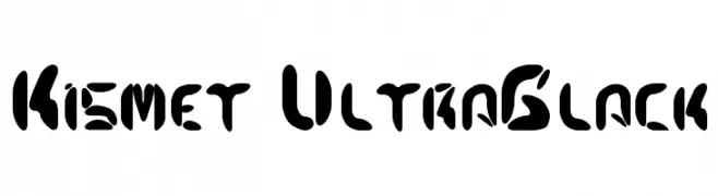
A bold, ultra-black font with abstract cutouts and a modern, decorative style.
![Kismet UltraBlack フリーフォントのダウンロード]() ダウンロード 54 ダウンロード数@WebFont
ダウンロード 54 ダウンロード数@WebFont -
( Fonts by Afkari Studio - Musthafa Kamal Emje - Musthafa Kamal Emje - Personal-use only. For commercial use please contact owner. )
A modern, rounded font with geometric structure and consistent stroke width.
![Bandar フリーフォントのダウンロード]() ダウンロード 54 ダウンロード数@WebFont
ダウンロード 54 ダウンロード数@WebFont -
( Fonts by Kat`s Fun Fonts - Personal-use only. For commercial use please contact owner. )
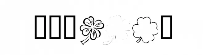
A decorative font with shamrock and clover motifs.
![KR Shams フリーフォントのダウンロード]() ダウンロード 54 ダウンロード数@WebFont
ダウンロード 54 ダウンロード数@WebFont -
-
( Fonts by erik5541 - Frederik Aristaputra - Personal-use only. For commercial use please contact owner. )
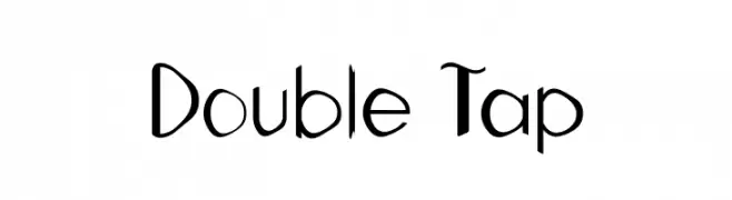
A playful, modern font with bold, dynamic shapes and artistic flair.
![Double Tap フリーフォントのダウンロード]() ダウンロード 54 ダウンロード数@WebFont
ダウンロード 54 ダウンロード数@WebFont -
( Iconian Fonts - Daniel Zadorozny - www.iconian.com )
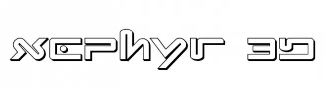
A futuristic, geometric font with a bold, 3D outline style.
![Xephyr 3D フリーフォントのダウンロード]() ダウンロード 54 ダウンロード数@WebFont
ダウンロード 54 ダウンロード数@WebFont -
( Fonts by Letterflow - Personal-use only. For commercial use please contact owner. )
A playful, hand-drawn font with a sketch-like, textured appearance.
![Papernotes Sketch フリーフォントのダウンロード]() ダウンロード 54 ダウンロード数@WebFont
ダウンロード 54 ダウンロード数@WebFont -
( weknow - Wino S Kadir - www.creativefabrica.com/designer/weknow/ )
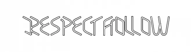
A futuristic, hollow, geometric font with sharp, angular lines.
![RESPECTHOLLOW フリーフォントのダウンロード]() ダウンロード 54 ダウンロード数@WebFont
ダウンロード 54 ダウンロード数@WebFont -
( Beyond Design )
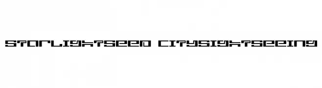
A bold, geometric font with a futuristic, digital aesthetic.
![starlightseed citysightseeing フリーフォントのダウンロード]() ダウンロード 54 ダウンロード数@WebFont
ダウンロード 54 ダウンロード数@WebFont


今のトップフォントは?
は、クリーンな造形と広い適用範囲で支持を集めています。 ブランディングからランディングページ、ポスターまで活躍します。
ロゴで人気のフォントは?
幾何学系の サンセリフ(例: Poppins、Gotham 系のファミリー)は、スケーラブルでクリーンな印象に最適。 親しみやすさを出すなら スクリプト や手書き系も定番です。 見出しは力強く、本文はニュートラルに──この組み合わせが認知とバランスを高めます。
人気リストはどのくらいの頻度で更新される?
ダウンロード数やエンゲージメントに基づき定期的に更新します。 こまめにチェックして、次に流行るフォントを先取りしましょう。
💡 ヒント: このページをブックマークしておくと便利です。トレンドは速く、今のトップが明日のリブランディングを導くこともあります。