人気フォント セクションへようこそ。ここでは「よくダウンロードされ、よく使われている」実績ある書体をまとめています。 ロゴ、Web、SNS のどれにも使いやすい、外さない選択肢が見つかります。
どの トップフォント も、バランス・可読性・汎用性で高評価です。 モダン・サンセリフ、エレガントなスクリプト、ヴィンテージなセリフ、ミニマルなディスプレイなどを厳選しています。
-
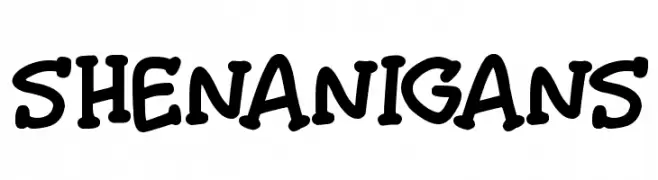
( Darrell Flood )
A playful, bold, and rounded font with a hand-drawn, comic-like style.
 ダウンロード 54 ダウンロード数@WebFont
 -
( Fonts by PutraCetol Studio )
A bold, decorative font with a snowflake pattern, perfect for festive themes.
![Cold Snowflake One フリーフォントのダウンロード]() ダウンロード 54 ダウンロード数@WebFont
ダウンロード 54 ダウンロード数@WebFont -
( Fonts by Woodcutter Manero - www.woodcutter.es - Personal-use only. For commercial use please contact owner. )
A dripping, horror-themed font with a liquid-like appearance.
![Friday 14 フリーフォントのダウンロード]() ダウンロード 54 ダウンロード数@WebFont
ダウンロード 54 ダウンロード数@WebFont -
( Fonts by RVST - Personal-use only. For commercial use please contact owner. )
A jagged, horror-themed font with sharp, irregular edges.
![Frightmare フリーフォントのダウンロード]() ダウンロード 54 ダウンロード数@WebFont
ダウンロード 54 ダウンロード数@WebFont -
( imagex - www.imagex-fonts.com )
A bold, textured font with a distressed, vintage appearance.
![No Silly Walk There フリーフォントのダウンロード]() ダウンロード 54 ダウンロード数@WebFont
ダウンロード 54 ダウンロード数@WebFont -
-
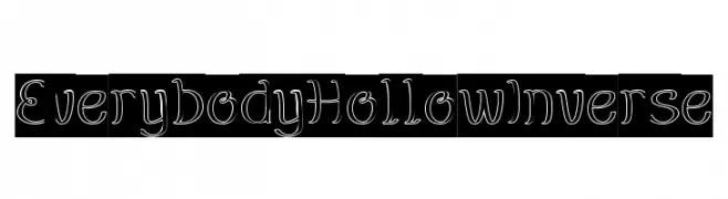
( weknow - Wino S Kadir - www.creativefabrica.com/designer/weknow/ )
A playful, hollow, outlined font with consistent stroke width and whimsical design.
![EverybodyHollowInverse フリーフォントのダウンロード]() ダウンロード 54 ダウンロード数@WebFont
ダウンロード 54 ダウンロード数@WebFont -
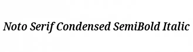
( Noto is a trademark of Google Inc. Noto fonts are open source. All Noto fonts are published under the SIL Open Font License, Version 1.1 )
A refined, condensed serif font with a semi-bold italic style.
![Noto Serif Condensed SemiBold Italic フリーフォントのダウンロード]() ダウンロード 54 ダウンロード数@WebFont
ダウンロード 54 ダウンロード数@WebFont -
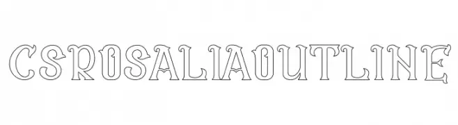
( Craft Supply Co. - creativemarket.com/craftsupplyco )
A decorative outline font with bold, artistic strokes and stylized serifs.
![CS Rosalia Outline フリーフォントのダウンロード]() ダウンロード 54 ダウンロード数@WebFont
ダウンロード 54 ダウンロード数@WebFont -
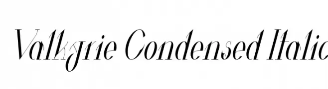
( Fonts by Hendrick Rolandez - Personal-use only. For commercial use please contact owner. )
A sleek, condensed italic font with high contrast and elegant design.
![Valkyrie Condensed Italic フリーフォントのダウンロード]() ダウンロード 54 ダウンロード数@WebFont
ダウンロード 54 ダウンロード数@WebFont -
( Noto is a trademark of Google Inc. Noto fonts are open source. All Noto fonts are published under the SIL Open Font License, Version 1.1 )
Condensed serif font for Ethiopic script.
![Noto Serif Ethiopic ExtraCondensed フリーフォントのダウンロード]() ダウンロード 54 ダウンロード数@WebFont
ダウンロード 54 ダウンロード数@WebFont


今のトップフォントは?
は、クリーンな造形と広い適用範囲で支持を集めています。 ブランディングからランディングページ、ポスターまで活躍します。
ロゴで人気のフォントは?
幾何学系の サンセリフ(例: Poppins、Gotham 系のファミリー)は、スケーラブルでクリーンな印象に最適。 親しみやすさを出すなら スクリプト や手書き系も定番です。 見出しは力強く、本文はニュートラルに──この組み合わせが認知とバランスを高めます。
人気リストはどのくらいの頻度で更新される?
ダウンロード数やエンゲージメントに基づき定期的に更新します。 こまめにチェックして、次に流行るフォントを先取りしましょう。
💡 ヒント: このページをブックマークしておくと便利です。トレンドは速く、今のトップが明日のリブランディングを導くこともあります。