人気フォント セクションへようこそ。ここでは「よくダウンロードされ、よく使われている」実績ある書体をまとめています。 ロゴ、Web、SNS のどれにも使いやすい、外さない選択肢が見つかります。
どの トップフォント も、バランス・可読性・汎用性で高評価です。 モダン・サンセリフ、エレガントなスクリプト、ヴィンテージなセリフ、ミニマルなディスプレイなどを厳選しています。
-
( Fonts by StringLabs - stringlabscreative.com - Personal-use only. For commercial use please contact owner. )
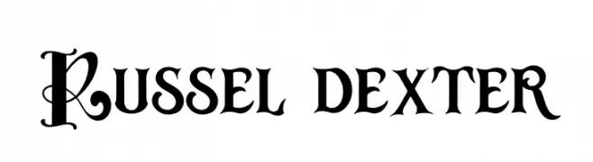
A bold, decorative font with ornate uppercase letters and clear, impactful numbers.
 ダウンロード 54 ダウンロード数@WebFont
 -
( Fonts by Balpirick Studio - https://www.creativefabrica.com/designer/balpirick/ref/308299/ - Personal-use only. For commercial use please contact owner. )
A playful handwritten font with thin, fluid strokes and a whimsical style.
![Silver Buttercup フリーフォントのダウンロード]() ダウンロード 54 ダウンロード数@WebFont
ダウンロード 54 ダウンロード数@WebFont -
( Fonts by Goma Shin - www.geocities.jp/gomarice_font/ - Personal-use only. For commercial use please contact owner. )
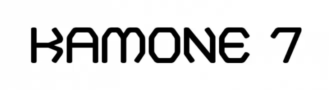
A geometric, modern font with octagonal shapes and uniform thickness.
![Kamone 7 フリーフォントのダウンロード]() ダウンロード 54 ダウンロード数@WebFont
ダウンロード 54 ダウンロード数@WebFont -
( Fonts by David Espinosa [Type Sailor] - www.facebook.com/typesailor - Personal-use only. For commercial use please contact owner. )
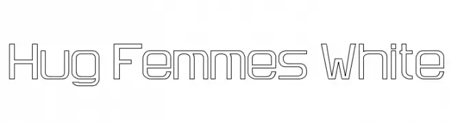
A geometric, outlined font with a modern, technical style.
![Hug Femmes White フリーフォントのダウンロード]() ダウンロード 54 ダウンロード数@WebFont
ダウンロード 54 ダウンロード数@WebFont -
( Zetafonts - www.zetafonts.com )
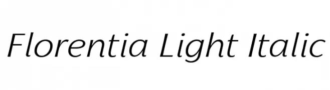
A light, italic typeface with elegant curves and a classic aesthetic.
![Florentia Light Italic フリーフォントのダウンロード]() ダウンロード 54 ダウンロード数@WebFont
ダウンロード 54 ダウンロード数@WebFont -
-
( Fonts by David Espinosa [Type Sailor] - www.facebook.com/typesailor - Personal-use only. For commercial use please contact owner. )
A bold, geometric font with a modern and structured aesthetic.
![Hug Femmes Bold フリーフォントのダウンロード]() ダウンロード 54 ダウンロード数@WebFont
ダウンロード 54 ダウンロード数@WebFont -
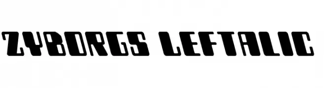
( Iconian Fonts - Daniel Zadorozny - www.iconian.com )
A bold, left-slanted, futuristic font with geometric and blocky characters.
![Zyborgs Leftalic フリーフォントのダウンロード]() ダウンロード 54 ダウンロード数@WebFont
ダウンロード 54 ダウンロード数@WebFont -
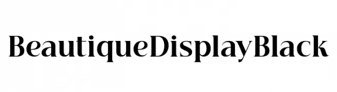
( Fonts by BeauType Studio - beautique.vn - Personal-use only. For commercial use please contact owner. )
A bold, high-contrast serif display font with elegant and dramatic features.
![Beautique Display Black フリーフォントのダウンロード]() ダウンロード 54 ダウンロード数@WebFont
ダウンロード 54 ダウンロード数@WebFont -
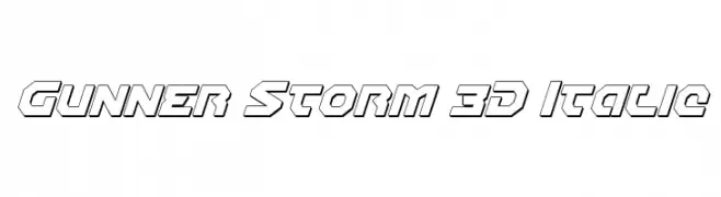
( Fonts by Daniel Zadorozny - www.iconian.com )
A bold, 3D italic font with a futuristic and dynamic style.
![Gunner Storm 3D Italic フリーフォントのダウンロード]() ダウンロード 54 ダウンロード数@WebFont
ダウンロード 54 ダウンロード数@WebFont -
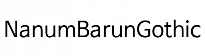
( Collection of Korean web fonts - Personal-use only. For commercial use please contact owner. )
A clean, modern sans-serif typeface with consistent stroke width and balanced spacing.
![NanumBarunGothic フリーフォントのダウンロード]() ダウンロード 54 ダウンロード数@WebFont
ダウンロード 54 ダウンロード数@WebFont


今のトップフォントは?
は、クリーンな造形と広い適用範囲で支持を集めています。 ブランディングからランディングページ、ポスターまで活躍します。
ロゴで人気のフォントは?
幾何学系の サンセリフ(例: Poppins、Gotham 系のファミリー)は、スケーラブルでクリーンな印象に最適。 親しみやすさを出すなら スクリプト や手書き系も定番です。 見出しは力強く、本文はニュートラルに──この組み合わせが認知とバランスを高めます。
人気リストはどのくらいの頻度で更新される?
ダウンロード数やエンゲージメントに基づき定期的に更新します。 こまめにチェックして、次に流行るフォントを先取りしましょう。
💡 ヒント: このページをブックマークしておくと便利です。トレンドは速く、今のトップが明日のリブランディングを導くこともあります。