人気フォント セクションへようこそ。ここでは「よくダウンロードされ、よく使われている」実績ある書体をまとめています。 ロゴ、Web、SNS のどれにも使いやすい、外さない選択肢が見つかります。
どの トップフォント も、バランス・可読性・汎用性で高評価です。 モダン・サンセリフ、エレガントなスクリプト、ヴィンテージなセリフ、ミニマルなディスプレイなどを厳選しています。
-
( ADT )
A bold, angular font with a geometric and edgy style.
 ダウンロード 54 ダウンロード数@WebFont
 -
( Iconian Fonts - Daniel Zadorozny - www.iconian.com )
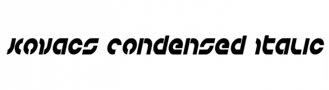
A bold, condensed, and italicized font with a futuristic geometric style.
![Kovacs Condensed Italic フリーフォントのダウンロード]() ダウンロード 54 ダウンロード数@WebFont
ダウンロード 54 ダウンロード数@WebFont -
( Iconian Fonts - Daniel Zadorozny - www.iconian.com )
A bold, condensed font with geometric shapes and a modern look.
![Right Hand Luke Condensed フリーフォントのダウンロード]() ダウンロード 54 ダウンロード数@WebFont
ダウンロード 54 ダウンロード数@WebFont -
( Fonts by Scratch Design )
Elegant handwritten script font.
![Katherina Signature Regular フリーフォントのダウンロード]() ダウンロード 54 ダウンロード数@WebFont
ダウンロード 54 ダウンロード数@WebFont -
( Fonts by Vladimir Nikolic - https://www.creativefabrica.com/product/educated-deers/ref/144265/ - Personal-use only. For commercial use please contact owner. )
A bold, geometric font with a three-dimensional effect and strong visual impact.
![Trader Regular フリーフォントのダウンロード]() ダウンロード 54 ダウンロード数@WebFont
ダウンロード 54 ダウンロード数@WebFont -
-
( Fonts by Vladimir Nikolic - www.creativefabrica.com/designer/vladimirnikolic/ - Personal-use only. For commercial use please contact owner. )
A bold, geometric sans-serif font with a modern, condensed style.
![Shakeout Regular フリーフォントのダウンロード]() ダウンロード 54 ダウンロード数@WebFont
ダウンロード 54 ダウンロード数@WebFont -
( Fonts by weknow - Wino S Kadir - Personal-use only. For commercial use please contact owner. )
A bold, rounded font with a futuristic and playful style.
![DOMINIQUE-Light フリーフォントのダウンロード]() ダウンロード 54 ダウンロード数@WebFont
ダウンロード 54 ダウンロード数@WebFont -
( Fonts by Tepid Monkey Fonts - Personal-use only. For commercial use please contact owner. )
A bold, pixelated font with a retro, digital aesthetic.
![Zig フリーフォントのダウンロード]() ダウンロード 54 ダウンロード数@WebFont
ダウンロード 54 ダウンロード数@WebFont -
( Fonts by Dona Teproje - Personal-use only. For commercial use please contact owner. )
An elegant script font with flowing, interconnected letters and high contrast strokes.
![Creme Espana フリーフォントのダウンロード]() ダウンロード 54 ダウンロード数@WebFont
ダウンロード 54 ダウンロード数@WebFont -
( Fonts by Wino S Kadir - weknow - www.revolge.com/shop/weknow/ - Personal-use only. For commercial use please contact owner. )
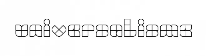
A geometric, modular font with a bold, modern aesthetic.
![UNIVERSALISME フリーフォントのダウンロード]() ダウンロード 54 ダウンロード数@WebFont
ダウンロード 54 ダウンロード数@WebFont


今のトップフォントは?
は、クリーンな造形と広い適用範囲で支持を集めています。 ブランディングからランディングページ、ポスターまで活躍します。
ロゴで人気のフォントは?
幾何学系の サンセリフ(例: Poppins、Gotham 系のファミリー)は、スケーラブルでクリーンな印象に最適。 親しみやすさを出すなら スクリプト や手書き系も定番です。 見出しは力強く、本文はニュートラルに──この組み合わせが認知とバランスを高めます。
人気リストはどのくらいの頻度で更新される?
ダウンロード数やエンゲージメントに基づき定期的に更新します。 こまめにチェックして、次に流行るフォントを先取りしましょう。
💡 ヒント: このページをブックマークしておくと便利です。トレンドは速く、今のトップが明日のリブランディングを導くこともあります。