人気フォント セクションへようこそ。ここでは「よくダウンロードされ、よく使われている」実績ある書体をまとめています。 ロゴ、Web、SNS のどれにも使いやすい、外さない選択肢が見つかります。
どの トップフォント も、バランス・可読性・汎用性で高評価です。 モダン・サンセリフ、エレガントなスクリプト、ヴィンテージなセリフ、ミニマルなディスプレイなどを厳選しています。
-
( Fonts by Don Marciano - Personal-use only. For commercial use please contact owner. )
A bold, modern sans-serif font with strong, uniform strokes.
 ダウンロード 41 ダウンロード数@WebFont
 -
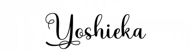
( Fonts by Mega Type - M Akmal - Personal-use only. For commercial use please contact owner. )
An elegant and decorative font with intricate swirls and flourishes.
![Yoshieka フリーフォントのダウンロード]() ダウンロード 41 ダウンロード数@WebFont
ダウンロード 41 ダウンロード数@WebFont -
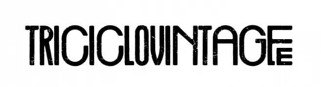
( Fonts by Woodcutter - woodcutter Manero - Personal-use only. For commercial use please contact owner. )
A vintage, distressed font with bold, condensed characters and a nostalgic feel.
![Triciclo Vintage フリーフォントのダウンロード]() ダウンロード 41 ダウンロード数@WebFont
ダウンロード 41 ダウンロード数@WebFont -
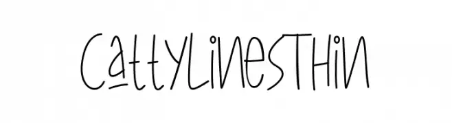
( Fonts by AGUS ALFIAN - ghielz.com - Personal-use only. For commercial use please contact owner. )
A playful, hand-drawn font with tall, thin letters and quirky cat silhouettes.
![CattyLinesThin フリーフォントのダウンロード]() ダウンロード 41 ダウンロード数@WebFont
ダウンロード 41 ダウンロード数@WebFont -
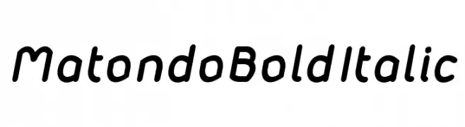
( Audry Kitoko Makelele - www.facebook.com/aukimvisuel )
A bold, italicized font with rounded edges and a modern, approachable style.
![Matondo BoldItalic フリーフォントのダウンロード]() ダウンロード 41 ダウンロード数@WebFont
ダウンロード 41 ダウンロード数@WebFont -
-
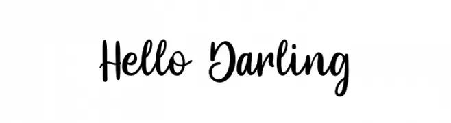
( Fonts by MJB Letters - Muhammad Mujibulloh - Personal-use only. For commercial use please contact owner. )
A playful, handwritten font with smooth, flowing strokes and a whimsical charm.
![Hello Darling フリーフォントのダウンロード]() ダウンロード 41 ダウンロード数@WebFont
ダウンロード 41 ダウンロード数@WebFont -
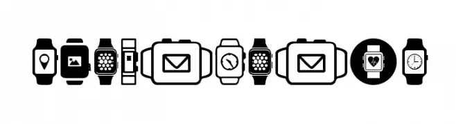
( Woodcutter - woodcutter Manero - www.woodcutter.es )
Modern, bold smartwatch icon set with geometric shapes.
![Smartwatch フリーフォントのダウンロード]() ダウンロード 41 ダウンロード数@WebFont
ダウンロード 41 ダウンロード数@WebFont -
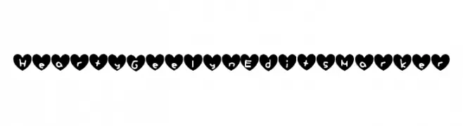
( GeelynEdits - plus.google.com/u/0/108461348931992643310/ )
A playful, heart-enclosed handwritten font perfect for romantic or themed designs.
![Hearty_Geelyn_Edits_Marker フリーフォントのダウンロード]() ダウンロード 41 ダウンロード数@WebFont
ダウンロード 41 ダウンロード数@WebFont -
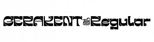
( Fonts by twinletter )
A bold, geometric font with a modern and edgy design.
![GERAKENT-Regular フリーフォントのダウンロード]() ダウンロード 41 ダウンロード数@WebFont
ダウンロード 41 ダウンロード数@WebFont -
( Fonts by Letterhend Studio - Hendry Juanda - Personal-use only. For commercial use please contact owner. )
A lively handwritten font with dynamic strokes and a playful appearance.
![Stacylia DEMO-Regular フリーフォントのダウンロード]() ダウンロード 41 ダウンロード数@WebFont
ダウンロード 41 ダウンロード数@WebFont
今のトップフォントは?
は、クリーンな造形と広い適用範囲で支持を集めています。 ブランディングからランディングページ、ポスターまで活躍します。
ロゴで人気のフォントは?
幾何学系の サンセリフ(例: Poppins、Gotham 系のファミリー)は、スケーラブルでクリーンな印象に最適。 親しみやすさを出すなら スクリプト や手書き系も定番です。 見出しは力強く、本文はニュートラルに──この組み合わせが認知とバランスを高めます。
人気リストはどのくらいの頻度で更新される?
ダウンロード数やエンゲージメントに基づき定期的に更新します。 こまめにチェックして、次に流行るフォントを先取りしましょう。
💡 ヒント: このページをブックマークしておくと便利です。トレンドは速く、今のトップが明日のリブランディングを導くこともあります。