人気フォント セクションへようこそ。ここでは「よくダウンロードされ、よく使われている」実績ある書体をまとめています。 ロゴ、Web、SNS のどれにも使いやすい、外さない選択肢が見つかります。
どの トップフォント も、バランス・可読性・汎用性で高評価です。 モダン・サンセリフ、エレガントなスクリプト、ヴィンテージなセリフ、ミニマルなディスプレイなどを厳選しています。
-
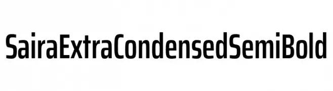
( Fonts by Omnibus Type )
A modern, extra condensed, semi-bold font with clean lines and geometric shapes.
 ダウンロード 40 ダウンロード数@WebFont
 -
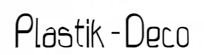
( Fonts by Malre Deszik - Personal-use only. For commercial use please contact owner. )
A modern, Art Deco-inspired font with sleek, elongated characters.
![Plastik-Deco フリーフォントのダウンロード]() ダウンロード 40 ダウンロード数@WebFont
ダウンロード 40 ダウンロード数@WebFont -
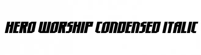
( Fonts by Daniel Zadorozny - www.iconian.com - Personal-use only. For commercial use please contact owner. )
A bold, condensed, and italicized font with a dynamic and modern style.
![Hero Worship Condensed Italic フリーフォントのダウンロード]() ダウンロード 40 ダウンロード数@WebFont
ダウンロード 40 ダウンロード数@WebFont -
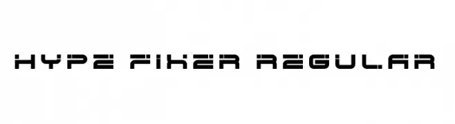
( Fonts by EyeCone - Personal-use only. For commercial use please contact owner. )
A modern, geometric font with a futuristic, tech-inspired design.
![Hype Fixer Regular フリーフォントのダウンロード]() ダウンロード 40 ダウンロード数@WebFont
ダウンロード 40 ダウンロード数@WebFont -
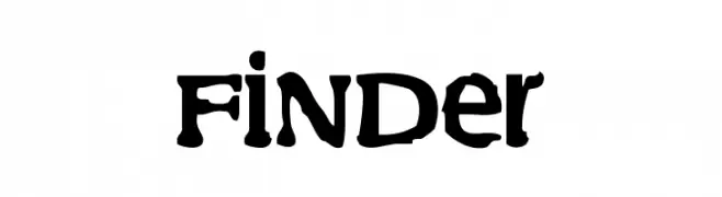
( Fonts by Md Shohail Bhuian - Personal-use only. For commercial use please contact owner. )
A bold, rugged font with distressed edges and a hand-crafted appearance.
![Finder フリーフォントのダウンロード]() ダウンロード 40 ダウンロード数@WebFont
ダウンロード 40 ダウンロード数@WebFont -
-
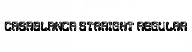
( Fonts by Vladimir Nikolic - www.creativefabrica.com/designer/vladimirnikolic/ - Personal-use only. For commercial use please contact owner. )
A bold, decorative font with a 3D effect and dotted interior pattern.
![Casablanca Straight Regular フリーフォントのダウンロード]() ダウンロード 40 ダウンロード数@WebFont
ダウンロード 40 ダウンロード数@WebFont -
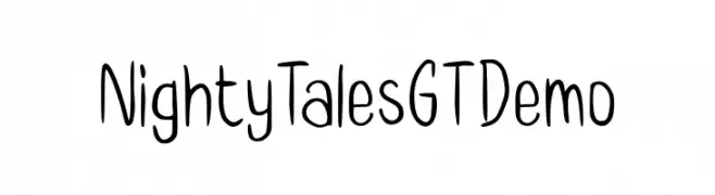
( Fonts by Gartype Studio - Gartype Studio - Personal-use only. For commercial use please contact owner. )
A playful handwritten font with a casual and friendly style.
![Nighty Tales GT Demo フリーフォントのダウンロード]() ダウンロード 40 ダウンロード数@WebFont
ダウンロード 40 ダウンロード数@WebFont -
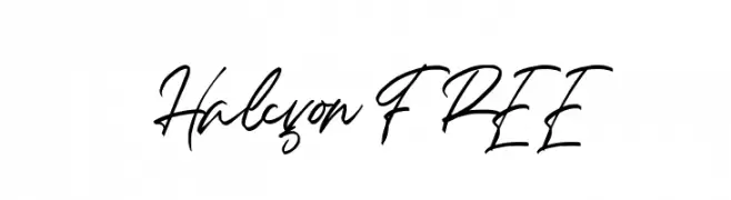
( Fonts by InspiraType )
Casual handwritten script font.
![Halcyon FREE フリーフォントのダウンロード]() ダウンロード 40 ダウンロード数@WebFont
ダウンロード 40 ダウンロード数@WebFont -
( Noto is a trademark of Google Inc. Noto fonts are open source. All Noto fonts are published under the SIL Open Font License, Version 1.1 )
A modern, condensed sans-serif font ideal for UI design.
![Noto Sans Sinhala UI Condensed フリーフォントのダウンロード]() ダウンロード 40 ダウンロード数@WebFont
ダウンロード 40 ダウンロード数@WebFont -
( Fonts by JunCreative - Personal-use only. For commercial use please contact owner. )
A delicate, elegant handwritten font with flowing lines and whimsical charm.
![Lettersign フリーフォントのダウンロード]() ダウンロード 40 ダウンロード数@WebFont
ダウンロード 40 ダウンロード数@WebFont

今のトップフォントは?
は、クリーンな造形と広い適用範囲で支持を集めています。 ブランディングからランディングページ、ポスターまで活躍します。
ロゴで人気のフォントは?
幾何学系の サンセリフ(例: Poppins、Gotham 系のファミリー)は、スケーラブルでクリーンな印象に最適。 親しみやすさを出すなら スクリプト や手書き系も定番です。 見出しは力強く、本文はニュートラルに──この組み合わせが認知とバランスを高めます。
人気リストはどのくらいの頻度で更新される?
ダウンロード数やエンゲージメントに基づき定期的に更新します。 こまめにチェックして、次に流行るフォントを先取りしましょう。
💡 ヒント: このページをブックマークしておくと便利です。トレンドは速く、今のトップが明日のリブランディングを導くこともあります。