人気フォント セクションへようこそ。ここでは「よくダウンロードされ、よく使われている」実績ある書体をまとめています。 ロゴ、Web、SNS のどれにも使いやすい、外さない選択肢が見つかります。
どの トップフォント も、バランス・可読性・汎用性で高評価です。 モダン・サンセリフ、エレガントなスクリプト、ヴィンテージなセリフ、ミニマルなディスプレイなどを厳選しています。
-
( Cubo Fonts - Florent Courtaigne - www.cubo.fr )
An angular, geometric font with a modern and artistic style.
 ダウンロード 40 ダウンロード数@WebFont
 -
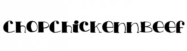
( Ohab Tbj )
A bold, playful font with whimsical, artistic strokes and exaggerated curves.
![ChopChickennBeef フリーフォントのダウンロード]() ダウンロード 40 ダウンロード数@WebFont
ダウンロード 40 ダウンロード数@WebFont -
( Fonts by Matej Hofman - Personal-use only. For commercial use please contact owner. )
A pixelated, blocky font with a retro digital aesthetic.
![Pixeleris Regular フリーフォントのダウンロード]() ダウンロード 40 ダウンロード数@WebFont
ダウンロード 40 ダウンロード数@WebFont -
( Fonts by j4p4n - Personal-use only. For commercial use please contact owner. )
A bold, angular font with a geometric and dynamic style.
![gizagiza フリーフォントのダウンロード]() ダウンロード 40 ダウンロード数@WebFont
ダウンロード 40 ダウンロード数@WebFont -
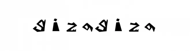
( Fonts by Daniel Zadorozny - www.iconian.com - Personal-use only. For commercial use please contact owner. )
A futuristic, geometric font with elongated, narrow characters and sharp angles.
![Blue Cobra Laser フリーフォントのダウンロード]() ダウンロード 40 ダウンロード数@WebFont
ダウンロード 40 ダウンロード数@WebFont -
-
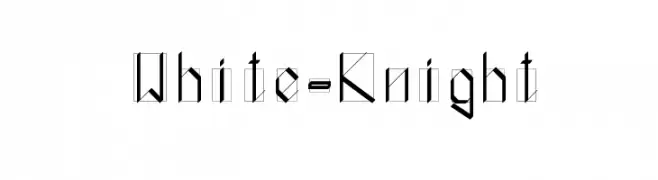
( Eric Amate )
A modern, angular font with a geometric and technical aesthetic.
![White-Knight フリーフォントのダウンロード]() ダウンロード 40 ダウンロード数@WebFont
ダウンロード 40 ダウンロード数@WebFont -
( Fonts by Emmanuel Thomassey - Personal-use only. For commercial use please contact owner. )
A modern, decorative font with bold, rounded strokes and unique cutouts.
![Kiwiline フリーフォントのダウンロード]() ダウンロード 40 ダウンロード数@WebFont
ダウンロード 40 ダウンロード数@WebFont -
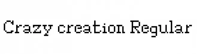
( Fonts by Matej Hofman - Personal-use only. For commercial use please contact owner. )
A pixelated, blocky font with a retro digital aesthetic.
![Crazy creation Regular フリーフォントのダウンロード]() ダウンロード 40 ダウンロード数@WebFont
ダウンロード 40 ダウンロード数@WebFont -
( Noto is a trademark of Google Inc. Noto fonts are open source. All Noto fonts are published under the SIL Open Font License, Version 1.1 )
Modern sans-serif with semi-condensed bold style.
![Noto Sans Armenian SemiCondensed Bold フリーフォントのダウンロード]() ダウンロード 40 ダウンロード数@WebFont
ダウンロード 40 ダウンロード数@WebFont -
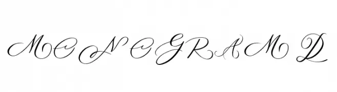
( Fonts by AminMario - Amin Mario - Personal-use only. For commercial use please contact owner. )
An elegant script font with flowing, ornate letters and intricate flourishes.
![MONOGRAM D フリーフォントのダウンロード]() ダウンロード 40 ダウンロード数@WebFont
ダウンロード 40 ダウンロード数@WebFont


今のトップフォントは?
は、クリーンな造形と広い適用範囲で支持を集めています。 ブランディングからランディングページ、ポスターまで活躍します。
ロゴで人気のフォントは?
幾何学系の サンセリフ(例: Poppins、Gotham 系のファミリー)は、スケーラブルでクリーンな印象に最適。 親しみやすさを出すなら スクリプト や手書き系も定番です。 見出しは力強く、本文はニュートラルに──この組み合わせが認知とバランスを高めます。
人気リストはどのくらいの頻度で更新される?
ダウンロード数やエンゲージメントに基づき定期的に更新します。 こまめにチェックして、次に流行るフォントを先取りしましょう。
💡 ヒント: このページをブックマークしておくと便利です。トレンドは速く、今のトップが明日のリブランディングを導くこともあります。