人気フォント セクションへようこそ。ここでは「よくダウンロードされ、よく使われている」実績ある書体をまとめています。 ロゴ、Web、SNS のどれにも使いやすい、外さない選択肢が見つかります。
どの トップフォント も、バランス・可読性・汎用性で高評価です。 モダン・サンセリフ、エレガントなスクリプト、ヴィンテージなセリフ、ミニマルなディスプレイなどを厳選しています。
-
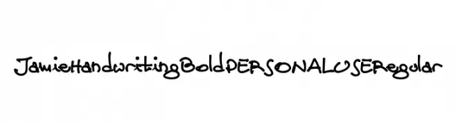
( Fonts by Mans Greback - Personal-use only. For commercial use please contact owner. )
A bold, playful handwritten font with a casual, artistic style.
 ダウンロード 40 ダウンロード数@WebFont
 -
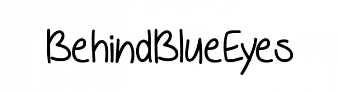
( Misti's Fonts - mistifonts.com/ )
A playful, handwritten font with a casual and friendly style.
![BehindBlueEyes フリーフォントのダウンロード]() ダウンロード 40 ダウンロード数@WebFont
ダウンロード 40 ダウンロード数@WebFont -
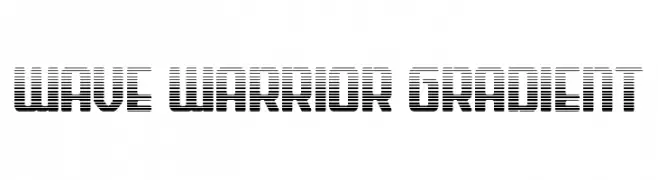
( Fonts by Daniel Zadorozny - www.iconian.com - Personal-use only. For commercial use please contact owner. )
A bold, futuristic font with a gradient effect and dynamic, geometric shapes.
![Wave Warrior Gradient フリーフォントのダウンロード]() ダウンロード 40 ダウンロード数@WebFont
ダウンロード 40 ダウンロード数@WebFont -
( Fonts by Pineungtype Missinklab - Personal-use only. For commercial use please contact owner. )
A sophisticated script font with fluid, cursive strokes and elegant flourishes.
![Amestaya フリーフォントのダウンロード]() ダウンロード 40 ダウンロード数@WebFont
ダウンロード 40 ダウンロード数@WebFont -
( Fonts by Edric Studio - Personal-use only. For commercial use please contact owner. )
A bold, expressive handwritten font with a lively cursive style.
![Nhadiem Elans Demo フリーフォントのダウンロード]() ダウンロード 40 ダウンロード数@WebFont
ダウンロード 40 ダウンロード数@WebFont -
-
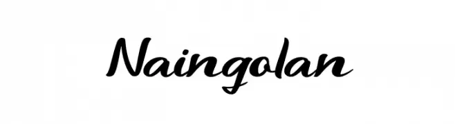
( Fonts by Basni.std - Bery Arisandi - Personal-use only. For commercial use please contact owner. )
A dynamic and fluid script font with elegant, flowing letterforms.
![Naingolan フリーフォントのダウンロード]() ダウンロード 40 ダウンロード数@WebFont
ダウンロード 40 ダウンロード数@WebFont -
( Fonts by GFR Creative - Personal-use only. For commercial use please contact owner. )
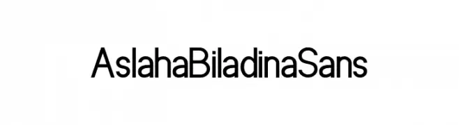
A modern, clean sans-serif font with uniform stroke width and excellent readability.
![Aslaha Biladina Sans フリーフォントのダウンロード]() ダウンロード 40 ダウンロード数@WebFont
ダウンロード 40 ダウンロード数@WebFont -
( Fonts by Jaime Rangel Castro - Personal-use only. For commercial use please contact owner. )
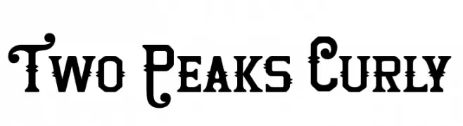
A decorative font with ornate curls and spikes, perfect for dramatic designs.
![Two Peaks Curly フリーフォントのダウンロード]() ダウンロード 40 ダウンロード数@WebFont
ダウンロード 40 ダウンロード数@WebFont -
( Fonts by Xerographer Fonts - Max Infeld - Personal-use only. For commercial use please contact owner. )
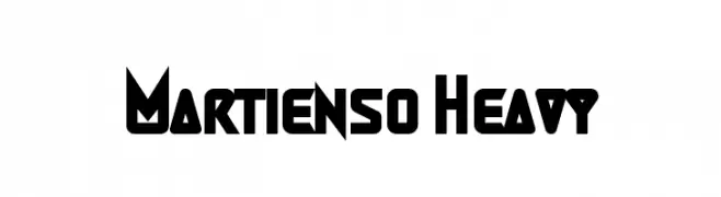
A bold, geometric font with sharp angles and a futuristic style.
![Martienso Heavy フリーフォントのダウンロード]() ダウンロード 40 ダウンロード数@WebFont
ダウンロード 40 ダウンロード数@WebFont -
( Catharsis - www.cinga.ch/fonts.html )
A geometric and angular font with a futuristic and abstract style.
![Cirnaja Bookhand フリーフォントのダウンロード]() ダウンロード 40 ダウンロード数@WebFont
ダウンロード 40 ダウンロード数@WebFont


今のトップフォントは?
は、クリーンな造形と広い適用範囲で支持を集めています。 ブランディングからランディングページ、ポスターまで活躍します。
ロゴで人気のフォントは?
幾何学系の サンセリフ(例: Poppins、Gotham 系のファミリー)は、スケーラブルでクリーンな印象に最適。 親しみやすさを出すなら スクリプト や手書き系も定番です。 見出しは力強く、本文はニュートラルに──この組み合わせが認知とバランスを高めます。
人気リストはどのくらいの頻度で更新される?
ダウンロード数やエンゲージメントに基づき定期的に更新します。 こまめにチェックして、次に流行るフォントを先取りしましょう。
💡 ヒント: このページをブックマークしておくと便利です。トレンドは速く、今のトップが明日のリブランディングを導くこともあります。