人気フォント セクションへようこそ。ここでは「よくダウンロードされ、よく使われている」実績ある書体をまとめています。 ロゴ、Web、SNS のどれにも使いやすい、外さない選択肢が見つかります。
どの トップフォント も、バランス・可読性・汎用性で高評価です。 モダン・サンセリフ、エレガントなスクリプト、ヴィンテージなセリフ、ミニマルなディスプレイなどを厳選しています。
-
( Fonts by Attract Studio - Personal-use only. For commercial use please contact owner. )
A playful, handwritten font with tall, narrow letters and smooth strokes.
 ダウンロード 40 ダウンロード数@WebFont
 -
( Fonts by Jimtype Studio - Personal-use only. For commercial use please contact owner. )
A cursive, handwritten font with elegant, flowing strokes.
![Amelia Bloomer フリーフォントのダウンロード]() ダウンロード 40 ダウンロード数@WebFont
ダウンロード 40 ダウンロード数@WebFont -
( Fonts by Runsell Studio - Personal-use only. For commercial use please contact owner. )
A bold, expressive handwritten font with playful curves and a friendly vibe.
![Housemate フリーフォントのダウンロード]() ダウンロード 40 ダウンロード数@WebFont
ダウンロード 40 ダウンロード数@WebFont -
( Fonts by Seckin Hatipoglu )
A decorative font with intricate maze-like patterns within each character.
![infinitylabyrinth-Regular フリーフォントのダウンロード]() ダウンロード 40 ダウンロード数@WebFont
ダウンロード 40 ダウンロード数@WebFont -
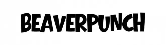
( Fonts by Eko Bimantara )
Bold, playful display font with a hand-drawn look.
![Beaver Punch フリーフォントのダウンロード]() ダウンロード 40 ダウンロード数@WebFont
ダウンロード 40 ダウンロード数@WebFont -
-
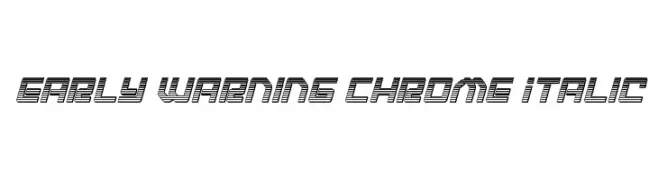
( Fonts by Daniel Zadorozny - www.iconian.com - Personal-use only. For commercial use please contact owner. )
A bold, italic, chrome-like font with dynamic horizontal lines and a futuristic style.
![Early Warning Chrome Italic フリーフォントのダウンロード]() ダウンロード 40 ダウンロード数@WebFont
ダウンロード 40 ダウンロード数@WebFont -
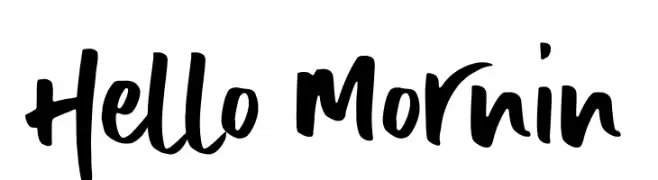
( Fonts by AZ Std - Muh Aswar - Personal-use only. For commercial use please contact owner. )
A bold, handwritten font with a lively and energetic brush-like style.
![Hello Mornin フリーフォントのダウンロード]() ダウンロード 40 ダウンロード数@WebFont
ダウンロード 40 ダウンロード数@WebFont -
( Fonts by Luluk Surotul - Personal-use only. For commercial use please contact owner. )
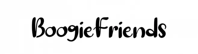
A playful, bold, and rounded font with a whimsical, hand-drawn style.
![Boogie Friends フリーフォントのダウンロード]() ダウンロード 40 ダウンロード数@WebFont
ダウンロード 40 ダウンロード数@WebFont -
( Fonts by Mr.W - Willian Santos - Personal-use only. For commercial use please contact owner. )
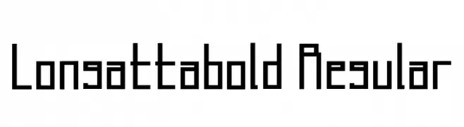
A geometric, modern font with bold weight and sharp angles.
![Longatta_bold Regular フリーフォントのダウンロード]() ダウンロード 40 ダウンロード数@WebFont
ダウンロード 40 ダウンロード数@WebFont -
( Fonts by Xavier Puig - Personal-use only. For commercial use please contact owner. )
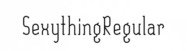
A modern, geometric font with tall, narrow letterforms and subtle vintage influences.
![SexythingRegular フリーフォントのダウンロード]() ダウンロード 40 ダウンロード数@WebFont
ダウンロード 40 ダウンロード数@WebFont


今のトップフォントは?
は、クリーンな造形と広い適用範囲で支持を集めています。 ブランディングからランディングページ、ポスターまで活躍します。
ロゴで人気のフォントは?
幾何学系の サンセリフ(例: Poppins、Gotham 系のファミリー)は、スケーラブルでクリーンな印象に最適。 親しみやすさを出すなら スクリプト や手書き系も定番です。 見出しは力強く、本文はニュートラルに──この組み合わせが認知とバランスを高めます。
人気リストはどのくらいの頻度で更新される?
ダウンロード数やエンゲージメントに基づき定期的に更新します。 こまめにチェックして、次に流行るフォントを先取りしましょう。
💡 ヒント: このページをブックマークしておくと便利です。トレンドは速く、今のトップが明日のリブランディングを導くこともあります。