人気フォント セクションへようこそ。ここでは「よくダウンロードされ、よく使われている」実績ある書体をまとめています。 ロゴ、Web、SNS のどれにも使いやすい、外さない選択肢が見つかります。
どの トップフォント も、バランス・可読性・汎用性で高評価です。 モダン・サンセリフ、エレガントなスクリプト、ヴィンテージなセリフ、ミニマルなディスプレイなどを厳選しています。
-
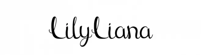
( Fonts by Ronin Design - Personal-use only. For commercial use please contact owner. )
A playful and elegant script font with modern, flowing lines.
 ダウンロード 39 ダウンロード数@WebFont
 -
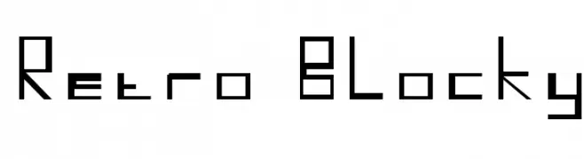
( Lensicle - www.lensicle.com/fonts/ )
A retro, blocky font with a geometric and angular design.
![Retro Blocky フリーフォントのダウンロード]() ダウンロード 39 ダウンロード数@WebFont
ダウンロード 39 ダウンロード数@WebFont -
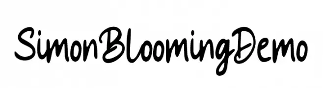
( Fonts by Mans Greback - www.mansgreback.com - Personal-use only. For commercial use please contact owner. )
A bold, playful handwritten font with expressive strokes.
![Simon Blooming Demo フリーフォントのダウンロード]() ダウンロード 39 ダウンロード数@WebFont
ダウンロード 39 ダウンロード数@WebFont -
( Fonts by Daniel Zadorozny - www.iconian.com - Personal-use only. For commercial use please contact owner. )
A bold, condensed, and italicized font with a futuristic and dynamic style.
![Combat Droid Condensed Italic フリーフォントのダウンロード]() ダウンロード 39 ダウンロード数@WebFont
ダウンロード 39 ダウンロード数@WebFont -
( Fonts by Vunira Design - Personal-use only. For commercial use please contact owner. )
A bold, fluid script font with an elegant, handwritten style.
![Watterland Typeface FREE フリーフォントのダウンロード]() ダウンロード 39 ダウンロード数@WebFont
ダウンロード 39 ダウンロード数@WebFont -
-
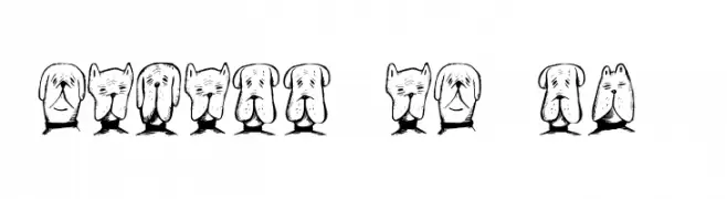
( Fonts by Vladimir Nikolic )
A whimsical font featuring dog illustrations for each character.
![Gebell Regular フリーフォントのダウンロード]() ダウンロード 39 ダウンロード数@WebFont
ダウンロード 39 ダウンロード数@WebFont -
( Fonts by Allouse Studio - Personal-use only. For commercial use please contact owner. )
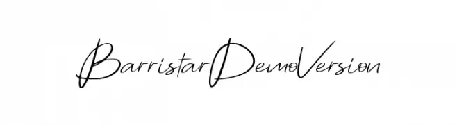
A flowing, handwritten font with elegant, cursive characters and medium contrast.
![Barristar Demo Version フリーフォントのダウンロード]() ダウンロード 39 ダウンロード数@WebFont
ダウンロード 39 ダウンロード数@WebFont -
( Fonts by Vacatype Co. - Vacatype - Personal-use only. For commercial use please contact owner. )
An elegant and sophisticated font with classic swashes and modern elements.
![VaucaPersonalUse-Regular フリーフォントのダウンロード]() ダウンロード 39 ダウンロード数@WebFont
ダウンロード 39 ダウンロード数@WebFont -
( Fonts by Vladimir Nikolic - Personal-use only. For commercial use please contact owner. )
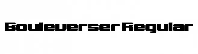
A bold, geometric font with a futuristic, industrial style.
![Bouleverser Regular フリーフォントのダウンロード]() ダウンロード 39 ダウンロード数@WebFont
ダウンロード 39 ダウンロード数@WebFont -
( Fonts by twinletter - Rozikan - Personal-use only. For commercial use please contact owner. )
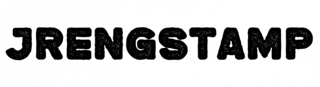
A bold, distressed font with a textured, stamp-like appearance.
![Jreng Stamp フリーフォントのダウンロード]() ダウンロード 39 ダウンロード数@WebFont
ダウンロード 39 ダウンロード数@WebFont


今のトップフォントは?
は、クリーンな造形と広い適用範囲で支持を集めています。 ブランディングからランディングページ、ポスターまで活躍します。
ロゴで人気のフォントは?
幾何学系の サンセリフ(例: Poppins、Gotham 系のファミリー)は、スケーラブルでクリーンな印象に最適。 親しみやすさを出すなら スクリプト や手書き系も定番です。 見出しは力強く、本文はニュートラルに──この組み合わせが認知とバランスを高めます。
人気リストはどのくらいの頻度で更新される?
ダウンロード数やエンゲージメントに基づき定期的に更新します。 こまめにチェックして、次に流行るフォントを先取りしましょう。
💡 ヒント: このページをブックマークしておくと便利です。トレンドは速く、今のトップが明日のリブランディングを導くこともあります。