人気フォント セクションへようこそ。ここでは「よくダウンロードされ、よく使われている」実績ある書体をまとめています。 ロゴ、Web、SNS のどれにも使いやすい、外さない選択肢が見つかります。
どの トップフォント も、バランス・可読性・汎用性で高評価です。 モダン・サンセリフ、エレガントなスクリプト、ヴィンテージなセリフ、ミニマルなディスプレイなどを厳選しています。
-
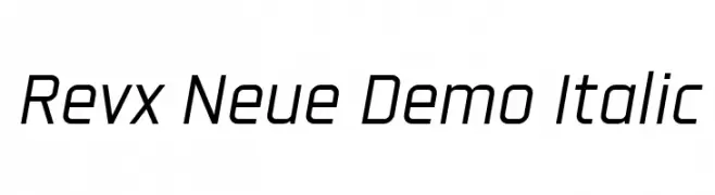
( Fonts by Abhishek Junghare - Personal-use only. For commercial use please contact owner. )
A modern, italic font with a sleek and dynamic design.
 ダウンロード 39 ダウンロード数@WebFont
 -
( Fonts by Vunira Design - Personal-use only. For commercial use please contact owner. )
A playful, handwritten script font with a dynamic and informal style.
![Catars FREE フリーフォントのダウンロード]() ダウンロード 39 ダウンロード数@WebFont
ダウンロード 39 ダウンロード数@WebFont -
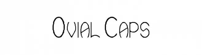
( Glyphobet Font Foundry - glyphobet.net/typography/ )
A playful, hand-drawn font with elongated, irregular strokes.
![Ovial Caps フリーフォントのダウンロード]() ダウンロード 39 ダウンロード数@WebFont
ダウンロード 39 ダウンロード数@WebFont -
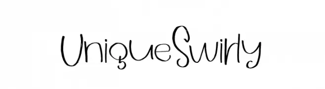
( Fonts by Muhammad Fajar - Personal-use only. For commercial use please contact owner. )
A playful, hand-drawn font with a whimsical, swirly style.
![UniqueSwirly フリーフォントのダウンロード]() ダウンロード 39 ダウンロード数@WebFont
ダウンロード 39 ダウンロード数@WebFont -
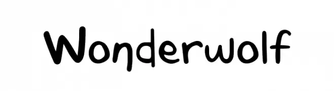
( Fonts by Tigadestd - Doli Harahap - Personal-use only. For commercial use please contact owner. )
A playful, handwritten font with a casual and friendly style.
![Wonderwolf フリーフォントのダウンロード]() ダウンロード 39 ダウンロード数@WebFont
ダウンロード 39 ダウンロード数@WebFont -
-
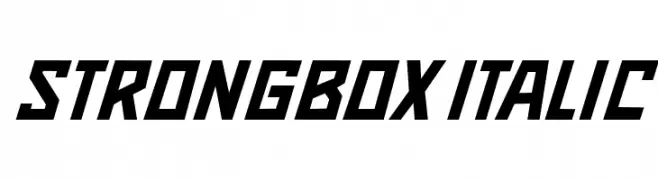
( Fonts by Vladimir Nikolic - Personal-use only. For commercial use please contact owner. )
A bold, italicized font with angular, geometric characters.
![Strongbox Italic フリーフォントのダウンロード]() ダウンロード 39 ダウンロード数@WebFont
ダウンロード 39 ダウンロード数@WebFont -
( Fonts by Yahhya Anas - Personal-use only. For commercial use please contact owner. )
A bold, expressive script font with flowing cursive letterforms.
![Beauty Diary フリーフォントのダウンロード]() ダウンロード 39 ダウンロード数@WebFont
ダウンロード 39 ダウンロード数@WebFont -
( Fonts by Andika Fez - Personal-use only. For commercial use please contact owner. )
A bold, geometric font with clean lines and modern style.
![berlinsans フリーフォントのダウンロード]() ダウンロード 39 ダウンロード数@WebFont
ダウンロード 39 ダウンロード数@WebFont -
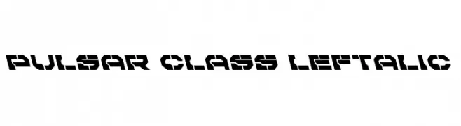
( Iconian Fonts - Daniel Zadorozny - www.iconian.com )
A bold, futuristic font with angular, geometric shapes and a digital aesthetic.
![Pulsar Class Leftalic フリーフォントのダウンロード]() ダウンロード 39 ダウンロード数@WebFont
ダウンロード 39 ダウンロード数@WebFont -
( Fonts by Polah Type - Personal-use only. For commercial use please contact owner. )
A bold, dynamic handwritten font with fluid strokes and a brush-like texture.
![Blankers フリーフォントのダウンロード]() ダウンロード 39 ダウンロード数@WebFont
ダウンロード 39 ダウンロード数@WebFont


今のトップフォントは?
は、クリーンな造形と広い適用範囲で支持を集めています。 ブランディングからランディングページ、ポスターまで活躍します。
ロゴで人気のフォントは?
幾何学系の サンセリフ(例: Poppins、Gotham 系のファミリー)は、スケーラブルでクリーンな印象に最適。 親しみやすさを出すなら スクリプト や手書き系も定番です。 見出しは力強く、本文はニュートラルに──この組み合わせが認知とバランスを高めます。
人気リストはどのくらいの頻度で更新される?
ダウンロード数やエンゲージメントに基づき定期的に更新します。 こまめにチェックして、次に流行るフォントを先取りしましょう。
💡 ヒント: このページをブックマークしておくと便利です。トレンドは速く、今のトップが明日のリブランディングを導くこともあります。