人気フォント セクションへようこそ。ここでは「よくダウンロードされ、よく使われている」実績ある書体をまとめています。 ロゴ、Web、SNS のどれにも使いやすい、外さない選択肢が見つかります。
どの トップフォント も、バランス・可読性・汎用性で高評価です。 モダン・サンセリフ、エレガントなスクリプト、ヴィンテージなセリフ、ミニマルなディスプレイなどを厳選しています。
-
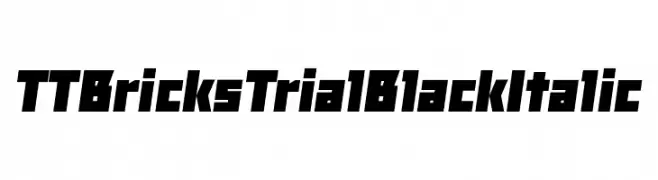
( Fonts by TypeType Foundry )
A bold, angular, and italic typeface with a modern, geometric style.
 ダウンロード 39 ダウンロード数@WebFont
 -
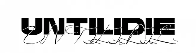
( Fonts by Ciaran Brandin - Personal-use only. For commercial use please contact owner. )
A bold, modern font with high contrast and strong visual impact.
![Until I Die フリーフォントのダウンロード]() ダウンロード 39 ダウンロード数@WebFont
ダウンロード 39 ダウンロード数@WebFont -
( Fonts by FallenGraphic Studio - Vava Aryanto - Personal-use only. For commercial use please contact owner. )
An elegant, flowing script font with intricate loops and swirls.
![Rottrydam Wargna Personal Use フリーフォントのダウンロード]() ダウンロード 39 ダウンロード数@WebFont
ダウンロード 39 ダウンロード数@WebFont -
( Fonts by Maulana Creative - Gilang Maulana - Personal-use only. For commercial use please contact owner. )
A modern, elegant handwritten font with fluid and continuous strokes.
![Pillish Free フリーフォントのダウンロード]() ダウンロード 39 ダウンロード数@WebFont
ダウンロード 39 ダウンロード数@WebFont -
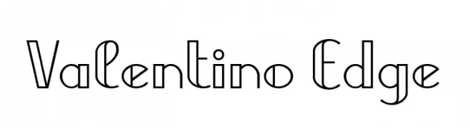
( Fonts by Yves Michel - Personal-use only. For commercial use please contact owner. )
A modern, geometric font with sharp edges and clean lines.
![Valentino Edge フリーフォントのダウンロード]() ダウンロード 39 ダウンロード数@WebFont
ダウンロード 39 ダウンロード数@WebFont -
-
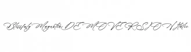
( Fonts by Letterena Studios )
A graceful, italic script font with a handwritten, calligraphic feel.
![Blissfuly Magnotia DEMO VERSION Italic フリーフォントのダウンロード]() ダウンロード 39 ダウンロード数@WebFont
ダウンロード 39 ダウンロード数@WebFont -
( Fonts by LetterStock - Guguh Gumantoro - Personal-use only. For commercial use please contact owner. )
A bold, energetic brush script font with dynamic, expressive strokes.
![Lockdowndemo フリーフォントのダウンロード]() ダウンロード 39 ダウンロード数@WebFont
ダウンロード 39 ダウンロード数@WebFont -
( Fonts by mightype - Personal-use only. For commercial use please contact owner. )
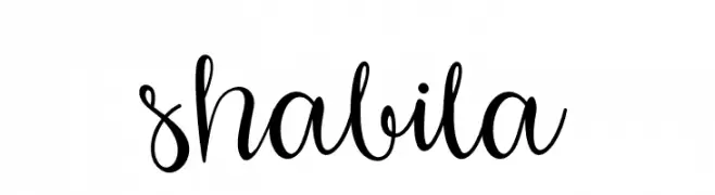
A decorative script font with elegant loops and swirls, perfect for creative projects.
![shabila フリーフォントのダウンロード]() ダウンロード 39 ダウンロード数@WebFont
ダウンロード 39 ダウンロード数@WebFont -
( Fonts by AZ Std - Muh Aswar - Personal-use only. For commercial use please contact owner. )
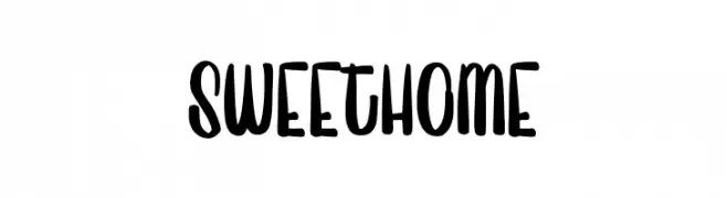
A playful, bold font with rounded, hand-drawn strokes.
![Sweet Home フリーフォントのダウンロード]() ダウンロード 39 ダウンロード数@WebFont
ダウンロード 39 ダウンロード数@WebFont -
( Fonts by Edric Studio - Personal-use only. For commercial use please contact owner. )
A bold, brush-style script font with dynamic, slanted characters.
![hummer フリーフォントのダウンロード]() ダウンロード 39 ダウンロード数@WebFont
ダウンロード 39 ダウンロード数@WebFont


今のトップフォントは?
は、クリーンな造形と広い適用範囲で支持を集めています。 ブランディングからランディングページ、ポスターまで活躍します。
ロゴで人気のフォントは?
幾何学系の サンセリフ(例: Poppins、Gotham 系のファミリー)は、スケーラブルでクリーンな印象に最適。 親しみやすさを出すなら スクリプト や手書き系も定番です。 見出しは力強く、本文はニュートラルに──この組み合わせが認知とバランスを高めます。
人気リストはどのくらいの頻度で更新される?
ダウンロード数やエンゲージメントに基づき定期的に更新します。 こまめにチェックして、次に流行るフォントを先取りしましょう。
💡 ヒント: このページをブックマークしておくと便利です。トレンドは速く、今のトップが明日のリブランディングを導くこともあります。