人気フォント セクションへようこそ。ここでは「よくダウンロードされ、よく使われている」実績ある書体をまとめています。 ロゴ、Web、SNS のどれにも使いやすい、外さない選択肢が見つかります。
どの トップフォント も、バランス・可読性・汎用性で高評価です。 モダン・サンセリフ、エレガントなスクリプト、ヴィンテージなセリフ、ミニマルなディスプレイなどを厳選しています。
-
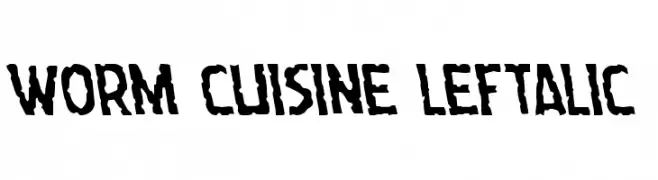
( Iconian Fonts - Daniel Zadorozny - www.iconian.com )
A bold, rugged font with irregular edges and a dynamic tilt.
 ダウンロード 38 ダウンロード数@WebFont
 -
( Fonts by Daniel Zadorozny - www.iconian.com - Personal-use only. For commercial use please contact owner. )
A bold, angular, and italic font with a futuristic and edgy design.
![Dark Hornet Italic フリーフォントのダウンロード]() ダウンロード 38 ダウンロード数@WebFont
ダウンロード 38 ダウンロード数@WebFont -
( Fonts by Glyphstyle - Dimas Ardhi - Personal-use only. For commercial use please contact owner. )
A bold, expressive handwritten font with a dynamic brush-like texture.
![Trackersdemo フリーフォントのダウンロード]() ダウンロード 38 ダウンロード数@WebFont
ダウンロード 38 ダウンロード数@WebFont -
( Fonts by Vladimir Nikolic - Personal-use only. For commercial use please contact owner. )
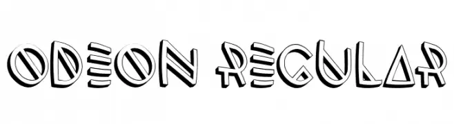
A bold, geometric font with a three-dimensional effect and angular lines.
![Odeon Regular フリーフォントのダウンロード]() ダウンロード 38 ダウンロード数@WebFont
ダウンロード 38 ダウンロード数@WebFont -
( Donna J Morse )
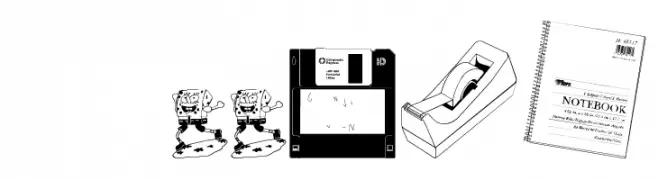
Illustrative display font made from office supply drawings.
![My Office フリーフォントのダウンロード]() ダウンロード 38 ダウンロード数@WebFont
ダウンロード 38 ダウンロード数@WebFont -
-
( Fonts by Mans Greback - www.mansgreback.com - Personal-use only. For commercial use please contact owner. )
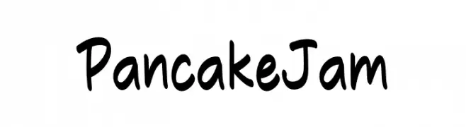
A playful, handwritten font with bold, rounded strokes and a casual, friendly appearance.
![Pancake Jam フリーフォントのダウンロード]() ダウンロード 38 ダウンロード数@WebFont
ダウンロード 38 ダウンロード数@WebFont -
( Fonts by CalligraphyFonts - Personal-use only. For commercial use please contact owner. )
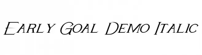
A sophisticated italic font with elegant, flowing lines and refined curves.
![Early Goal Demo Italic フリーフォントのダウンロード]() ダウンロード 38 ダウンロード数@WebFont
ダウンロード 38 ダウンロード数@WebFont -
( Fonts by Letterhend Studio - Hendry Juanda - Personal-use only. For commercial use please contact owner. )
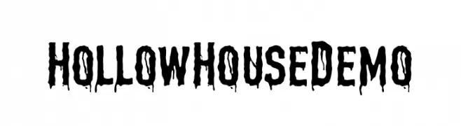
A spooky, dripping font ideal for horror-themed designs.
![HollowHouseDemo フリーフォントのダウンロード]() ダウンロード 38 ダウンロード数@WebFont
ダウンロード 38 ダウンロード数@WebFont -
( Fonts by Nirmana Visual - Sigit Dwipa - Personal-use only. For commercial use please contact owner. )
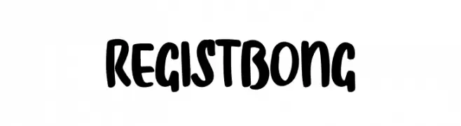
A bold, playful font with a hand-drawn, rounded style.
![Regist Bong フリーフォントのダウンロード]() ダウンロード 38 ダウンロード数@WebFont
ダウンロード 38 ダウンロード数@WebFont -
( Fonts by Vladimir Nikolic - Personal-use only. For commercial use please contact owner. )
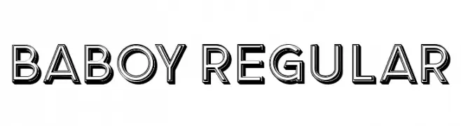
A bold, three-dimensional font with strong outlines and shadow effects.
![Baboy Regular フリーフォントのダウンロード]() ダウンロード 38 ダウンロード数@WebFont
ダウンロード 38 ダウンロード数@WebFont

今のトップフォントは?
は、クリーンな造形と広い適用範囲で支持を集めています。 ブランディングからランディングページ、ポスターまで活躍します。
ロゴで人気のフォントは?
幾何学系の サンセリフ(例: Poppins、Gotham 系のファミリー)は、スケーラブルでクリーンな印象に最適。 親しみやすさを出すなら スクリプト や手書き系も定番です。 見出しは力強く、本文はニュートラルに──この組み合わせが認知とバランスを高めます。
人気リストはどのくらいの頻度で更新される?
ダウンロード数やエンゲージメントに基づき定期的に更新します。 こまめにチェックして、次に流行るフォントを先取りしましょう。
💡 ヒント: このページをブックマークしておくと便利です。トレンドは速く、今のトップが明日のリブランディングを導くこともあります。