人気フォント セクションへようこそ。ここでは「よくダウンロードされ、よく使われている」実績ある書体をまとめています。 ロゴ、Web、SNS のどれにも使いやすい、外さない選択肢が見つかります。
どの トップフォント も、バランス・可読性・汎用性で高評価です。 モダン・サンセリフ、エレガントなスクリプト、ヴィンテージなセリフ、ミニマルなディスプレイなどを厳選しています。
-
( Fonts by Fadhil Aqsa - Personal-use only. For commercial use please contact owner. )
A cursive, handwritten-style font with fluid, connected strokes.
 ダウンロード 38 ダウンロード数@WebFont
 -
( Fonts by Four Lines - zain Fahroni - Personal-use only. For commercial use please contact owner. )
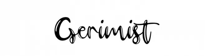
A bold, cursive handwritten font with dynamic and playful strokes.
![Gerimist フリーフォントのダウンロード]() ダウンロード 38 ダウンロード数@WebFont
ダウンロード 38 ダウンロード数@WebFont -
( Fonts by Vladimir Nikolic - Personal-use only. For commercial use please contact owner. )
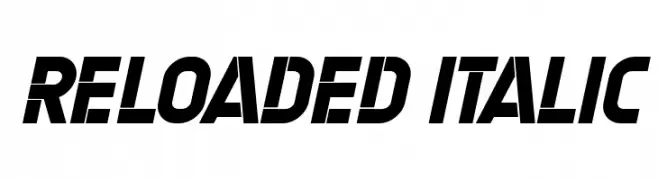
A bold, italicized font with dynamic angles and futuristic cut-out elements.
![Reloaded Italic フリーフォントのダウンロード]() ダウンロード 38 ダウンロード数@WebFont
ダウンロード 38 ダウンロード数@WebFont -
( Canale Studio, Inc. - Thomas Canale )
A bold, decorative serif font with modern and vintage influences.
![SqSerifThree フリーフォントのダウンロード]() ダウンロード 38 ダウンロード数@WebFont
ダウンロード 38 ダウンロード数@WebFont -
( Fonts by Arterfak Project - Ahmad Ramzi Fahruddin - Personal-use only. For commercial use please contact owner. )
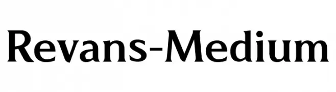
A modern serif font with sharp lines and balanced proportions.
![Revans-Medium フリーフォントのダウンロード]() ダウンロード 38 ダウンロード数@WebFont
ダウンロード 38 ダウンロード数@WebFont -
-
( Iconian Fonts - Daniel Zadorozny - www.iconian.com )
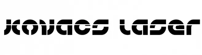
A bold, futuristic font with geometric shapes and dynamic negative space.
![Kovacs Laser フリーフォントのダウンロード]() ダウンロード 38 ダウンロード数@WebFont
ダウンロード 38 ダウンロード数@WebFont -
( Fonts by Pizzadude - Jakob Fischer - Personal-use only. For commercial use please contact owner. )
A bold, outlined font with a playful, retro style.
![Tasteless Candy フリーフォントのダウンロード]() ダウンロード 38 ダウンロード数@WebFont
ダウンロード 38 ダウンロード数@WebFont -
( Fonts by Eifetstype - Stefie Justprince - Personal-use only. For commercial use please contact owner. )
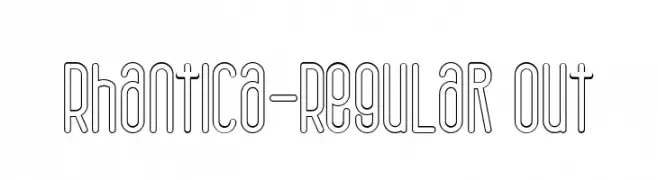
A modern, outlined font with a sleek, condensed style and uniform stroke width.
![Rhantica-Regular Out フリーフォントのダウンロード]() ダウンロード 38 ダウンロード数@WebFont
ダウンロード 38 ダウンロード数@WebFont -
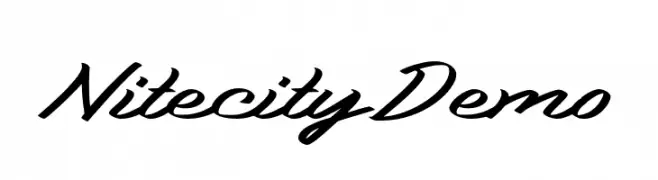
( Fonts by Katario Studio - Rioniga Zandy - Personal-use only. For commercial use please contact owner. )
A dynamic and energetic script font with flowing, cursive letterforms.
![Nitecity Demo フリーフォントのダウンロード]() ダウンロード 38 ダウンロード数@WebFont
ダウンロード 38 ダウンロード数@WebFont -
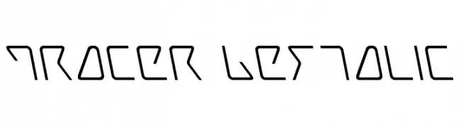
( Fonts by Iconian Fonts )
A futuristic, angular font with a consistent line thickness and dynamic slant.
![Tracer Leftalic フリーフォントのダウンロード]() ダウンロード 38 ダウンロード数@WebFont
ダウンロード 38 ダウンロード数@WebFont


今のトップフォントは?
は、クリーンな造形と広い適用範囲で支持を集めています。 ブランディングからランディングページ、ポスターまで活躍します。
ロゴで人気のフォントは?
幾何学系の サンセリフ(例: Poppins、Gotham 系のファミリー)は、スケーラブルでクリーンな印象に最適。 親しみやすさを出すなら スクリプト や手書き系も定番です。 見出しは力強く、本文はニュートラルに──この組み合わせが認知とバランスを高めます。
人気リストはどのくらいの頻度で更新される?
ダウンロード数やエンゲージメントに基づき定期的に更新します。 こまめにチェックして、次に流行るフォントを先取りしましょう。
💡 ヒント: このページをブックマークしておくと便利です。トレンドは速く、今のトップが明日のリブランディングを導くこともあります。