人気フォント セクションへようこそ。ここでは「よくダウンロードされ、よく使われている」実績ある書体をまとめています。 ロゴ、Web、SNS のどれにも使いやすい、外さない選択肢が見つかります。
どの トップフォント も、バランス・可読性・汎用性で高評価です。 モダン・サンセリフ、エレガントなスクリプト、ヴィンテージなセリフ、ミニマルなディスプレイなどを厳選しています。
-
( Fonts by Valency Graphics - Sean Grady - Personal-use only. For commercial use please contact owner. )
A bold, geometric font with sharp angles and a modern style.
 ダウンロード 38 ダウンロード数@WebFont
 -
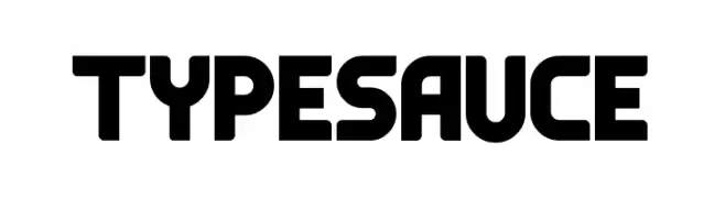
( Fonts by MaxiGamer - Maxime Maynard - Personal-use only. For commercial use please contact owner. )
A bold, geometric font with unique cutouts and rounded edges.
![Typesauce フリーフォントのダウンロード]() ダウンロード 38 ダウンロード数@WebFont
ダウンロード 38 ダウンロード数@WebFont -
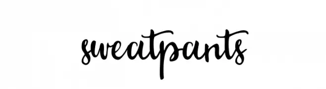
( Fonts by my sunday - Personal-use only. For commercial use please contact owner. )
A bold and expressive script font with lively, flowing strokes.
![sweatpants フリーフォントのダウンロード]() ダウンロード 38 ダウンロード数@WebFont
ダウンロード 38 ダウンロード数@WebFont -
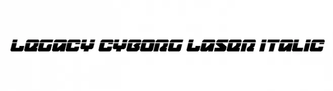
( Fonts by Daniel Zadorozny - www.iconian.com - Personal-use only. For commercial use please contact owner. )
A futuristic, bold, and italic font with sharp angles and a high-tech aesthetic.
![Legacy Cyborg Laser Italic フリーフォントのダウンロード]() ダウンロード 38 ダウンロード数@WebFont
ダウンロード 38 ダウンロード数@WebFont -
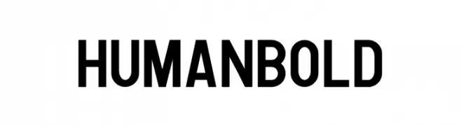
( Fonts by Human Design - Gilang Ramadhan - Personal-use only. For commercial use please contact owner. )
A bold, modern font with thick strokes and strong presence.
![Human Bold フリーフォントのダウンロード]() ダウンロード 38 ダウンロード数@WebFont
ダウンロード 38 ダウンロード数@WebFont -
-
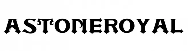
( Fonts by Joko Setiono - Personal-use only. For commercial use please contact owner. )
A bold, Gothic-style font with sharp, angular lines and ornamental details.
![ASTONE ROYAL フリーフォントのダウンロード]() ダウンロード 38 ダウンロード数@WebFont
ダウンロード 38 ダウンロード数@WebFont -
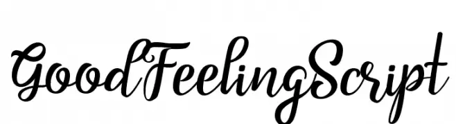
( Fonts by Subectype & Orenari - Rangga Subekti & Ari - Personal-use only. For commercial use please contact owner. )
A lively and expressive script font with elegant loops and flourishes.
![Good Feeling Script フリーフォントのダウンロード]() ダウンロード 38 ダウンロード数@WebFont
ダウンロード 38 ダウンロード数@WebFont -
( Fonts by Daniel Tampubolon - Personal-use only. For commercial use please contact owner. )
A bold, hand-drawn font with dynamic and lively characters.
![MrWhite フリーフォントのダウンロード]() ダウンロード 38 ダウンロード数@WebFont
ダウンロード 38 ダウンロード数@WebFont -
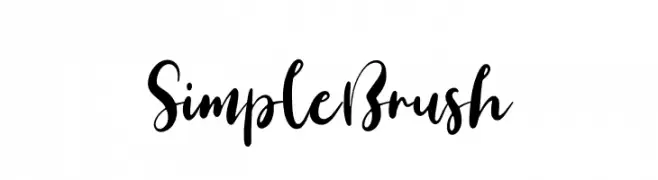
( Fonts by Hamzah Muhamad Ihsan - Typesthetic Studio - Personal-use only. For commercial use please contact owner. )
A lively and expressive brush script font with dynamic strokes.
![Simple Brush フリーフォントのダウンロード]() ダウンロード 38 ダウンロード数@WebFont
ダウンロード 38 ダウンロード数@WebFont -
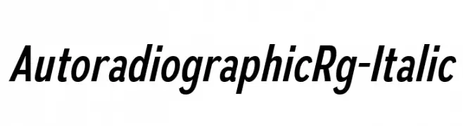
( Fonts by Typodermic Fonts - Raymond Larabie - Personal-use only. For commercial use please contact owner. )
A modern italic font with clean lines and smooth curves.
![AutoradiographicRg-Italic フリーフォントのダウンロード]() ダウンロード 38 ダウンロード数@WebFont
ダウンロード 38 ダウンロード数@WebFont

今のトップフォントは?
は、クリーンな造形と広い適用範囲で支持を集めています。 ブランディングからランディングページ、ポスターまで活躍します。
ロゴで人気のフォントは?
幾何学系の サンセリフ(例: Poppins、Gotham 系のファミリー)は、スケーラブルでクリーンな印象に最適。 親しみやすさを出すなら スクリプト や手書き系も定番です。 見出しは力強く、本文はニュートラルに──この組み合わせが認知とバランスを高めます。
人気リストはどのくらいの頻度で更新される?
ダウンロード数やエンゲージメントに基づき定期的に更新します。 こまめにチェックして、次に流行るフォントを先取りしましょう。
💡 ヒント: このページをブックマークしておくと便利です。トレンドは速く、今のトップが明日のリブランディングを導くこともあります。