人気フォント セクションへようこそ。ここでは「よくダウンロードされ、よく使われている」実績ある書体をまとめています。 ロゴ、Web、SNS のどれにも使いやすい、外さない選択肢が見つかります。
どの トップフォント も、バランス・可読性・汎用性で高評価です。 モダン・サンセリフ、エレガントなスクリプト、ヴィンテージなセリフ、ミニマルなディスプレイなどを厳選しています。
-
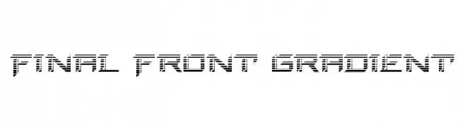
( Fonts by Daniel Zadorozny - www.iconian.com - Personal-use only. For commercial use please contact owner. )
A futuristic, segmented font with a digital and geometric design.
 ダウンロード 38 ダウンロード数@WebFont
 -
( Fonts by Haksen Studio - Sarwo Edhi Prayitno - Personal-use only. For commercial use please contact owner. )
A lively and expressive script font with flowing, cursive letterforms.
![Morning Girls - Personal Use フリーフォントのダウンロード]() ダウンロード 38 ダウンロード数@WebFont
ダウンロード 38 ダウンロード数@WebFont -
( Fonts by Niskala Huruf - Personal-use only. For commercial use please contact owner. )
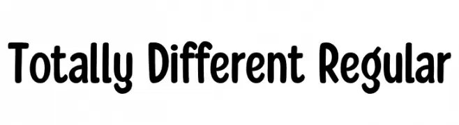
A playful, bold font with rounded edges and a friendly appearance.
![Totally Different Regular フリーフォントのダウンロード]() ダウンロード 38 ダウンロード数@WebFont
ダウンロード 38 ダウンロード数@WebFont -
( Fonts by Studio Typo - Personal-use only. For commercial use please contact owner. )
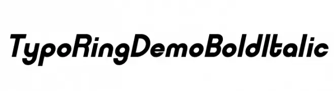
A bold, italic font with a modern and dynamic style.
![Typo Ring Demo Bold Italic フリーフォントのダウンロード]() ダウンロード 38 ダウンロード数@WebFont
ダウンロード 38 ダウンロード数@WebFont -
( Fonts by Maulana Creative - Gilang Maulana - Personal-use only. For commercial use please contact owner. )
A modern, handwritten script with elegant, elongated characters.
![Elitmog Free Font フリーフォントのダウンロード]() ダウンロード 38 ダウンロード数@WebFont
ダウンロード 38 ダウンロード数@WebFont -
-
( Fonts by Typetemp Studio - Personal-use only. For commercial use please contact owner. )
A flowing, cursive font with elegant loops and swashes.
![Hampshire Free Personal Regular フリーフォントのダウンロード]() ダウンロード 38 ダウンロード数@WebFont
ダウンロード 38 ダウンロード数@WebFont -
( Fonts by WolfBainX - Personal-use only. For commercial use please contact owner. )
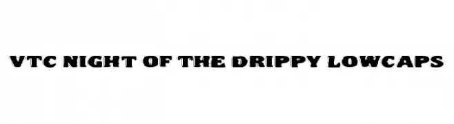
A bold, dripping font with a playful, liquid-like appearance.
![VTC Night Of The Drippy LowCaps フリーフォントのダウンロード]() ダウンロード 38 ダウンロード数@WebFont
ダウンロード 38 ダウンロード数@WebFont -
( Fonts by Aksoro 99 - Wahyu Nugroho - Personal-use only. For commercial use please contact owner. )
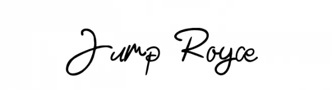
A lively, cursive font with fluid, interconnected strokes.
![Jump Royce フリーフォントのダウンロード]() ダウンロード 38 ダウンロード数@WebFont
ダウンロード 38 ダウンロード数@WebFont -
( Fonts by Kong Font - Personal-use only. For commercial use please contact owner. )
A cursive, italic font with a flowing, elegant style.
![Blossom Italic フリーフォントのダウンロード]() ダウンロード 38 ダウンロード数@WebFont
ダウンロード 38 ダウンロード数@WebFont -
( Fonts by Scratch Design - Studio 41 - Personal-use only. For commercial use please contact owner. )
A bold, textured font with a vintage, handcrafted look.
![Quachita Regular フリーフォントのダウンロード]() ダウンロード 38 ダウンロード数@WebFont
ダウンロード 38 ダウンロード数@WebFont


今のトップフォントは?
は、クリーンな造形と広い適用範囲で支持を集めています。 ブランディングからランディングページ、ポスターまで活躍します。
ロゴで人気のフォントは?
幾何学系の サンセリフ(例: Poppins、Gotham 系のファミリー)は、スケーラブルでクリーンな印象に最適。 親しみやすさを出すなら スクリプト や手書き系も定番です。 見出しは力強く、本文はニュートラルに──この組み合わせが認知とバランスを高めます。
人気リストはどのくらいの頻度で更新される?
ダウンロード数やエンゲージメントに基づき定期的に更新します。 こまめにチェックして、次に流行るフォントを先取りしましょう。
💡 ヒント: このページをブックマークしておくと便利です。トレンドは速く、今のトップが明日のリブランディングを導くこともあります。