人気フォント セクションへようこそ。ここでは「よくダウンロードされ、よく使われている」実績ある書体をまとめています。 ロゴ、Web、SNS のどれにも使いやすい、外さない選択肢が見つかります。
どの トップフォント も、バランス・可読性・汎用性で高評価です。 モダン・サンセリフ、エレガントなスクリプト、ヴィンテージなセリフ、ミニマルなディスプレイなどを厳選しています。
-
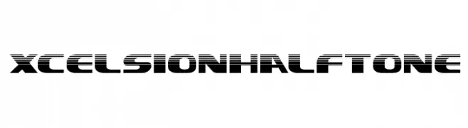
( Iconian Fonts - Daniel Zadorozny - www.iconian.com )
A bold, futuristic font with a dynamic halftone effect.
 ダウンロード 38 ダウンロード数@WebFont
 -
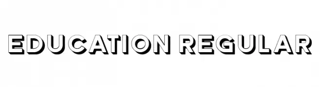
( Fonts by Vladimir Nikolic - www.creativefabrica.com/designer/vladimirnikolic/ - Personal-use only. For commercial use please contact owner. )
A bold, geometric font with a 3D shadow effect, perfect for impactful designs.
![Education Regular フリーフォントのダウンロード]() ダウンロード 38 ダウンロード数@WebFont
ダウンロード 38 ダウンロード数@WebFont -
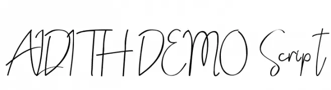
( Fonts by Edric Studio - Personal-use only. For commercial use please contact owner. )
A lively and dynamic script font with flowing, interconnected strokes.
![ALDITH DEMO Script フリーフォントのダウンロード]() ダウンロード 38 ダウンロード数@WebFont
ダウンロード 38 ダウンロード数@WebFont -
( Fonts by Madatype Studio - Andri Ardianto - Personal-use only. For commercial use please contact owner. )
A dynamic and fluid font with calligraphic swashes and elegant curves.
![Rocket Shield Swashes フリーフォントのダウンロード]() ダウンロード 38 ダウンロード数@WebFont
ダウンロード 38 ダウンロード数@WebFont -
( Fonts by Zulfikar Ali - Personal-use only. For commercial use please contact owner. )
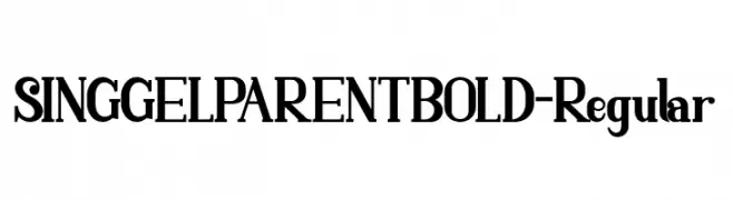
A bold, high-contrast font with dramatic strokes and a commanding presence.
![SINGGELPARENTBOLD-Regular フリーフォントのダウンロード]() ダウンロード 38 ダウンロード数@WebFont
ダウンロード 38 ダウンロード数@WebFont -
-
( Fonts by Goma Shin - Personal-use only. For commercial use please contact owner. )
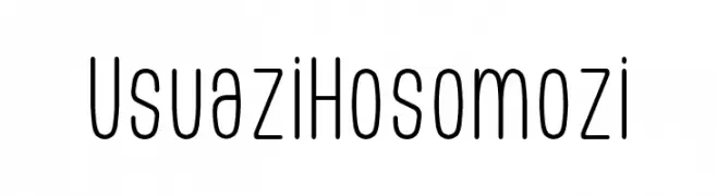
A clean, modern monospaced font with rounded, narrow characters.
![Usuazi Hosomozi フリーフォントのダウンロード]() ダウンロード 38 ダウンロード数@WebFont
ダウンロード 38 ダウンロード数@WebFont -
( Rifan Asri )
A bold, slanted brush-style font with textured strokes and expressive character.
![ShowetyBrushSlant フリーフォントのダウンロード]() ダウンロード 38 ダウンロード数@WebFont
ダウンロード 38 ダウンロード数@WebFont -
( Fonts by Letter Jos - Personal-use only. For commercial use please contact owner. )
A playful, hand-drawn font with rounded edges and a whimsical style.
![Simple Story フリーフォントのダウンロード]() ダウンロード 38 ダウンロード数@WebFont
ダウンロード 38 ダウンロード数@WebFont -
( Fonts by Mans Greback - Personal-use only. For commercial use please contact owner. )
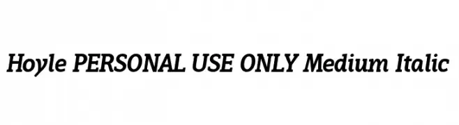
A medium weight, italic serif font with a modern and elegant style.
![Hoyle PERSONAL USE ONLY Medium Italic フリーフォントのダウンロード]() ダウンロード 38 ダウンロード数@WebFont
ダウンロード 38 ダウンロード数@WebFont -
( Fonts by weknow - Wino S Kadir - Personal-use only. For commercial use please contact owner. )
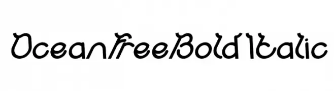
A bold, italicized decorative font with a whimsical, cursive-like style.
![Ocean Free Bold Italic フリーフォントのダウンロード]() ダウンロード 38 ダウンロード数@WebFont
ダウンロード 38 ダウンロード数@WebFont


今のトップフォントは?
は、クリーンな造形と広い適用範囲で支持を集めています。 ブランディングからランディングページ、ポスターまで活躍します。
ロゴで人気のフォントは?
幾何学系の サンセリフ(例: Poppins、Gotham 系のファミリー)は、スケーラブルでクリーンな印象に最適。 親しみやすさを出すなら スクリプト や手書き系も定番です。 見出しは力強く、本文はニュートラルに──この組み合わせが認知とバランスを高めます。
人気リストはどのくらいの頻度で更新される?
ダウンロード数やエンゲージメントに基づき定期的に更新します。 こまめにチェックして、次に流行るフォントを先取りしましょう。
💡 ヒント: このページをブックマークしておくと便利です。トレンドは速く、今のトップが明日のリブランディングを導くこともあります。