人気フォント セクションへようこそ。ここでは「よくダウンロードされ、よく使われている」実績ある書体をまとめています。 ロゴ、Web、SNS のどれにも使いやすい、外さない選択肢が見つかります。
どの トップフォント も、バランス・可読性・汎用性で高評価です。 モダン・サンセリフ、エレガントなスクリプト、ヴィンテージなセリフ、ミニマルなディスプレイなどを厳選しています。
-
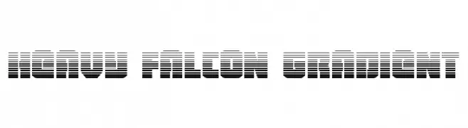
( Fonts by Daniel Zadorozny - www.iconian.com - Personal-use only. For commercial use please contact owner. )
A bold, modern font with a gradient effect created by horizontal lines.
 ダウンロード 37 ダウンロード数@WebFont
 -
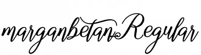
( Fonts by Aquilera Saiman - Personal-use only. For commercial use please contact owner. )
A decorative script font with elegant swirls and loops.
![marganbetan Regular フリーフォントのダウンロード]() ダウンロード 37 ダウンロード数@WebFont
ダウンロード 37 ダウンロード数@WebFont -
![Anthracite フリーフォントのダウンロード]() ダウンロード 37 ダウンロード数
ダウンロード 37 ダウンロード数 -
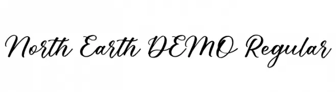
( Fonts by vilogsign - Nur Kholis - Personal-use only. For commercial use please contact owner. )
A flowing, elegant script font with smooth, cursive strokes.
![North Earth DEMO Regular フリーフォントのダウンロード]() ダウンロード 37 ダウンロード数@WebFont
ダウンロード 37 ダウンロード数@WebFont -
( Fonts by Matias Romero - Personal-use only. For commercial use please contact owner. )
A bold, modern font with geometric cuts and high contrast.
![Aiuruoca フリーフォントのダウンロード]() ダウンロード 37 ダウンロード数@WebFont
ダウンロード 37 ダウンロード数@WebFont -
-
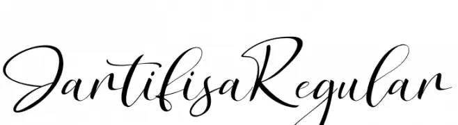
( Fonts by Agni Ardi Rein Prasetyo - Personal-use only. For commercial use please contact owner. )
A sophisticated script font with elegant, flowing cursive letterforms.
![JartifisaRegular フリーフォントのダウンロード]() ダウンロード 37 ダウンロード数@WebFont
ダウンロード 37 ダウンロード数@WebFont -
( Fonts by Northeast Type Foundry - Personal-use only. For commercial use please contact owner. )
A thin, modern font with clean lines and elegant simplicity.
![Molecula - Demo Thin フリーフォントのダウンロード]() ダウンロード 37 ダウンロード数@WebFont
ダウンロード 37 ダウンロード数@WebFont -
( Fonts by dcoxy - Greg Medina - Personal-use only. For commercial use please contact owner. )
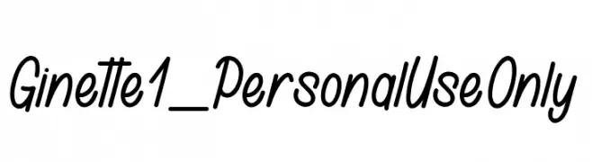
A playful and dynamic script font with smooth, flowing lines.
![Ginette 1_PersonalUseOnly フリーフォントのダウンロード]() ダウンロード 37 ダウンロード数@WebFont
ダウンロード 37 ダウンロード数@WebFont -
( Fonts by dawnland - Daniel Viberg - Personal-use only. For commercial use please contact owner. )
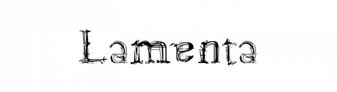
A decorative, sketch-like font with a chaotic and artistic design.
![Lamenta フリーフォントのダウンロード]() ダウンロード 37 ダウンロード数@WebFont
ダウンロード 37 ダウンロード数@WebFont -
( Fonts by Bluestype Studio - Jefri Dwi Alfatah - Personal-use only. For commercial use please contact owner. )
A lively, expressive handwritten font with fluid strokes and dynamic style.
![Sherina Safira フリーフォントのダウンロード]() ダウンロード 37 ダウンロード数@WebFont
ダウンロード 37 ダウンロード数@WebFont


今のトップフォントは?
は、クリーンな造形と広い適用範囲で支持を集めています。 ブランディングからランディングページ、ポスターまで活躍します。
ロゴで人気のフォントは?
幾何学系の サンセリフ(例: Poppins、Gotham 系のファミリー)は、スケーラブルでクリーンな印象に最適。 親しみやすさを出すなら スクリプト や手書き系も定番です。 見出しは力強く、本文はニュートラルに──この組み合わせが認知とバランスを高めます。
人気リストはどのくらいの頻度で更新される?
ダウンロード数やエンゲージメントに基づき定期的に更新します。 こまめにチェックして、次に流行るフォントを先取りしましょう。
💡 ヒント: このページをブックマークしておくと便利です。トレンドは速く、今のトップが明日のリブランディングを導くこともあります。