人気フォント セクションへようこそ。ここでは「よくダウンロードされ、よく使われている」実績ある書体をまとめています。 ロゴ、Web、SNS のどれにも使いやすい、外さない選択肢が見つかります。
どの トップフォント も、バランス・可読性・汎用性で高評価です。 モダン・サンセリフ、エレガントなスクリプト、ヴィンテージなセリフ、ミニマルなディスプレイなどを厳選しています。
-
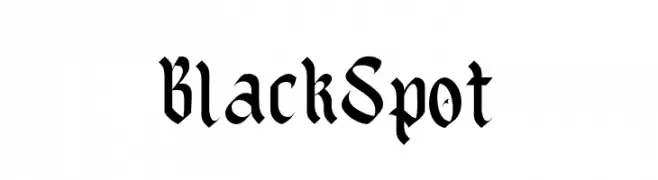
( Fonts by Kong Font - fontkong.com - Personal-use only. For commercial use please contact owner. )
A classic blackletter font with intricate, high-contrast strokes and ornate details.
 ダウンロード 37 ダウンロード数@WebFont
 -
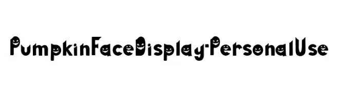
( Fonts by Attype Studio - Fadli Ramadhan Iskandar - Personal-use only. For commercial use please contact owner. )
A playful, Halloween-themed font with a carved pumpkin style.
![Pumpkin Face Display - Personal Use フリーフォントのダウンロード]() ダウンロード 37 ダウンロード数@WebFont
ダウンロード 37 ダウンロード数@WebFont -
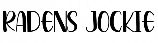
( Fonts by Pandan Wangi - Personal-use only. For commercial use please contact owner. )
A playful, handwritten-style font with bold, slightly condensed characters.
![Radens Jockie フリーフォントのダウンロード]() ダウンロード 37 ダウンロード数@WebFont
ダウンロード 37 ダウンロード数@WebFont -
( Fonts by Creative Lab - Creative LAB - Personal-use only. For commercial use please contact owner. )
A playful and elegant script font with flowing, cursive letterforms.
![ShailaScript フリーフォントのダウンロード]() ダウンロード 37 ダウンロード数@WebFont
ダウンロード 37 ダウンロード数@WebFont -
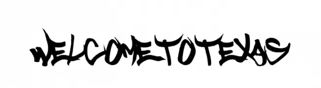
( Fonts by Font Monger - Chris Vile - Personal-use only. For commercial use please contact owner. )
A bold, graffiti-inspired font with sharp, angular lines and a rebellious aesthetic.
![Welcome to Texas フリーフォントのダウンロード]() ダウンロード 37 ダウンロード数@WebFont
ダウンロード 37 ダウンロード数@WebFont -
-
( Iconian Fonts - Daniel Zadorozny - www.iconian.com )
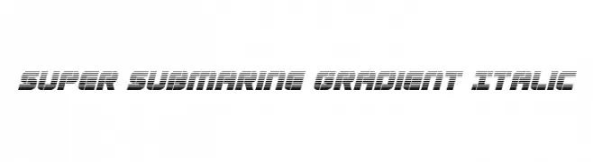
A bold, italicized font with a gradient effect created by horizontal lines.
![Super Submarine Gradient Italic フリーフォントのダウンロード]() ダウンロード 37 ダウンロード数@WebFont
ダウンロード 37 ダウンロード数@WebFont -
( Fonts by Khurasan )
A playful, bold font with rounded, bubbly characters.
![Hugmate フリーフォントのダウンロード]() ダウンロード 37 ダウンロード数@WebFont
ダウンロード 37 ダウンロード数@WebFont -
( Fonts by Zetafonts - Personal-use only. For commercial use please contact owner. )
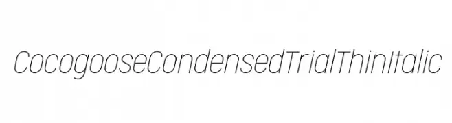
A sleek, modern, condensed thin italic font with a clean and elegant design.
![Cocogoose Condensed Trial Thin Italic フリーフォントのダウンロード]() ダウンロード 37 ダウンロード数@WebFont
ダウンロード 37 ダウンロード数@WebFont -
( Fonts by Daniel Zadorozny - www.iconian.com - Personal-use only. For commercial use please contact owner. )
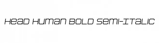
A bold, semi-italic font with a modern, geometric design.
![Head Human Bold Semi-Italic フリーフォントのダウンロード]() ダウンロード 37 ダウンロード数@WebFont
ダウンロード 37 ダウンロード数@WebFont -
( Fonts by Kong Font - Personal-use only. For commercial use please contact owner. )
A lively and expressive handwritten font with dynamic strokes and playful swashes.
![EarnestHarlley フリーフォントのダウンロード]() ダウンロード 37 ダウンロード数@WebFont
ダウンロード 37 ダウンロード数@WebFont


今のトップフォントは?
は、クリーンな造形と広い適用範囲で支持を集めています。 ブランディングからランディングページ、ポスターまで活躍します。
ロゴで人気のフォントは?
幾何学系の サンセリフ(例: Poppins、Gotham 系のファミリー)は、スケーラブルでクリーンな印象に最適。 親しみやすさを出すなら スクリプト や手書き系も定番です。 見出しは力強く、本文はニュートラルに──この組み合わせが認知とバランスを高めます。
人気リストはどのくらいの頻度で更新される?
ダウンロード数やエンゲージメントに基づき定期的に更新します。 こまめにチェックして、次に流行るフォントを先取りしましょう。
💡 ヒント: このページをブックマークしておくと便利です。トレンドは速く、今のトップが明日のリブランディングを導くこともあります。