人気フォント セクションへようこそ。ここでは「よくダウンロードされ、よく使われている」実績ある書体をまとめています。 ロゴ、Web、SNS のどれにも使いやすい、外さない選択肢が見つかります。
どの トップフォント も、バランス・可読性・汎用性で高評価です。 モダン・サンセリフ、エレガントなスクリプト、ヴィンテージなセリフ、ミニマルなディスプレイなどを厳選しています。
-
( Fonts by Vladimir Nikolic - Personal-use only. For commercial use please contact owner. )
A bold, italicized font with a futuristic, sporty design and outlined characters.
 ダウンロード 36 ダウンロード数@WebFont
 -
( Fonts by Type Factory )
A bold, angular gothic-style font with sharp edges and dramatic flair.
![Hollowtown フリーフォントのダウンロード]() ダウンロード 36 ダウンロード数@WebFont
ダウンロード 36 ダウンロード数@WebFont -
( Fonts by SSI.Scraps - Syukur Setiyadi - Personal-use only. For commercial use please contact owner. )
A dynamic script font with flowing, interconnected letterforms and varying stroke thickness.
![Dentanx フリーフォントのダウンロード]() ダウンロード 36 ダウンロード数@WebFont
ダウンロード 36 ダウンロード数@WebFont -
( Noto is a trademark of Google Inc. Noto fonts are open source. All Noto fonts are published under the SIL Open Font License, Version 1.1 )
A clean, modern sans-serif font with uniform stroke widths and excellent legibility.
![Noto Sans Cherokee Light フリーフォントのダウンロード]() ダウンロード 36 ダウンロード数@WebFont
ダウンロード 36 ダウンロード数@WebFont -
( Fonts by Husnan Taufiq - Personal-use only. For commercial use please contact owner. )
A playful handwritten font with fluid, whimsical letterforms.
![Akhadias フリーフォントのダウンロード]() ダウンロード 36 ダウンロード数@WebFont
ダウンロード 36 ダウンロード数@WebFont -
-
( Fonts by Whole Hearted - Personal-use only. For commercial use please contact owner. )
A playful, hand-drawn font with bold, irregular strokes and a casual vibe.
![Triadi フリーフォントのダウンロード]() ダウンロード 36 ダウンロード数@WebFont
ダウンロード 36 ダウンロード数@WebFont -
( Fonts by Anomali Creative - Krisna Teja - Personal-use only. For commercial use please contact owner. )
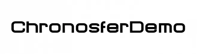
A modern, geometric font with a sleek, futuristic design.
![Chronosfer Demo フリーフォントのダウンロード]() ダウンロード 36 ダウンロード数@WebFont
ダウンロード 36 ダウンロード数@WebFont -
( Fonts by Kong Font - fontkong.com - Personal-use only. For commercial use please contact owner. )
An elegant, flowing script font with high contrast and an italic slant.
![Bigger Italic フリーフォントのダウンロード]() ダウンロード 36 ダウンロード数@WebFont
ダウンロード 36 ダウンロード数@WebFont -
( Fonts by Integritype Studio )
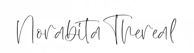
Playful handwritten script font.
![Norabita Thereal フリーフォントのダウンロード]() ダウンロード 36 ダウンロード数@WebFont
ダウンロード 36 ダウンロード数@WebFont -
( Fonts by Subectype & Orenari - Rangga Subekti & Ari - Personal-use only. For commercial use please contact owner. )
A bold, cursive script font with fluid, connected characters.
![Rollanda フリーフォントのダウンロード]() ダウンロード 36 ダウンロード数@WebFont
ダウンロード 36 ダウンロード数@WebFont


今のトップフォントは?
は、クリーンな造形と広い適用範囲で支持を集めています。 ブランディングからランディングページ、ポスターまで活躍します。
ロゴで人気のフォントは?
幾何学系の サンセリフ(例: Poppins、Gotham 系のファミリー)は、スケーラブルでクリーンな印象に最適。 親しみやすさを出すなら スクリプト や手書き系も定番です。 見出しは力強く、本文はニュートラルに──この組み合わせが認知とバランスを高めます。
人気リストはどのくらいの頻度で更新される?
ダウンロード数やエンゲージメントに基づき定期的に更新します。 こまめにチェックして、次に流行るフォントを先取りしましょう。
💡 ヒント: このページをブックマークしておくと便利です。トレンドは速く、今のトップが明日のリブランディングを導くこともあります。