人気フォント セクションへようこそ。ここでは「よくダウンロードされ、よく使われている」実績ある書体をまとめています。 ロゴ、Web、SNS のどれにも使いやすい、外さない選択肢が見つかります。
どの トップフォント も、バランス・可読性・汎用性で高評価です。 モダン・サンセリフ、エレガントなスクリプト、ヴィンテージなセリフ、ミニマルなディスプレイなどを厳選しています。
-
( Fonts by Daniel Zadorozny - www.iconian.com - Personal-use only. For commercial use please contact owner. )
A bold, angular font with a strong, impactful presence.
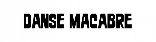 ダウンロード 36 ダウンロード数@WebFont
 -
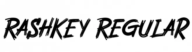
( Fonts by Arterfak Project - Ahmad Ramzi Fahruddin - Personal-use only. For commercial use please contact owner. )
A bold, brush-style font with dynamic, textured strokes.
![Rashkey Regular フリーフォントのダウンロード]() ダウンロード 36 ダウンロード数@WebFont
ダウンロード 36 ダウンロード数@WebFont -
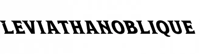
( Fonts by Kong Font - Personal-use only. For commercial use please contact owner. )
A bold, oblique serif font with strong, angular serifs and a dynamic style.
![Leviathan Oblique フリーフォントのダウンロード]() ダウンロード 36 ダウンロード数@WebFont
ダウンロード 36 ダウンロード数@WebFont -
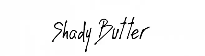
( Fonts by Moontesk - Personal-use only. For commercial use please contact owner. )
A lively, handwritten-style font with dynamic strokes and a casual vibe.
![Shady Butter フリーフォントのダウンロード]() ダウンロード 36 ダウンロード数@WebFont
ダウンロード 36 ダウンロード数@WebFont -
( Fonts by dcoxy - Greg Medina - Personal-use only. For commercial use please contact owner. )
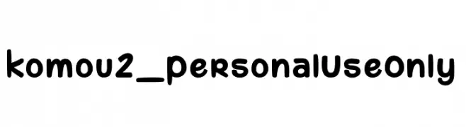
A bold, rounded, and playful font with a friendly and whimsical style.
![komou 2_PersonalUseOnly フリーフォントのダウンロード]() ダウンロード 36 ダウンロード数@WebFont
ダウンロード 36 ダウンロード数@WebFont -
-
( imagex - www.imagex-fonts.com )
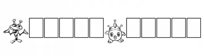
A decorative font featuring unique robot-themed characters for each letter.
![Bots'n Droids フリーフォントのダウンロード]() ダウンロード 36 ダウンロード数@WebFont
ダウンロード 36 ダウンロード数@WebFont -
( Paul Grosse - grosse.is-a-geek.com/paul/ttf01.htm )
Icon-based decorative font themed around water rockets and related objects.
![Water Rocket PG フリーフォントのダウンロード]() ダウンロード 36 ダウンロード数@WebFont
ダウンロード 36 ダウンロード数@WebFont -
( Fonts by Goodrichees )
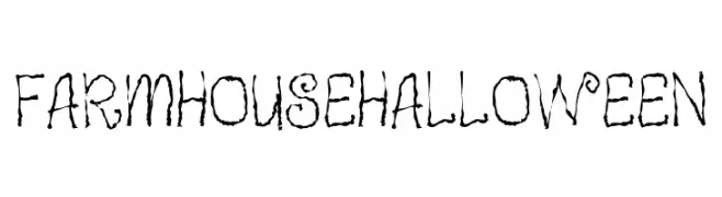
A whimsical, eerie font with jagged edges and playful curls, perfect for Halloween themes.
![Farmhouse Halloween フリーフォントのダウンロード]() ダウンロード 36 ダウンロード数@WebFont
ダウンロード 36 ダウンロード数@WebFont -
( Fonts by Hanoded - David Kerkhoff - Personal-use only. For commercial use please contact owner. )
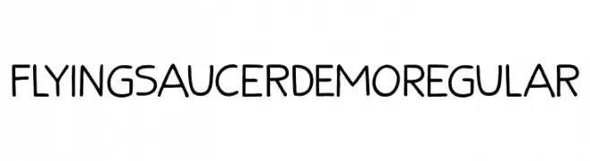
A playful, hand-drawn font with alien-themed motifs and rounded letterforms.
![Flying Saucer DEMO Regular フリーフォントのダウンロード]() ダウンロード 36 ダウンロード数@WebFont
ダウンロード 36 ダウンロード数@WebFont -
( Fonts by Kong Font - Personal-use only. For commercial use please contact owner. )
A playful, handwritten font with bold, rounded characters.
![Shellina フリーフォントのダウンロード]() ダウンロード 36 ダウンロード数@WebFont
ダウンロード 36 ダウンロード数@WebFont


今のトップフォントは?
は、クリーンな造形と広い適用範囲で支持を集めています。 ブランディングからランディングページ、ポスターまで活躍します。
ロゴで人気のフォントは?
幾何学系の サンセリフ(例: Poppins、Gotham 系のファミリー)は、スケーラブルでクリーンな印象に最適。 親しみやすさを出すなら スクリプト や手書き系も定番です。 見出しは力強く、本文はニュートラルに──この組み合わせが認知とバランスを高めます。
人気リストはどのくらいの頻度で更新される?
ダウンロード数やエンゲージメントに基づき定期的に更新します。 こまめにチェックして、次に流行るフォントを先取りしましょう。
💡 ヒント: このページをブックマークしておくと便利です。トレンドは速く、今のトップが明日のリブランディングを導くこともあります。