人気フォント セクションへようこそ。ここでは「よくダウンロードされ、よく使われている」実績ある書体をまとめています。 ロゴ、Web、SNS のどれにも使いやすい、外さない選択肢が見つかります。
どの トップフォント も、バランス・可読性・汎用性で高評価です。 モダン・サンセリフ、エレガントなスクリプト、ヴィンテージなセリフ、ミニマルなディスプレイなどを厳選しています。
-
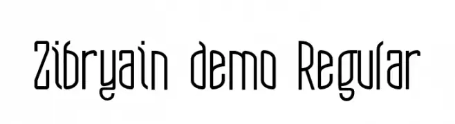
( Fonts by Suamzu Art - Personal-use only. For commercial use please contact owner. )
A modern, elongated font with a sleek and narrow design.
 ダウンロード 27 ダウンロード数@WebFont
 -
( Fonts by Masanis Studio - Naufal Anis - Personal-use only. For commercial use please contact owner. )
A flowing, cursive font with elegant loops and swashes.
![Earcy Day フリーフォントのダウンロード]() ダウンロード 27 ダウンロード数@WebFont
ダウンロード 27 ダウンロード数@WebFont -
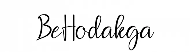
( Fonts by Muhammad Wahyudin - Personal-use only. For commercial use please contact owner. )
A playful, casual handwritten font with fluid, connected strokes.
![Be Hodakga フリーフォントのダウンロード]() ダウンロード 27 ダウンロード数@WebFont
ダウンロード 27 ダウンロード数@WebFont -
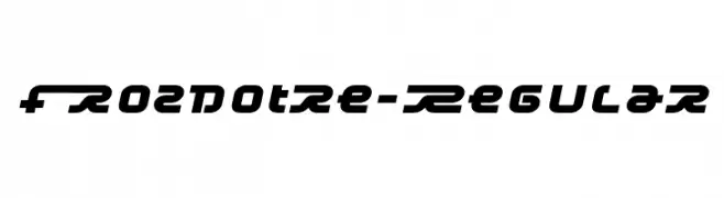
( Fonts by Typodermic Fonts - Raymond Larabie - Personal-use only. For commercial use please contact owner. )
A futuristic, bold font with geometric shapes and smooth curves.
![Frozdotre-Regular フリーフォントのダウンロード]() ダウンロード 27 ダウンロード数@WebFont
ダウンロード 27 ダウンロード数@WebFont -
( Fonts by Kong Font - fontkong.com - Personal-use only. For commercial use please contact owner. )
A playful, casual handwritten font with smooth, flowing lines.
![SimonAllice フリーフォントのダウンロード]() ダウンロード 27 ダウンロード数@WebFont
ダウンロード 27 ダウンロード数@WebFont -
-
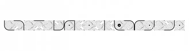
( Fonts by gluk )
An intricate, decorative font with geometric patterns and rounded frames.
![GlukFramesM7CAzure フリーフォントのダウンロード]() ダウンロード 27 ダウンロード数@WebFont
ダウンロード 27 ダウンロード数@WebFont -
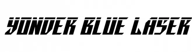
( Fonts by Iconian Fonts - Daniel Zadorozny - Personal-use only. For commercial use please contact owner. )
A bold, angular font with a futuristic and dynamic style.
![Yonder Blue Laser フリーフォントのダウンロード]() ダウンロード 27 ダウンロード数@WebFont
ダウンロード 27 ダウンロード数@WebFont -
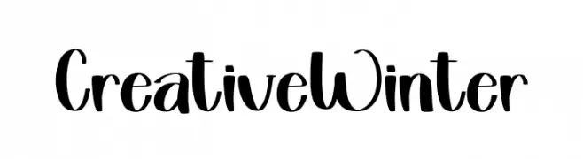
( Fonts by Inermedia Studio - Personal-use only. For commercial use please contact owner. )
A bold, playful script font with a handwritten feel.
![Creative Winter フリーフォントのダウンロード]() ダウンロード 27 ダウンロード数@WebFont
ダウンロード 27 ダウンロード数@WebFont -
( Fonts by Vunira Design - Personal-use only. For commercial use please contact owner. )
A playful and whimsical handwritten font with fluid, flowing letterforms.
![Lovely FREE フリーフォントのダウンロード]() ダウンロード 27 ダウンロード数@WebFont
ダウンロード 27 ダウンロード数@WebFont -
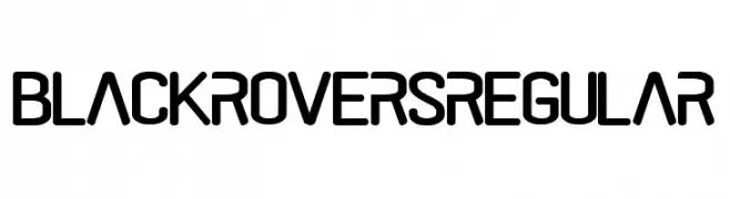
( Fonts by Pandan Wangi - Personal-use only. For commercial use please contact owner. )
A bold, rounded sans-serif font with a modern and clean look.
![black rovers regular フリーフォントのダウンロード]() ダウンロード 27 ダウンロード数@WebFont
ダウンロード 27 ダウンロード数@WebFont


今のトップフォントは?
は、クリーンな造形と広い適用範囲で支持を集めています。 ブランディングからランディングページ、ポスターまで活躍します。
ロゴで人気のフォントは?
幾何学系の サンセリフ(例: Poppins、Gotham 系のファミリー)は、スケーラブルでクリーンな印象に最適。 親しみやすさを出すなら スクリプト や手書き系も定番です。 見出しは力強く、本文はニュートラルに──この組み合わせが認知とバランスを高めます。
人気リストはどのくらいの頻度で更新される?
ダウンロード数やエンゲージメントに基づき定期的に更新します。 こまめにチェックして、次に流行るフォントを先取りしましょう。
💡 ヒント: このページをブックマークしておくと便利です。トレンドは速く、今のトップが明日のリブランディングを導くこともあります。