人気フォント セクションへようこそ。ここでは「よくダウンロードされ、よく使われている」実績ある書体をまとめています。 ロゴ、Web、SNS のどれにも使いやすい、外さない選択肢が見つかります。
どの トップフォント も、バランス・可読性・汎用性で高評価です。 モダン・サンセリフ、エレガントなスクリプト、ヴィンテージなセリフ、ミニマルなディスプレイなどを厳選しています。
-
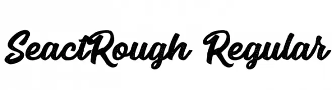
( Fonts by Runsell Studio - Personal-use only. For commercial use please contact owner. )
A bold, textured script font with a vintage, hand-painted look.
 ダウンロード 21 ダウンロード数@WebFont
 -
( Fonts by Kong Font - Personal-use only. For commercial use please contact owner. )
A bold, angular font with a futuristic and aggressive style.
![Iron Shark Oblique フリーフォントのダウンロード]() ダウンロード 21 ダウンロード数@WebFont
ダウンロード 21 ダウンロード数@WebFont -
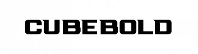
( Fonts by Peter Olexa - Personal-use only. For commercial use please contact owner. )
A bold, geometric font with strong, angular characters.
![Cube Bold フリーフォントのダウンロード]() ダウンロード 21 ダウンロード数@WebFont
ダウンロード 21 ダウンロード数@WebFont -
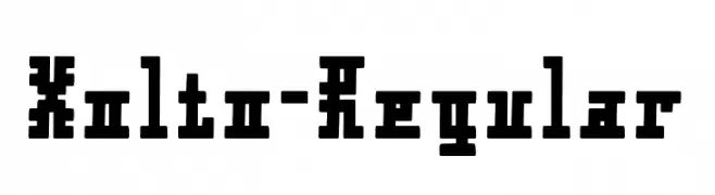
( Fonts by Typodermic Fonts - Raymond Larabie - Personal-use only. For commercial use please contact owner. )
A bold, blocky font with geometric and industrial influences.
![Xolto-Regular フリーフォントのダウンロード]() ダウンロード 21 ダウンロード数@WebFont
ダウンロード 21 ダウンロード数@WebFont -
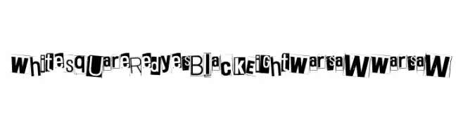
( Fonts by Juha Korhonen )
Collage-style ransom note font.
![White Square Red Yes Black Eight Warsaw Warsaw フリーフォントのダウンロード]() ダウンロード 21 ダウンロード数@WebFont
ダウンロード 21 ダウンロード数@WebFont -
-
( Fonts by Syaf Rizal - Khurasan - Personal-use only. For commercial use please contact owner. )
A bold, brush-style font with dynamic and expressive strokes.
![Cooldex フリーフォントのダウンロード]() ダウンロード 21 ダウンロード数@WebFont
ダウンロード 21 ダウンロード数@WebFont -
( Fonts by Analogous Studio - Muhammad Ilham - Personal-use only. For commercial use please contact owner. )
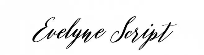
An elegant, cursive script font with fluid, interconnected strokes.
![Evelyne Script フリーフォントのダウンロード]() ダウンロード 21 ダウンロード数@WebFont
ダウンロード 21 ダウンロード数@WebFont -
( Fonts by Kong Font - Personal-use only. For commercial use please contact owner. )
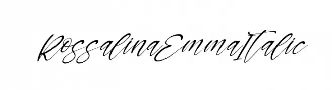
A flowing, elegant script font with a dynamic italic slant.
![Rossalina Emma Italic フリーフォントのダウンロード]() ダウンロード 21 ダウンロード数@WebFont
ダウンロード 21 ダウンロード数@WebFont -
( Fonts by Nico Muslib - Personal-use only. For commercial use please contact owner. )
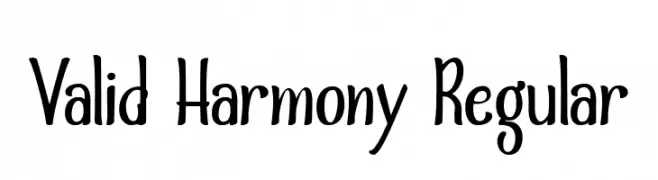
A playful, whimsical font with smooth, rounded strokes and a hand-drawn feel.
![Valid Harmony Regular フリーフォントのダウンロード]() ダウンロード 21 ダウンロード数@WebFont
ダウンロード 21 ダウンロード数@WebFont -
( Fonts by Mans Greback - www.mansgreback.com - Personal-use only. For commercial use please contact owner. )
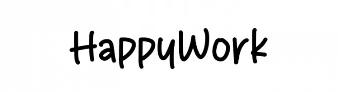
A playful, handwritten font with a casual and approachable style.
![Happy Work フリーフォントのダウンロード]() ダウンロード 21 ダウンロード数@WebFont
ダウンロード 21 ダウンロード数@WebFont


今のトップフォントは?
は、クリーンな造形と広い適用範囲で支持を集めています。 ブランディングからランディングページ、ポスターまで活躍します。
ロゴで人気のフォントは?
幾何学系の サンセリフ(例: Poppins、Gotham 系のファミリー)は、スケーラブルでクリーンな印象に最適。 親しみやすさを出すなら スクリプト や手書き系も定番です。 見出しは力強く、本文はニュートラルに──この組み合わせが認知とバランスを高めます。
人気リストはどのくらいの頻度で更新される?
ダウンロード数やエンゲージメントに基づき定期的に更新します。 こまめにチェックして、次に流行るフォントを先取りしましょう。
💡 ヒント: このページをブックマークしておくと便利です。トレンドは速く、今のトップが明日のリブランディングを導くこともあります。