人気フォント セクションへようこそ。ここでは「よくダウンロードされ、よく使われている」実績ある書体をまとめています。 ロゴ、Web、SNS のどれにも使いやすい、外さない選択肢が見つかります。
どの トップフォント も、バランス・可読性・汎用性で高評価です。 モダン・サンセリフ、エレガントなスクリプト、ヴィンテージなセリフ、ミニマルなディスプレイなどを厳選しています。
-
( Fonts by Type Factory )
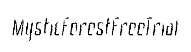
A textured, brush-like font with a mystical and dynamic style.
 ダウンロード 21 ダウンロード数@WebFont
 -
( Fonts by Md Shohail Bhuian - Personal-use only. For commercial use please contact owner. )
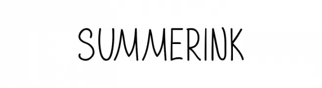
A playful, handwritten font with tall, narrow letters and a casual style.
![Summer Ink フリーフォントのダウンロード]() ダウンロード 21 ダウンロード数@WebFont
ダウンロード 21 ダウンロード数@WebFont -
( Fonts by Sharvanna Kenny - Personal-use only. For commercial use please contact owner. )
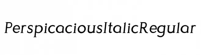
An elegant serif font with an italic slant and moderate stroke contrast.
![Perspicacious Italic Regular フリーフォントのダウンロード]() ダウンロード 21 ダウンロード数@WebFont
ダウンロード 21 ダウンロード数@WebFont -
( Fonts by UI Creative - Personal-use only. For commercial use please contact owner. )
A bold, flowing script font with a dynamic and elegant handwritten style.
![Lorenia フリーフォントのダウンロード]() ダウンロード 21 ダウンロード数@WebFont
ダウンロード 21 ダウンロード数@WebFont -
( Fonts by Vunira Design - Personal-use only. For commercial use please contact owner. )
A dynamic and expressive script font with fluid, elegant strokes.
![Roadistic フリーフォントのダウンロード]() ダウンロード 21 ダウンロード数@WebFont
ダウンロード 21 ダウンロード数@WebFont -
-
( Fonts by Motokiwo - Anton Cahyono - Personal-use only. For commercial use please contact owner. )
A stylish handwritten font with elegant, flowing script and unique flourishes.
![BeatrixSignature フリーフォントのダウンロード]() ダウンロード 21 ダウンロード数@WebFont
ダウンロード 21 ダウンロード数@WebFont -
( Fonts by Trequartista Studio - Personal-use only. For commercial use please contact owner. )
A bold, dynamic font with a three-dimensional effect and angular design.
![Calcio Italiano Free Personal Use 2 フリーフォントのダウンロード]() ダウンロード 21 ダウンロード数@WebFont
ダウンロード 21 ダウンロード数@WebFont -
( Fonts by bey Design - Personal-use only. For commercial use please contact owner. )
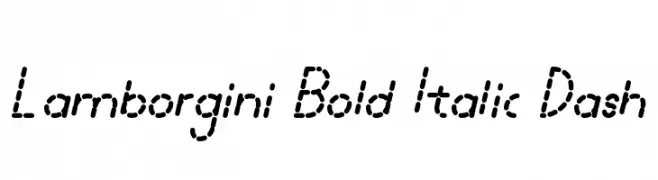
A bold, italicized font with a unique dashed style for a modern, playful look.
![Lamborgini Bold Italic Dash フリーフォントのダウンロード]() ダウンロード 21 ダウンロード数@WebFont
ダウンロード 21 ダウンロード数@WebFont -
( Fonts by Tyler Finck )
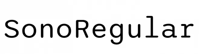
A modern, geometric sans-serif font with rounded edges and excellent readability.
![Sono Regular フリーフォントのダウンロード]() ダウンロード 21 ダウンロード数@WebFont
ダウンロード 21 ダウンロード数@WebFont -
( Fonts by Iconian Fonts - Daniel Zadorozny - Personal-use only. For commercial use please contact owner. )
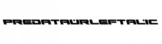
A bold, futuristic font with angular, geometric letterforms and a leftward slant.
![Predataur Leftalic フリーフォントのダウンロード]() ダウンロード 21 ダウンロード数@WebFont
ダウンロード 21 ダウンロード数@WebFont


今のトップフォントは?
は、クリーンな造形と広い適用範囲で支持を集めています。 ブランディングからランディングページ、ポスターまで活躍します。
ロゴで人気のフォントは?
幾何学系の サンセリフ(例: Poppins、Gotham 系のファミリー)は、スケーラブルでクリーンな印象に最適。 親しみやすさを出すなら スクリプト や手書き系も定番です。 見出しは力強く、本文はニュートラルに──この組み合わせが認知とバランスを高めます。
人気リストはどのくらいの頻度で更新される?
ダウンロード数やエンゲージメントに基づき定期的に更新します。 こまめにチェックして、次に流行るフォントを先取りしましょう。
💡 ヒント: このページをブックマークしておくと便利です。トレンドは速く、今のトップが明日のリブランディングを導くこともあります。