人気フォント セクションへようこそ。ここでは「よくダウンロードされ、よく使われている」実績ある書体をまとめています。 ロゴ、Web、SNS のどれにも使いやすい、外さない選択肢が見つかります。
どの トップフォント も、バランス・可読性・汎用性で高評価です。 モダン・サンセリフ、エレガントなスクリプト、ヴィンテージなセリフ、ミニマルなディスプレイなどを厳選しています。
-
( Fonts by Brithos Type - Personal-use only. For commercial use please contact owner. )
A modern, rounded sans-serif font with a playful and approachable style.
 ダウンロード 20 ダウンロード数@WebFont
 -
( Fonts by Amarlettering - Takiy - Amarlettering - Takiy - Personal-use only. For commercial use please contact owner. )
A refined and elegant script font with flowing, cursive characters and high contrast.
![niesha フリーフォントのダウンロード]() ダウンロード 20 ダウンロード数@WebFont
ダウンロード 20 ダウンロード数@WebFont -
( Fonts by Iconian Fonts - Daniel Zadorozny - Personal-use only. For commercial use please contact owner. )
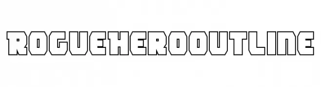
A bold, geometric outline font with a modern and futuristic style.
![Rogue Hero Outline フリーフォントのダウンロード]() ダウンロード 20 ダウンロード数@WebFont
ダウンロード 20 ダウンロード数@WebFont -
( Fonts by Pizzadude - Jakob Fischer - Personal-use only. For commercial use please contact owner. )
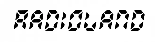
A bold, geometric font with a digital, futuristic style.
![Radioland フリーフォントのダウンロード]() ダウンロード 20 ダウンロード数@WebFont
ダウンロード 20 ダウンロード数@WebFont -
( Fonts by Edric Studio - Personal-use only. For commercial use please contact owner. )
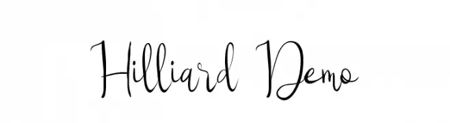
A whimsical and elegant script font with flowing, interconnected letterforms.
![Hilliard Demo フリーフォントのダウンロード]() ダウンロード 20 ダウンロード数@WebFont
ダウンロード 20 ダウンロード数@WebFont -
-
( Fonts by Gary Smith - Personal-use only. For commercial use please contact owner. )
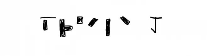
An abstract, hand-drawn style font with bold, irregular strokes and a graffiti-like appearance.
![Braile 1 フリーフォントのダウンロード]() ダウンロード 20 ダウンロード数@WebFont
ダウンロード 20 ダウンロード数@WebFont -
( Fonts by Pen Culture - Revo Farisky - Personal-use only. For commercial use please contact owner. )
An elegant, flowing script font with graceful cursive strokes.
![Willion フリーフォントのダウンロード]() ダウンロード 20 ダウンロード数@WebFont
ダウンロード 20 ダウンロード数@WebFont -
( Fonts by Almarkhatype - Abdul Malik Wisnu - Personal-use only. For commercial use please contact owner. )
An elegant, flowing script font with high contrast and graceful curves.
![monieta フリーフォントのダウンロード]() ダウンロード 20 ダウンロード数@WebFont
ダウンロード 20 ダウンロード数@WebFont -
( Fonts by alphArtype - Agung Rohmat - Personal-use only. For commercial use please contact owner. )
A lively and expressive script font with fluid, interconnected strokes.
![Sensation Regular フリーフォントのダウンロード]() ダウンロード 20 ダウンロード数@WebFont
ダウンロード 20 ダウンロード数@WebFont -
( Fonts by Gaspar - Personal-use only. For commercial use please contact owner. )
A playful, handwritten font with tall, narrow letters and a whimsical style.
![the do フリーフォントのダウンロード]() ダウンロード 20 ダウンロード数@WebFont
ダウンロード 20 ダウンロード数@WebFont


今のトップフォントは?
は、クリーンな造形と広い適用範囲で支持を集めています。 ブランディングからランディングページ、ポスターまで活躍します。
ロゴで人気のフォントは?
幾何学系の サンセリフ(例: Poppins、Gotham 系のファミリー)は、スケーラブルでクリーンな印象に最適。 親しみやすさを出すなら スクリプト や手書き系も定番です。 見出しは力強く、本文はニュートラルに──この組み合わせが認知とバランスを高めます。
人気リストはどのくらいの頻度で更新される?
ダウンロード数やエンゲージメントに基づき定期的に更新します。 こまめにチェックして、次に流行るフォントを先取りしましょう。
💡 ヒント: このページをブックマークしておくと便利です。トレンドは速く、今のトップが明日のリブランディングを導くこともあります。