人気フォント セクションへようこそ。ここでは「よくダウンロードされ、よく使われている」実績ある書体をまとめています。 ロゴ、Web、SNS のどれにも使いやすい、外さない選択肢が見つかります。
どの トップフォント も、バランス・可読性・汎用性で高評価です。 モダン・サンセリフ、エレガントなスクリプト、ヴィンテージなセリフ、ミニマルなディスプレイなどを厳選しています。
-
( Fonts by Typodermic Fonts - Raymond Larabie - Personal-use only. For commercial use please contact owner. )
A bold, geometric font with a 3D shadow effect and modern style.
 ダウンロード 19 ダウンロード数@WebFont
 -
( Fonts by Typodermic Fonts - Raymond Larabie - Personal-use only. For commercial use please contact owner. )
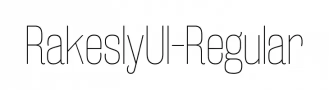
A sleek, ultra-light, and modern font with tall, narrow characters.
![RakeslyUl-Regular フリーフォントのダウンロード]() ダウンロード 19 ダウンロード数@WebFont
ダウンロード 19 ダウンロード数@WebFont -
( Fonts by GGBot - www.ggbot.net - Personal-use only. For commercial use please contact owner. )
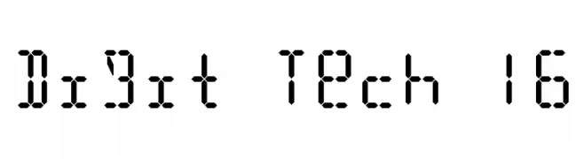
A segmented, digital-style font inspired by classic digital displays.
![Digit Tech 16 フリーフォントのダウンロード]() ダウンロード 19 ダウンロード数@WebFont
ダウンロード 19 ダウンロード数@WebFont -
( Fonts by Bexxtype - Personal-use only. For commercial use please contact owner. )
An elegant script font with flowing, cursive strokes and artistic flair.
![Mettadilla フリーフォントのダウンロード]() ダウンロード 19 ダウンロード数@WebFont
ダウンロード 19 ダウンロード数@WebFont -
( Fonts by Graphue - Personal-use only. For commercial use please contact owner. )
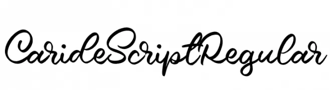
A fluid and elegant script font with a natural handwriting style.
![Caride Script Regular フリーフォントのダウンロード]() ダウンロード 19 ダウンロード数@WebFont
ダウンロード 19 ダウンロード数@WebFont -
-
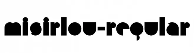
( Fonts by Typodermic Fonts - Raymond Larabie - Personal-use only. For commercial use please contact owner. )
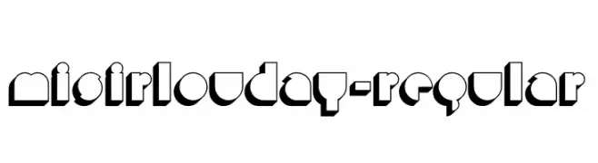
A bold, geometric font with strong, block-like shapes and high contrast.
![Misirlou-Regular フリーフォントのダウンロード]() ダウンロード 19 ダウンロード数@WebFont
ダウンロード 19 ダウンロード数@WebFont -
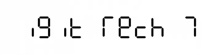
( Fonts by GGBot - www.ggbot.net - Personal-use only. For commercial use please contact owner. )
A digital, tech-inspired font with geometric lines and angles.
![Digit Tech 7 フリーフォントのダウンロード]() ダウンロード 19 ダウンロード数@WebFont
ダウンロード 19 ダウンロード数@WebFont -
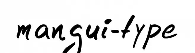
![mangui-type フリーフォントのダウンロード]() ダウンロード 19 ダウンロード数@WebFont
ダウンロード 19 ダウンロード数@WebFont -
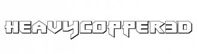
( Fonts by Iconian Fonts - Daniel Zadorozny - Personal-use only. For commercial use please contact owner. )
A bold, geometric font with a 3D effect and sharp angles.
![Heavy Copper 3D フリーフォントのダウンロード]() ダウンロード 19 ダウンロード数@WebFont
ダウンロード 19 ダウンロード数@WebFont -
( Fonts by Perspectype Studio - Personal-use only. For commercial use please contact owner. )
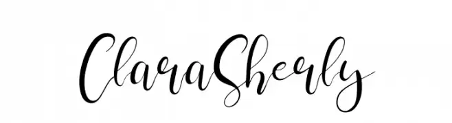
An elegant, flowing script font with ornate, connected letterforms.
![Clara Sherly フリーフォントのダウンロード]() ダウンロード 19 ダウンロード数@WebFont
ダウンロード 19 ダウンロード数@WebFont

今のトップフォントは?
は、クリーンな造形と広い適用範囲で支持を集めています。 ブランディングからランディングページ、ポスターまで活躍します。
ロゴで人気のフォントは?
幾何学系の サンセリフ(例: Poppins、Gotham 系のファミリー)は、スケーラブルでクリーンな印象に最適。 親しみやすさを出すなら スクリプト や手書き系も定番です。 見出しは力強く、本文はニュートラルに──この組み合わせが認知とバランスを高めます。
人気リストはどのくらいの頻度で更新される?
ダウンロード数やエンゲージメントに基づき定期的に更新します。 こまめにチェックして、次に流行るフォントを先取りしましょう。
💡 ヒント: このページをブックマークしておくと便利です。トレンドは速く、今のトップが明日のリブランディングを導くこともあります。