人気フォント セクションへようこそ。ここでは「よくダウンロードされ、よく使われている」実績ある書体をまとめています。 ロゴ、Web、SNS のどれにも使いやすい、外さない選択肢が見つかります。
どの トップフォント も、バランス・可読性・汎用性で高評価です。 モダン・サンセリフ、エレガントなスクリプト、ヴィンテージなセリフ、ミニマルなディスプレイなどを厳選しています。
-
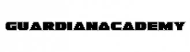
( Fonts by Iconian Fonts - Daniel Zadorozny - Personal-use only. For commercial use please contact owner. )
Bold, geometric font with a futuristic, angular design.
 ダウンロード 17 ダウンロード数@WebFont
 -
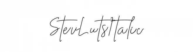
( Fonts by Klakon Studio - Personal-use only. For commercial use please contact owner. )
A delicate, handwritten cursive font with a flowing, elegant style.
![Stev Luts Italic フリーフォントのダウンロード]() ダウンロード 17 ダウンロード数@WebFont
ダウンロード 17 ダウンロード数@WebFont -
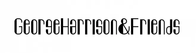
( Fonts by Mohammad Arafin - Personal-use only. For commercial use please contact owner. )
A modern, elongated font with a geometric and narrow design.
![George Harrison & Friends フリーフォントのダウンロード]() ダウンロード 17 ダウンロード数@WebFont
ダウンロード 17 ダウンロード数@WebFont -
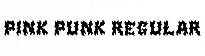
( Fonts by Prioritype Co - Prio Nurokhim Aji - Personal-use only. For commercial use please contact owner. )
A bold, punk-inspired font with jagged, dynamic characters.
![Pink Punk Regular フリーフォントのダウンロード]() ダウンロード 17 ダウンロード数@WebFont
ダウンロード 17 ダウンロード数@WebFont -
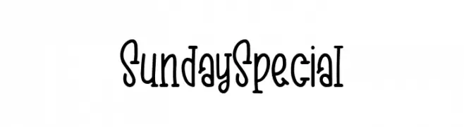
( Fonts by Rangkai Aksara - Personal-use only. For commercial use please contact owner. )
A playful, whimsical font with tall, narrow letters and a casual style.
![Sunday Special フリーフォントのダウンロード]() ダウンロード 17 ダウンロード数@WebFont
ダウンロード 17 ダウンロード数@WebFont -
-
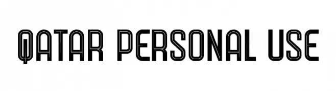
( Fonts by Trequartista Studio - Personal-use only. For commercial use please contact owner. )
A bold, geometric font with a modern, double-line design.
![Qatar Personal Use フリーフォントのダウンロード]() ダウンロード 17 ダウンロード数@WebFont
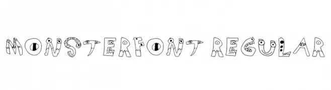
ダウンロード 17 ダウンロード数@WebFont -
![Monsterfont Regular フリーフォントのダウンロード]() ダウンロード 17 ダウンロード数@WebFont
ダウンロード 17 ダウンロード数@WebFont -
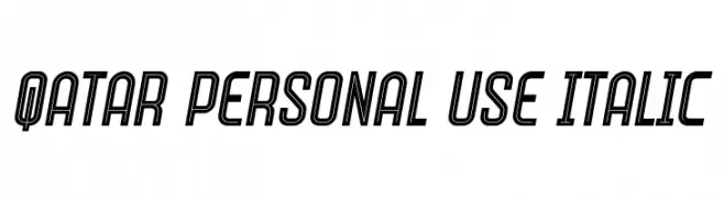
( Fonts by Trequartista Studio - Personal-use only. For commercial use please contact owner. )
A bold, italicized font with outlined characters and a modern, dynamic style.
![Qatar Personal Use Italic フリーフォントのダウンロード]() ダウンロード 17 ダウンロード数@WebFont
ダウンロード 17 ダウンロード数@WebFont -
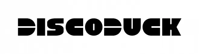
( Fonts by Iconian Fonts - Daniel Zadorozny - Personal-use only. For commercial use please contact owner. )
A bold, geometric font with a modern and futuristic style.
![Disco Duck フリーフォントのダウンロード]() ダウンロード 17 ダウンロード数@WebFont
ダウンロード 17 ダウンロード数@WebFont -
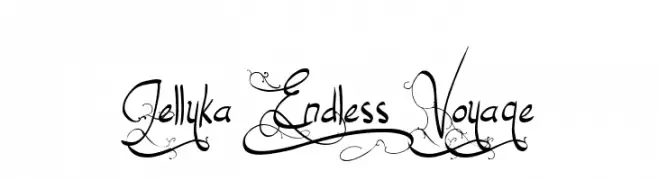
( Fonts by Jellyka Nerevan - Personal-use only. For commercial use please contact owner. )
An ornate and decorative script font with flowing, intricate letterforms.
![Jellyka End_less Voyage フリーフォントのダウンロード]() ダウンロード 17 ダウンロード数@WebFont
ダウンロード 17 ダウンロード数@WebFont
今のトップフォントは?
は、クリーンな造形と広い適用範囲で支持を集めています。 ブランディングからランディングページ、ポスターまで活躍します。
ロゴで人気のフォントは?
幾何学系の サンセリフ(例: Poppins、Gotham 系のファミリー)は、スケーラブルでクリーンな印象に最適。 親しみやすさを出すなら スクリプト や手書き系も定番です。 見出しは力強く、本文はニュートラルに──この組み合わせが認知とバランスを高めます。
人気リストはどのくらいの頻度で更新される?
ダウンロード数やエンゲージメントに基づき定期的に更新します。 こまめにチェックして、次に流行るフォントを先取りしましょう。
💡 ヒント: このページをブックマークしておくと便利です。トレンドは速く、今のトップが明日のリブランディングを導くこともあります。