人気フォント セクションへようこそ。ここでは「よくダウンロードされ、よく使われている」実績ある書体をまとめています。 ロゴ、Web、SNS のどれにも使いやすい、外さない選択肢が見つかります。
どの トップフォント も、バランス・可読性・汎用性で高評価です。 モダン・サンセリフ、エレガントなスクリプト、ヴィンテージなセリフ、ミニマルなディスプレイなどを厳選しています。
-
 ダウンロード 265 ダウンロード数@WebFont
 -
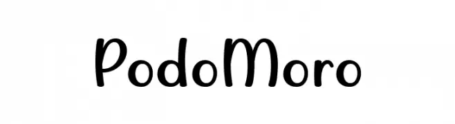
( Fonts by Situjuh Nazara - 7ntypes.com - Personal-use only. For commercial use please contact owner. )
A playful, rounded font with smooth curves and a whimsical style.
![Podo Moro フリーフォントのダウンロード]() ダウンロード 265 ダウンロード数@WebFont
ダウンロード 265 ダウンロード数@WebFont -
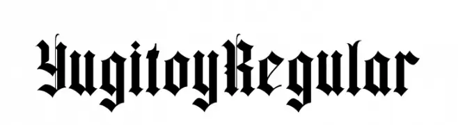
( Fonts by StringLabs - stringlabscreative.com - Personal-use only. For commercial use please contact owner. )
A bold, blackletter font with sharp, angular lines and a Gothic style.
![Yugitoy Regular フリーフォントのダウンロード]() ダウンロード 265 ダウンロード数@WebFont
ダウンロード 265 ダウンロード数@WebFont -
![CRU-Chaipot-handwritten-blod-ltalic フリーフォントのダウンロード]() ダウンロード 265 ダウンロード数@WebFont
ダウンロード 265 ダウンロード数@WebFont -
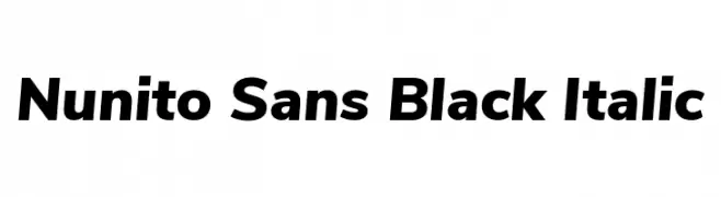
( Fonts by Jacques Le Bailly )
A bold, italicized modern font with smooth, consistent strokes.
![Nunito Sans Black Italic フリーフォントのダウンロード]() ダウンロード 265 ダウンロード数@WebFont
ダウンロード 265 ダウンロード数@WebFont -
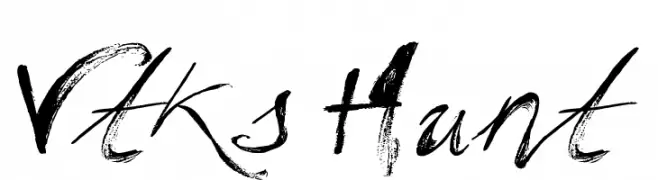
( Fonts by Douglas Vitkauskas - www.vtksdesign.com. Personal-use only. For commercial use please contact owner. )
A bold, expressive font with a hand-painted, brush-like appearance.
![Vtks Hunt フリーフォントのダウンロード]() ダウンロード 265 ダウンロード数@WebFont
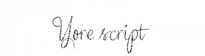
ダウンロード 265 ダウンロード数@WebFont -
![Yore script フリーフォントのダウンロード]() ダウンロード 265 ダウンロード数@WebFont
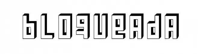
ダウンロード 265 ダウンロード数@WebFont -
![Bloqueada フリーフォントのダウンロード]() ダウンロード 265 ダウンロード数@WebFont
ダウンロード 265 ダウンロード数@WebFont -
![shannnn フリーフォントのダウンロード]() ダウンロード 265 ダウンロード数@WebFont
ダウンロード 265 ダウンロード数@WebFont -
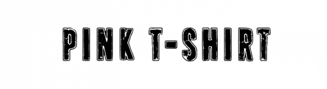
( Fonts by junkohanhero )
A bold, distressed font with a vintage, grunge aesthetic.
![Pink T-shirt フリーフォントのダウンロード]() ダウンロード 265 ダウンロード数@WebFont
ダウンロード 265 ダウンロード数@WebFont -
![New School Class Med フリーフォントのダウンロード]() ダウンロード 265 ダウンロード数@WebFont
ダウンロード 265 ダウンロード数@WebFont -
( Fonts by Type Factory )
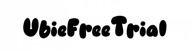
A playful, bold font with rounded, bubble-like characters.
![Ubie Free Trial フリーフォントのダウンロード]() ダウンロード 265 ダウンロード数@WebFont
ダウンロード 265 ダウンロード数@WebFont -
![SatlujA フリーフォントのダウンロード]() ダウンロード 265 ダウンロード数@WebFont
ダウンロード 265 ダウンロード数@WebFont -
( Fonts by Kurnia Setyadi )
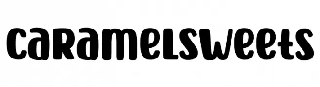
A playful, bold font with rounded, thick strokes and a friendly appearance.
![Caramel Sweets フリーフォントのダウンロード]() ダウンロード 265 ダウンロード数@WebFont
ダウンロード 265 ダウンロード数@WebFont -
![KhachaturianCaps フリーフォントのダウンロード]() ダウンロード 265 ダウンロード数
ダウンロード 265 ダウンロード数 -
( Fonts by weknow - Wino S Kadir )
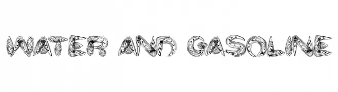
A decorative and abstract font with swirling, fluid patterns.
![water and gasoline フリーフォントのダウンロード]() ダウンロード 265 ダウンロード数@WebFont
ダウンロード 265 ダウンロード数@WebFont -
( Fonts by Filipe Rolim - Personal-use only. For commercial use please contact owner. )
A geometric, angular font with thin strokes and a futuristic style.
![Downtown フリーフォントのダウンロード]() ダウンロード 265 ダウンロード数@WebFont
ダウンロード 265 ダウンロード数@WebFont -
( Alexander Pravdin )
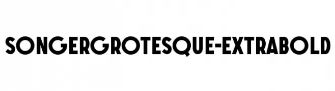
A bold, geometric font with thick strokes and a modern, clean appearance.
![SONGERGrotesque-ExtraBold フリーフォントのダウンロード]() ダウンロード 265 ダウンロード数@WebFont
ダウンロード 265 ダウンロード数@WebFont -
( Fonts by Yadhie Setiawan - typelinestudio.com - Personal-use only. For commercial use please contact owner. )
A delicate and flowing script font with elegant curves and a polished look.
![Ballegria フリーフォントのダウンロード]() ダウンロード 265 ダウンロード数@WebFont
ダウンロード 265 ダウンロード数@WebFont -
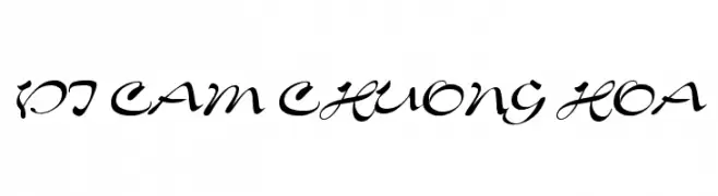
![VI Cam Chuong Hoa フリーフォントのダウンロード]() ダウンロード 265 ダウンロード数@WebFont
ダウンロード 265 ダウンロード数@WebFont -
( Fonts by Thatcher Ulrich )
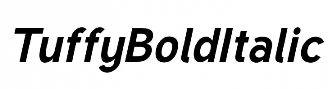
A bold, italicized font with a strong and dynamic presence.
![Tuffy Bold Italic フリーフォントのダウンロード]() ダウンロード 265 ダウンロード数@WebFont
ダウンロード 265 ダウンロード数@WebFont -
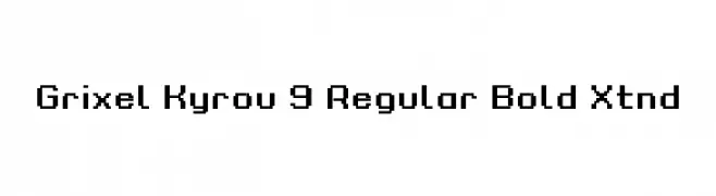
( Fonts by dustBUST - Andreas Nylin )
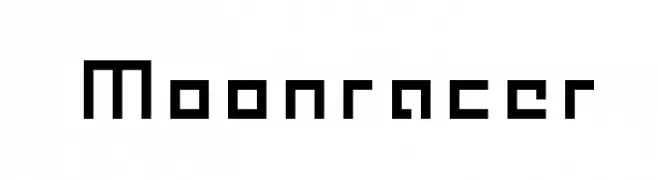
A pixelated, geometric font inspired by retro digital displays.
![Moonracer フリーフォントのダウンロード]() ダウンロード 265 ダウンロード数@WebFont
ダウンロード 265 ダウンロード数@WebFont -
![Grixel Kyrou 9 Regular Bold Xtnd フリーフォントのダウンロード]() ダウンロード 265 ダウンロード数@WebFont
ダウンロード 265 ダウンロード数@WebFont -
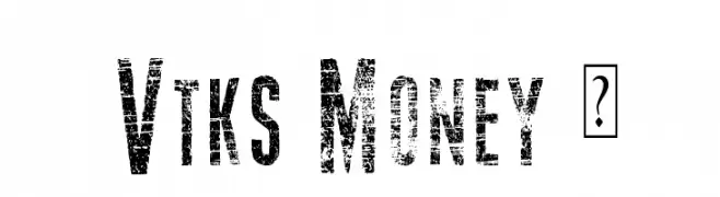
( Fonts by Douglas Vitkauskas - www.vtksdesign.com. Personal-use only. For commercial use please contact owner. )
A bold, distressed font with a vintage, grunge texture.
![Vtks Money 2 フリーフォントのダウンロード]() ダウンロード 265 ダウンロード数@WebFont
ダウンロード 265 ダウンロード数@WebFont -
![TickleShits フリーフォントのダウンロード]() ダウンロード 265 ダウンロード数@WebFont
ダウンロード 265 ダウンロード数@WebFont -
( Fonts by Fikry Alif - Fikryal studio - https://www.creativefabrica.com/designer/mfikryalif/ref/222304/ - Personal-use only. For commercial use please contact owner. )
A playful, flowing script font with elegant, cursive letterforms.
![Hello Snowflake フリーフォントのダウンロード]() ダウンロード 265 ダウンロード数@WebFont
ダウンロード 265 ダウンロード数@WebFont -
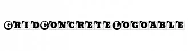
( Fonts by Manfred Klein - manfred-klein.ina-mar.com )
Bold, geometric font with characters enclosed in circles, offering a modern and striking appearance.
![GridConcreteLogoable フリーフォントのダウンロード]() ダウンロード 265 ダウンロード数@WebFont
ダウンロード 265 ダウンロード数@WebFont -
( Fonts by Daniel Zadorozny - www.iconian.com - Free for personal use )
A bold, hand-drawn font with an artistic and dynamic style.
![Mystic Singler Light フリーフォントのダウンロード]() ダウンロード 265 ダウンロード数@WebFont
ダウンロード 265 ダウンロード数@WebFont -
( Fonts by Jeri Ingalls - littlehouse.homestead.com )
A playful, bowling ball-inspired decorative font with bold, rounded characters.
![JI BowlingBalls フリーフォントのダウンロード]() ダウンロード 265 ダウンロード数@WebFont
ダウンロード 265 ダウンロード数@WebFont -
![sieben Bold フリーフォントのダウンロード]() ダウンロード 265 ダウンロード数@WebFont
ダウンロード 265 ダウンロード数@WebFont -
( Fonts by Rich Gast - www.greywolfwebworks.com 商用 フォント )
A futuristic, geometric font with a double-line structure and modern appeal.
![Venomous フリーフォントのダウンロード]() ダウンロード 265 ダウンロード数
ダウンロード 265 ダウンロード数 -
( Anke-Art - www.anke-art.de/ )
A bold, handwritten font with a playful and dynamic style.
![Anke Print フリーフォントのダウンロード]() ダウンロード 265 ダウンロード数@WebFont
ダウンロード 265 ダウンロード数@WebFont -
( Fonts by Fikryal studio )
A decorative font with heart-shaped cutouts, perfect for romantic and playful designs.
![Love Babe2 フリーフォントのダウンロード]() ダウンロード 265 ダウンロード数@WebFont
ダウンロード 265 ダウンロード数@WebFont -
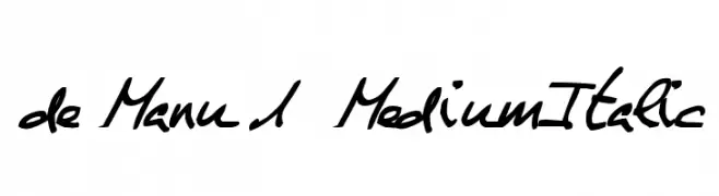
![de Manu 1 MediumItalic フリーフォントのダウンロード]() ダウンロード 265 ダウンロード数@WebFont
ダウンロード 265 ダウンロード数@WebFont -
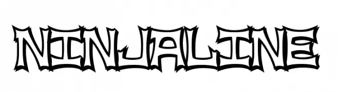
![NinjaLine フリーフォントのダウンロード]() ダウンロード 265 ダウンロード数@WebFont
ダウンロード 265 ダウンロード数@WebFont


今のトップフォントは?
は、クリーンな造形と広い適用範囲で支持を集めています。 ブランディングからランディングページ、ポスターまで活躍します。
ロゴで人気のフォントは?
幾何学系の サンセリフ(例: Poppins、Gotham 系のファミリー)は、スケーラブルでクリーンな印象に最適。 親しみやすさを出すなら スクリプト や手書き系も定番です。 見出しは力強く、本文はニュートラルに──この組み合わせが認知とバランスを高めます。
人気リストはどのくらいの頻度で更新される?
ダウンロード数やエンゲージメントに基づき定期的に更新します。 こまめにチェックして、次に流行るフォントを先取りしましょう。
💡 ヒント: このページをブックマークしておくと便利です。トレンドは速く、今のトップが明日のリブランディングを導くこともあります。