人気フォント セクションへようこそ。ここでは「よくダウンロードされ、よく使われている」実績ある書体をまとめています。 ロゴ、Web、SNS のどれにも使いやすい、外さない選択肢が見つかります。
どの トップフォント も、バランス・可読性・汎用性で高評価です。 モダン・サンセリフ、エレガントなスクリプト、ヴィンテージなセリフ、ミニマルなディスプレイなどを厳選しています。
-
( Fonts by Google 商用 フォント )
A bold, modern sans-serif font with geometric shapes and consistent stroke width.
 ダウンロード 0 ダウンロード数
 -
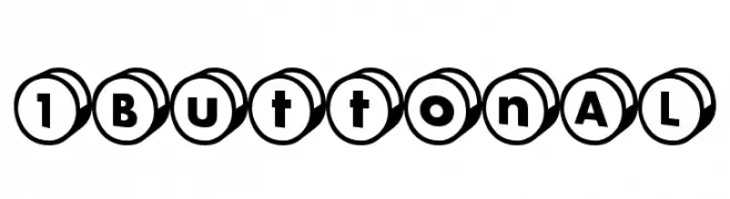
( Fonts by Maniackers Design - www.mksd.jp 商用 フォント )
A playful, button-like font with characters encased in circular outlines, ideal for creative projects.
![1ButtonAL フリーフォントのダウンロード]() ダウンロード 0 ダウンロード数
ダウンロード 0 ダウンロード数 -
( Fonts by Maniackers Design - www.mksd.jp 商用 フォント )
A playful, rounded font with bold strokes and a hand-drawn feel.
![KokeccoKT フリーフォントのダウンロード]() ダウンロード 0 ダウンロード数
ダウンロード 0 ダウンロード数 -
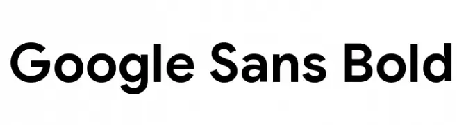
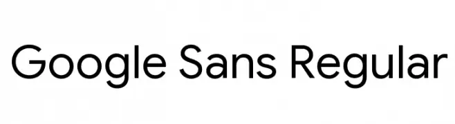
( Fonts by Google 商用 フォント )
A clean, modern typeface with geometric structure and excellent readability.
![Google Sans Regular フリーフォントのダウンロード]() ダウンロード 0 ダウンロード数
ダウンロード 0 ダウンロード数 -
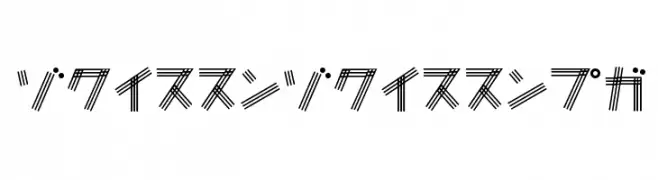
( Fonts by Maniackers Design - www.mksd.jp 商用 フォント )
A decorative, geometric font with parallel line patterns creating a bold, modern look.
![CherryCherryKT フリーフォントのダウンロード]() ダウンロード 0 ダウンロード数
ダウンロード 0 ダウンロード数 -
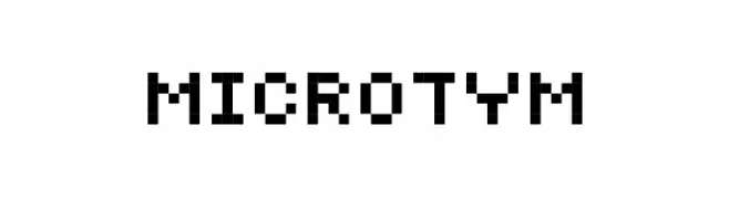
-
![MicroTym フリーフォントのダウンロード]() ダウンロード 0 ダウンロード数
ダウンロード 0 ダウンロード数 -
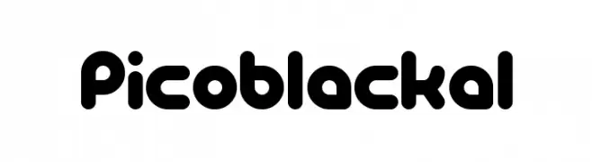
( Fonts by Maniackers Design - www.mksd.jp 商用 フォント )
A bold, rounded font with a playful and modern aesthetic.
![PicoBlackAl フリーフォントのダウンロード]() ダウンロード 0 ダウンロード数
ダウンロード 0 ダウンロード数 -
( Fonts by Google 商用 フォント )
A modern, bold, and italic sans-serif font with consistent stroke thickness.
![Google Sans Bold Italic フリーフォントのダウンロード]() ダウンロード 0 ダウンロード数
ダウンロード 0 ダウンロード数 -
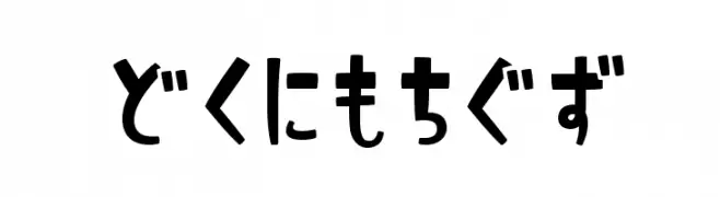
( Fonts by Maniackers Design - www.mksd.jp 商用 フォント )
A playful and bold font with rounded, irregular shapes.
![ShimaHR フリーフォントのダウンロード]() ダウンロード 0 ダウンロード数
ダウンロード 0 ダウンロード数 -
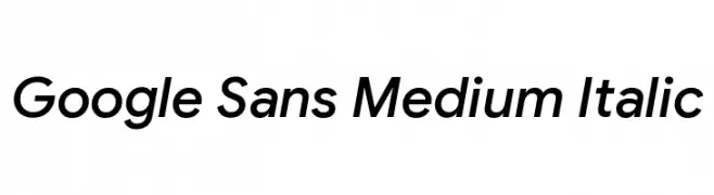
( Fonts by Google 商用 フォント )
A modern, italic sans-serif font with medium weight and balanced design.
![Google Sans Medium Italic フリーフォントのダウンロード]() ダウンロード 0 ダウンロード数
ダウンロード 0 ダウンロード数

今のトップフォントは?
は、クリーンな造形と広い適用範囲で支持を集めています。 ブランディングからランディングページ、ポスターまで活躍します。
ロゴで人気のフォントは?
幾何学系の サンセリフ(例: Poppins、Gotham 系のファミリー)は、スケーラブルでクリーンな印象に最適。 親しみやすさを出すなら スクリプト や手書き系も定番です。 見出しは力強く、本文はニュートラルに──この組み合わせが認知とバランスを高めます。
人気リストはどのくらいの頻度で更新される?
ダウンロード数やエンゲージメントに基づき定期的に更新します。 こまめにチェックして、次に流行るフォントを先取りしましょう。
💡 ヒント: このページをブックマークしておくと便利です。トレンドは速く、今のトップが明日のリブランディングを導くこともあります。