人気フォント セクションへようこそ。ここでは「よくダウンロードされ、よく使われている」実績ある書体をまとめています。 ロゴ、Web、SNS のどれにも使いやすい、外さない選択肢が見つかります。
どの トップフォント も、バランス・可読性・汎用性で高評価です。 モダン・サンセリフ、エレガントなスクリプト、ヴィンテージなセリフ、ミニマルなディスプレイなどを厳選しています。
-
( Fonts by a Alberto Villanueva - www.av.nixiweb.com. Personal-use only. For commercial use please contact owner. )
A modern, edgy font with sharp serifs and geometric shapes.
 ダウンロード 1180 ダウンロード数@WebFont
 -
![ideoma SPRAY フリーフォントのダウンロード]() ダウンロード 1180 ダウンロード数@WebFont
ダウンロード 1180 ダウンロード数@WebFont -
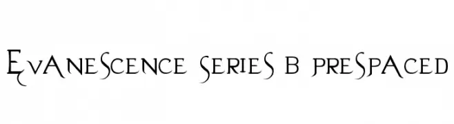
( Fonts by Aeryn www.draftlight.net/aeryn/ )
A dramatic and elegant font with sharp serifs and flowing curves, ideal for fantasy themes.
![Evanescence Series B Prespaced フリーフォントのダウンロード]() ダウンロード 1180 ダウンロード数@WebFont
ダウンロード 1180 ダウンロード数@WebFont -
( Fonts by Daniel Gauthier )
A bold, distressed font with a rugged, textured outline.
![Fear フリーフォントのダウンロード]() ダウンロード 1180 ダウンロード数@WebFont
ダウンロード 1180 ダウンロード数@WebFont -
![Cher Font フリーフォントのダウンロード]() ダウンロード 1180 ダウンロード数@WebFont
ダウンロード 1180 ダウンロード数@WebFont -
-
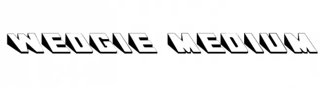
![Wedgie Medium フリーフォントのダウンロード]() ダウンロード 1180 ダウンロード数
ダウンロード 1180 ダウンロード数 -
( Fonts by Jonathan S. Harris )
A bold, playful font with a bubbly, organic design.
![Color Me Purple フリーフォントのダウンロード]() ダウンロード 1179 ダウンロード数@WebFont
ダウンロード 1179 ダウンロード数@WebFont -
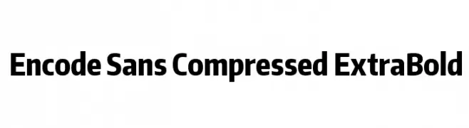
( Copyright (c) 2012, Impallari Type (www.impallari.com), with Reserved Font Name Encode Sans. )
A modern, compressed sans-serif font with an extra bold weight.
![Encode Sans Compressed ExtraBold フリーフォントのダウンロード]() ダウンロード 1179 ダウンロード数@WebFont
ダウンロード 1179 ダウンロード数@WebFont -
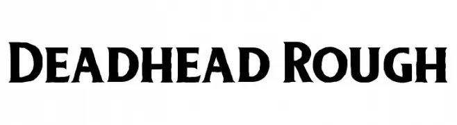
( Free for personal use - twicolabs.com )
A bold, rugged font with a hand-crafted, organic appearance.
![Deadhead Rough フリーフォントのダウンロード]() ダウンロード 1179 ダウンロード数@WebFont
ダウンロード 1179 ダウンロード数@WebFont -
( Fonts by Alvaro Thomaz - alvarothomaz.com )
A clean, modern sans-serif font with balanced proportions and excellent readability.
![Yagora フリーフォントのダウンロード]() ダウンロード 1179 ダウンロード数@WebFont
ダウンロード 1179 ダウンロード数@WebFont


今のトップフォントは?
は、クリーンな造形と広い適用範囲で支持を集めています。 ブランディングからランディングページ、ポスターまで活躍します。
ロゴで人気のフォントは?
幾何学系の サンセリフ(例: Poppins、Gotham 系のファミリー)は、スケーラブルでクリーンな印象に最適。 親しみやすさを出すなら スクリプト や手書き系も定番です。 見出しは力強く、本文はニュートラルに──この組み合わせが認知とバランスを高めます。
人気リストはどのくらいの頻度で更新される?
ダウンロード数やエンゲージメントに基づき定期的に更新します。 こまめにチェックして、次に流行るフォントを先取りしましょう。
💡 ヒント: このページをブックマークしておくと便利です。トレンドは速く、今のトップが明日のリブランディングを導くこともあります。