人気フォント セクションへようこそ。ここでは「よくダウンロードされ、よく使われている」実績ある書体をまとめています。 ロゴ、Web、SNS のどれにも使いやすい、外さない選択肢が見つかります。
どの トップフォント も、バランス・可読性・汎用性で高評価です。 モダン・サンセリフ、エレガントなスクリプト、ヴィンテージなセリフ、ミニマルなディスプレイなどを厳選しています。
-
( Copyright (c) 2012, Font Diner (www.fontdiner.com) )
A playful, curly handwritten font with decorative swirls.
 ダウンロード 239 ダウンロード数@WebFont
 -
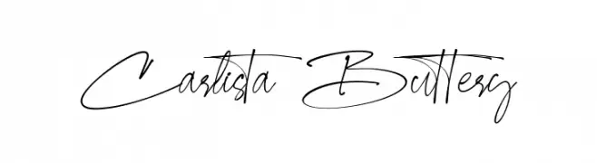
( Fonts by Burhan Afif - hanscostudio.com - Personal-use only. For commercial use please contact owner. )
An elegant, cursive font with fluid strokes and graceful flourishes.
![Carlista Buttery フリーフォントのダウンロード]() ダウンロード 239 ダウンロード数@WebFont
ダウンロード 239 ダウンロード数@WebFont -
( Fonts by InksTypia Studio )
A bold, playful font with a hand-drawn, friendly appearance.
![UrusansPersonalUse-Regular フリーフォントのダウンロード]() ダウンロード 239 ダウンロード数@WebFont
ダウンロード 239 ダウンロード数@WebFont -
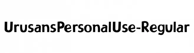
( Fonts by Vladimir Nikolic - www.creativefabrica.com/designer/vladimirnikolic/ - Personal-use only. For commercial use please contact owner. )
A bold, geometric italic font with a modern and dynamic style.
![London Book Italic フリーフォントのダウンロード]() ダウンロード 239 ダウンロード数@WebFont
ダウンロード 239 ダウンロード数@WebFont -
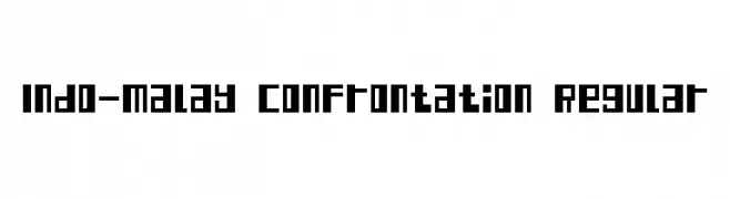
( Fonts by Adien Gunarta - fontasticindonesia.blogspot.com )
A bold, geometric font with a futuristic and industrial style.
![Indo-Malay Confrontation Regular フリーフォントのダウンロード]() ダウンロード 239 ダウンロード数@WebFont
ダウンロード 239 ダウンロード数@WebFont -
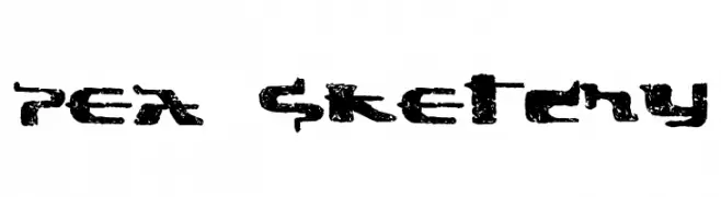
( Free for a personal use. For a commercial use please visit www.kevinandamanda.com )
A rough, textured font with a hand-drawn, grunge aesthetic.
![Pea Sketchy フリーフォントのダウンロード]() ダウンロード 239 ダウンロード数@WebFont
ダウンロード 239 ダウンロード数@WebFont -
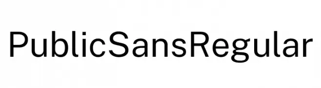
( Fonts by U.S. Web Design System )
A modern, clean sans-serif font with uniform stroke width and excellent readability.
![Public Sans Regular フリーフォントのダウンロード]() ダウンロード 239 ダウンロード数@WebFont
ダウンロード 239 ダウンロード数@WebFont -
( Fonts by DM Letter31 )
A bold, playful font with a hand-drawn, dynamic style.
![Sour Crunch フリーフォントのダウンロード]() ダウンロード 239 ダウンロード数@WebFont
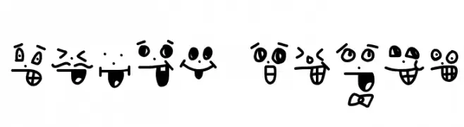
ダウンロード 239 ダウンロード数@WebFont -
![crazy smile フリーフォントのダウンロード]() ダウンロード 239 ダウンロード数@WebFont
ダウンロード 239 ダウンロード数@WebFont -
![Fuzzy フリーフォントのダウンロード]() ダウンロード 239 ダウンロード数@WebFont
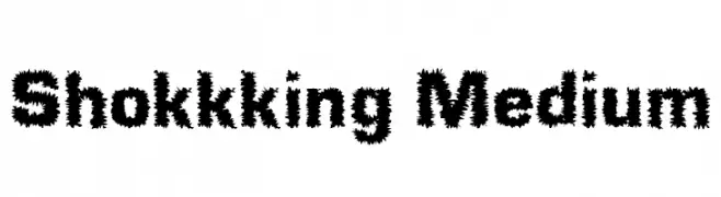
ダウンロード 239 ダウンロード数@WebFont -
( Fonts by Daniel Zadorozny - www.iconian.com - Free for personal use )
A modern, italicized font with bold, geometric characters and rounded edges.
![Federal Service Leftalic フリーフォントのダウンロード]() ダウンロード 239 ダウンロード数@WebFont
ダウンロード 239 ダウンロード数@WebFont -
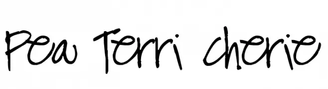
( Free for a personal use. For a commercial use please visit www.kevinandamanda.com )
A playful, casual handwritten font with free-flowing strokes and uneven spacing.
![Pea Terri Cherie フリーフォントのダウンロード]() ダウンロード 239 ダウンロード数@WebFont
ダウンロード 239 ダウンロード数@WebFont -
![Shokkking Medium フリーフォントのダウンロード]() ダウンロード 239 ダウンロード数@WebFont
ダウンロード 239 ダウンロード数@WebFont -
フォント by spideraysfonts. For commercial use please contact the owner.
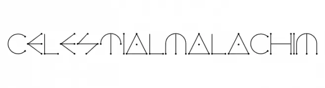
( CELESTIAL MALACHIM )
A geometric and abstract font with celestial-inspired symbols and minimalist design.
![CELESTIALMALACHIM フリーフォントのダウンロード]() ダウンロード 239 ダウンロード数@WebFont
ダウンロード 239 ダウンロード数@WebFont -
( Fonts by Apostrophic Lab )
A bold, 3D slab serif font with wide characters and a modern style.
![Street Slab - Wide 3D フリーフォントのダウンロード]() ダウンロード 239 ダウンロード数@WebFont
ダウンロード 239 ダウンロード数@WebFont -
![Living by Numbers フリーフォントのダウンロード]() ダウンロード 239 ダウンロード数@WebFont
ダウンロード 239 ダウンロード数@WebFont -
![Chocolate Bar Demo フリーフォントのダウンロード]() ダウンロード 239 ダウンロード数@WebFont
ダウンロード 239 ダウンロード数@WebFont -
![Making Lettering_DEMO フリーフォントのダウンロード]() ダウンロード 239 ダウンロード数@WebFont
ダウンロード 239 ダウンロード数@WebFont -
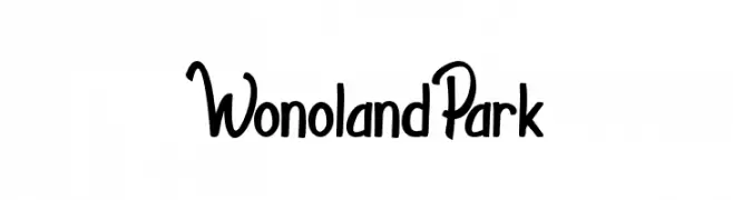
( Fonts by Indriyanti )
A playful, handwritten-style font with bold, slightly slanted characters.
![WonolandPark フリーフォントのダウンロード]() ダウンロード 239 ダウンロード数@WebFont
ダウンロード 239 ダウンロード数@WebFont -
( Fonts by wepfont - Wahyu Eka Prasetya - Personal-use only. For commercial use please contact owner. )
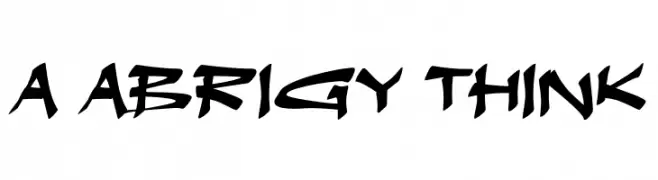
A bold, graffiti-inspired font with sharp, angular lines and dynamic energy.
![a Abrigy Think フリーフォントのダウンロード]() ダウンロード 239 ダウンロード数@WebFont
ダウンロード 239 ダウンロード数@WebFont -
( Fonts by Darrell Flood - Personal-use only. For commercial use please contact owner. )
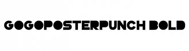
A bold, geometric font with strong, blocky letterforms.
![GoGoPosterPunch Bold フリーフォントのダウンロード]() ダウンロード 239 ダウンロード数@WebFont
ダウンロード 239 ダウンロード数@WebFont -
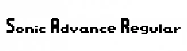
( Font Co. )
A bold, pixelated font with a retro, digital aesthetic.
![Sonic Advance Regular フリーフォントのダウンロード]() ダウンロード 239 ダウンロード数@WebFont
ダウンロード 239 ダウンロード数@WebFont -
![cookielove フリーフォントのダウンロード]() ダウンロード 239 ダウンロード数@WebFont
ダウンロード 239 ダウンロード数@WebFont -
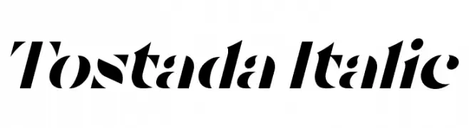
( Fonts by Ivan Nunez - www.behance.net/ivanngez - Personal-use only. For commercial use please contact owner. )
A bold, high-contrast italic font with a modern and dynamic style.
![Tostada Italic フリーフォントのダウンロード]() ダウンロード 239 ダウンロード数@WebFont
ダウンロード 239 ダウンロード数@WebFont -
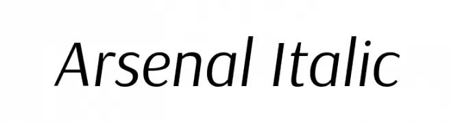
( Copyright 2012 The Arsenal Project Authors (andrij.design@gmail.com) )
A modern, italic sans-serif font with clean lines and excellent legibility.
![Arsenal Italic フリーフォントのダウンロード]() ダウンロード 239 ダウンロード数@WebFont
ダウンロード 239 ダウンロード数@WebFont -
( Fonts by Eyecue Design - Chris Brown )
A decorative font featuring Aboriginal-inspired pictograms.
![Aboriginebats 2 フリーフォントのダウンロード]() ダウンロード 239 ダウンロード数@WebFont
ダウンロード 239 ダウンロード数@WebFont -
( Fonts by Typeline Studio - Yadhie Setiawan - Personal-use only. For commercial use please contact owner. )
A playful, rounded handwritten font with a casual and friendly vibe.
![Sanshine フリーフォントのダウンロード]() ダウンロード 239 ダウンロード数@WebFont
ダウンロード 239 ダウンロード数@WebFont -
( untitled-motion.tumblr.com/fonts/ )
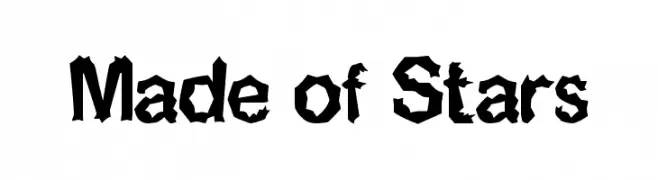
A bold, jagged font with sharp, angular shapes for an edgy look.
![Made of Stars フリーフォントのダウンロード]() ダウンロード 239 ダウンロード数@WebFont
ダウンロード 239 ダウンロード数@WebFont -
( Fonts by a Max Infeld - XEROGRAPHER FONTS - xerographer.blogspot.com . Personal-use only. For commercial use please contact owner. )
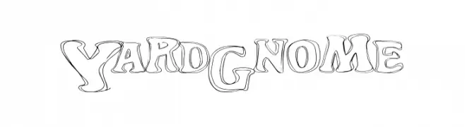
A playful, outlined font with a whimsical, hand-drawn style.
![YardGnome フリーフォントのダウンロード]() ダウンロード 239 ダウンロード数@WebFont
ダウンロード 239 ダウンロード数@WebFont -
( Fonts by Graham Meade - GemFonts )
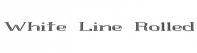
A modern, outline-style font with a futuristic and technical look.
![White Line Rolled フリーフォントのダウンロード]() ダウンロード 239 ダウンロード数@WebFont
ダウンロード 239 ダウンロード数@WebFont -
![Cartoon Madness フリーフォントのダウンロード]() ダウンロード 239 ダウンロード数@WebFont
ダウンロード 239 ダウンロード数@WebFont -
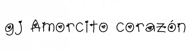
![gj Amorcito corazón フリーフォントのダウンロード]() ダウンロード 239 ダウンロード数@WebFont
ダウンロード 239 ダウンロード数@WebFont -
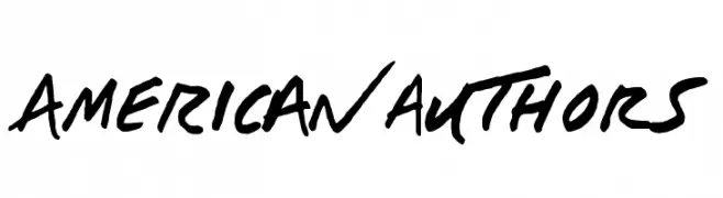
( Fonts by Aly K. Salazar )
A bold, brush-style font with dynamic, hand-drawn strokes.
![AMERIC_N auTHOrS フリーフォントのダウンロード]() ダウンロード 239 ダウンロード数@WebFont
ダウンロード 239 ダウンロード数@WebFont -
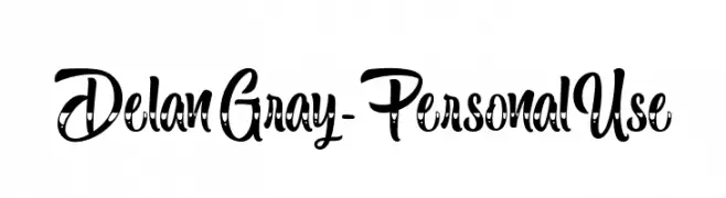
( Fonts by Typhoon Type - Suthi Srisopha - www.typhoontype.net - Personal-use only. For commercial use please contact owner. )
A playful, decorative font with a whimsical, handwritten style.
![DelanGray-PersonalUse フリーフォントのダウンロード]() ダウンロード 239 ダウンロード数@WebFont
ダウンロード 239 ダウンロード数@WebFont -
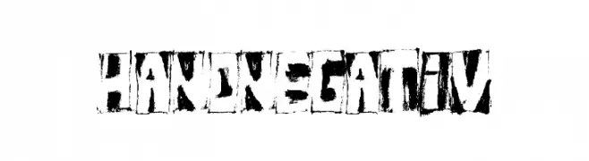
![HandNegativ フリーフォントのダウンロード]() ダウンロード 239 ダウンロード数@WebFont
ダウンロード 239 ダウンロード数@WebFont


今のトップフォントは?
は、クリーンな造形と広い適用範囲で支持を集めています。 ブランディングからランディングページ、ポスターまで活躍します。
ロゴで人気のフォントは?
幾何学系の サンセリフ(例: Poppins、Gotham 系のファミリー)は、スケーラブルでクリーンな印象に最適。 親しみやすさを出すなら スクリプト や手書き系も定番です。 見出しは力強く、本文はニュートラルに──この組み合わせが認知とバランスを高めます。
人気リストはどのくらいの頻度で更新される?
ダウンロード数やエンゲージメントに基づき定期的に更新します。 こまめにチェックして、次に流行るフォントを先取りしましょう。
💡 ヒント: このページをブックマークしておくと便利です。トレンドは速く、今のトップが明日のリブランディングを導くこともあります。