人気フォント セクションへようこそ。ここでは「よくダウンロードされ、よく使われている」実績ある書体をまとめています。 ロゴ、Web、SNS のどれにも使いやすい、外さない選択肢が見つかります。
どの トップフォント も、バランス・可読性・汎用性で高評価です。 モダン・サンセリフ、エレガントなスクリプト、ヴィンテージなセリフ、ミニマルなディスプレイなどを厳選しています。
-
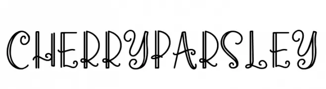
( Fonts by Abo Daniel Studio )
A playful and whimsical font with curly, decorative strokes.
 ダウンロード 235 ダウンロード数@WebFont
 -
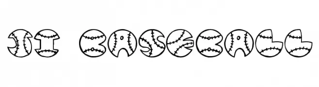
( Fonts by Jeri Ingalls - littlehouse.homestead.com )
A playful, baseball-themed font with characters enclosed in baseball shapes.
![JI Baseball フリーフォントのダウンロード]() ダウンロード 235 ダウンロード数@WebFont
ダウンロード 235 ダウンロード数@WebFont -
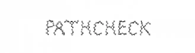
( Fonts by a Max Infeld - XEROGRAPHER FONTS - xerographer.blogspot.com . Personal-use only. For commercial use please contact owner. )
A playful, pixelated font with interconnected square designs for a digital look.
![PathCheck フリーフォントのダウンロード]() ダウンロード 235 ダウンロード数@WebFont
ダウンロード 235 ダウンロード数@WebFont -
( Fonts by Ezza Adhreza )
A tall, condensed font with bold, geometric letterforms and a modern industrial style.
![Zaun フリーフォントのダウンロード]() ダウンロード 235 ダウンロード数@WebFont
ダウンロード 235 ダウンロード数@WebFont -
![PHuture フリーフォントのダウンロード]() ダウンロード 235 ダウンロード数@WebFont
ダウンロード 235 ダウンロード数@WebFont -
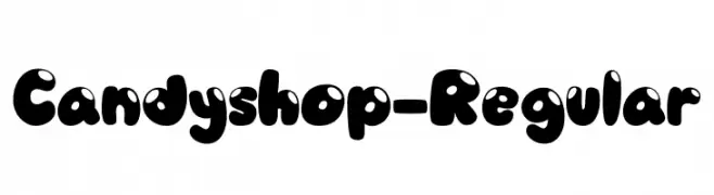
( Fonts by Vable studio )
A playful, bubble-like font with a glossy, candy-inspired design.
![Candyshop-Regular フリーフォントのダウンロード]() ダウンロード 235 ダウンロード数@WebFont
ダウンロード 235 ダウンロード数@WebFont -
( Fonts by Manfred Klein. Free for private and charity use. Free for commercial with donation to organizations )
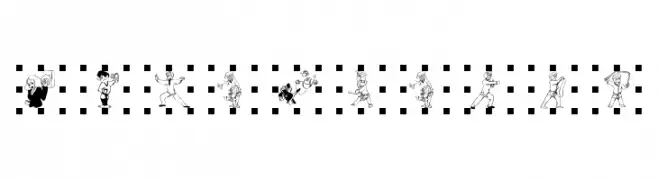
A decorative font with martial arts figures representing each character.
![Kampfsport フリーフォントのダウンロード]() ダウンロード 235 ダウンロード数@WebFont
ダウンロード 235 ダウンロード数@WebFont -
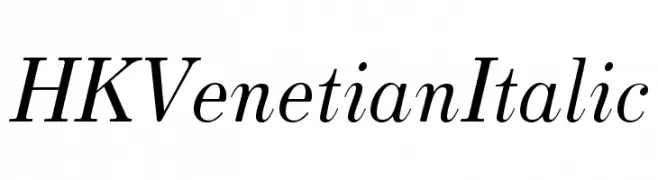
( Fonts by Hanken Design Co. - Personal-use only. For commercial use please contact owner. )
An elegant italic serif font with refined strokes and classic appeal.
![HK Venetian Italic フリーフォントのダウンロード]() ダウンロード 235 ダウンロード数@WebFont
ダウンロード 235 ダウンロード数@WebFont -
( Fonts by Situjuh Nazara - 7ntypes.com - Personal-use only. For commercial use please contact owner. )
A playful, handwritten font with bold, dynamic strokes and a casual style.
![Jotilla フリーフォントのダウンロード]() ダウンロード 235 ダウンロード数@WebFont
ダウンロード 235 ダウンロード数@WebFont -
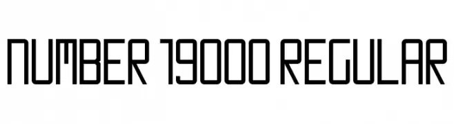
![Number 19000 Regular フリーフォントのダウンロード]() ダウンロード 235 ダウンロード数@WebFont
ダウンロード 235 ダウンロード数@WebFont -
![Yakap フリーフォントのダウンロード]() ダウンロード 235 ダウンロード数@WebFont
ダウンロード 235 ダウンロード数@WebFont -
( Fonts by Nils Cordes - Personal-use only. For commercial use please contact owner. )
A modern handwritten font with a playful and casual style.
![Cardenio Modern Regular フリーフォントのダウンロード]() ダウンロード 235 ダウンロード数@WebFont
ダウンロード 235 ダウンロード数@WebFont -
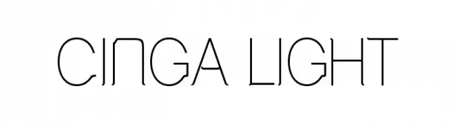
![Cinga Light フリーフォントのダウンロード]() ダウンロード 235 ダウンロード数@WebFont
ダウンロード 235 ダウンロード数@WebFont -
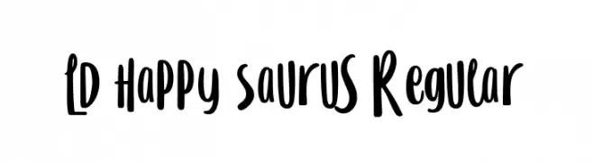
( Fonts by Muthia Fajrijannah )
A playful, handwritten font with bold, rounded strokes and a whimsical style.
![LD Happy Saurus Regular フリーフォントのダウンロード]() ダウンロード 235 ダウンロード数@WebFont
ダウンロード 235 ダウンロード数@WebFont -
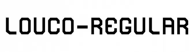
( www.rccarvalho.com )
A bold, geometric font with a modern, industrial style.
![Louco-Regular フリーフォントのダウンロード]() ダウンロード 235 ダウンロード数@WebFont
ダウンロード 235 ダウンロード数@WebFont -
( Fonts by Figuree Studio )
A bold, playful font with rounded, exaggerated shapes for a whimsical appearance.
![Rabbito フリーフォントのダウンロード]() ダウンロード 235 ダウンロード数@WebFont
ダウンロード 235 ダウンロード数@WebFont -
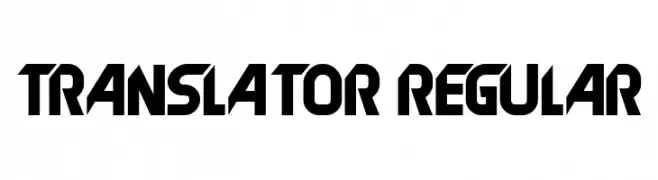
( Fonts by Vladimir Nikolic - www.creativefabrica.com/designer/vladimirnikolic/ - Personal-use only. For commercial use please contact owner. )
A bold, geometric font with a futuristic and angular design.
![Translator Regular フリーフォントのダウンロード]() ダウンロード 235 ダウンロード数@WebFont
ダウンロード 235 ダウンロード数@WebFont -
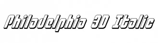
( Fonts by Daniel Zadorozny - www.iconian.com )
A bold, 3D italic font with a modern and dynamic style.
![Philadelphia 3D Italic フリーフォントのダウンロード]() ダウンロード 235 ダウンロード数@WebFont
ダウンロード 235 ダウンロード数@WebFont -
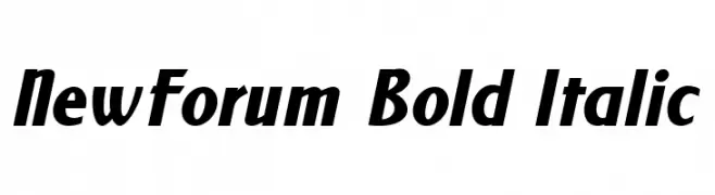
( Fonts by www.TomzWeb.com - Thomas E. Harvey - NOT free - Commercial use requires license )
A bold, italicized font with strong, dynamic strokes and a modern appearance.
![NewForum Bold Italic フリーフォントのダウンロード]() ダウンロード 235 ダウンロード数@WebFont
ダウンロード 235 ダウンロード数@WebFont -
( Fonts by dartcanada.tripod.com - Darren Rigby )
A bold, layered font with intersecting lines creating a dynamic, retro-modern look.
![History Repeating Regular フリーフォントのダウンロード]() ダウンロード 235 ダウンロード数@WebFont
ダウンロード 235 ダウンロード数@WebFont -
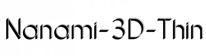
( HypeForType.com - Alex Haigh - www.hypefortype.com )
A sleek, modern 3D font with clean lines and a dynamic, futuristic appearance.
![Nanami-3D-Thin フリーフォントのダウンロード]() ダウンロード 235 ダウンロード数@WebFont
ダウンロード 235 ダウンロード数@WebFont -
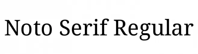
( Noto is a trademark of Google Inc. Noto fonts are open source. All Noto fonts are published under the SIL Open Font License, Version 1.1 )
A classic serif font with medium contrast and elegant serifs.
![Noto Serif Regular フリーフォントのダウンロード]() ダウンロード 235 ダウンロード数@WebFont
ダウンロード 235 ダウンロード数@WebFont -
![SCI FI BOX フリーフォントのダウンロード]() ダウンロード 235 ダウンロード数@WebFont
ダウンロード 235 ダウンロード数@WebFont -
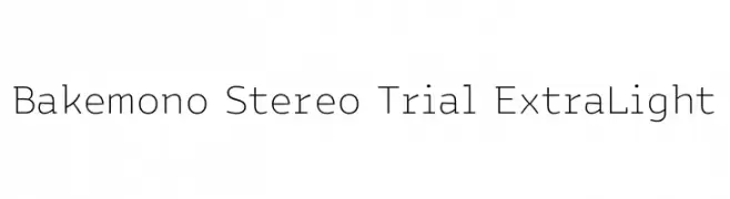
( Fonts by Zetafonts )
A modern, monospaced font with a clean and minimalist design.
![Bakemono Stereo Trial ExtraLight フリーフォントのダウンロード]() ダウンロード 235 ダウンロード数@WebFont
ダウンロード 235 ダウンロード数@WebFont -
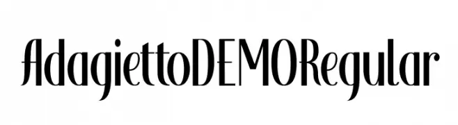
( Hanoded - David Kerkhoff - www.hanodedfonts.com )
An elegant, high-contrast font with tall, narrow letterforms.
![Adagietto DEMO Regular フリーフォントのダウンロード]() ダウンロード 235 ダウンロード数@WebFont
ダウンロード 235 ダウンロード数@WebFont -
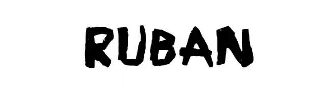
![Ruban フリーフォントのダウンロード]() ダウンロード 235 ダウンロード数@WebFont
ダウンロード 235 ダウンロード数@WebFont -
( Mr. Typeman - creativemarket.com/mr.typeman )
A bold, handwritten font with smooth, flowing strokes and a playful style.
![Muscat フリーフォントのダウンロード]() ダウンロード 235 ダウンロード数@WebFont
ダウンロード 235 ダウンロード数@WebFont -
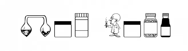
( Fonts by Apostrophic Lab )
A laboratory-themed dingbat font with science icons and cartoon scientists.
![Lab Bats フリーフォントのダウンロード]() ダウンロード 235 ダウンロード数@WebFont
ダウンロード 235 ダウンロード数@WebFont -
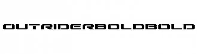
( Iconian Fonts - Daniel Zadorozny - www.iconian.com )
A bold, futuristic font with sharp, angular edges and a geometric style.
![Outrider Bold Bold フリーフォントのダウンロード]() ダウンロード 235 ダウンロード数@WebFont
ダウンロード 235 ダウンロード数@WebFont -
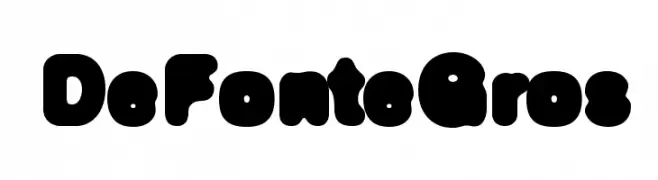
( Fonts by Ingo Zimmermann - www.ingofonts.com )
A playful, bold font with thick, rounded characters and a bubbly appearance.
![DeFonteGros フリーフォントのダウンロード]() ダウンロード 235 ダウンロード数@WebFont
ダウンロード 235 ダウンロード数@WebFont -
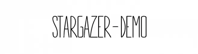
( Fonts by Hypefonts )
A tall, narrow font with clean lines and a modern, sleek appearance.
![STARGAZER-demo フリーフォントのダウンロード]() ダウンロード 235 ダウンロード数@WebFont
ダウンロード 235 ダウンロード数@WebFont -
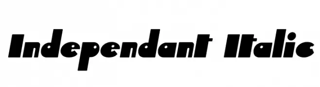
( Fonts by Apostrophic Lab )
A bold, geometric font with sharp angles and unique character shapes.
![Independant Italic フリーフォントのダウンロード]() ダウンロード 235 ダウンロード数@WebFont
ダウンロード 235 ダウンロード数@WebFont -
( Fonts by Adobe )
A bold, italicized sans-serif font with a modern and dynamic style.
![Source Sans Pro Bold Italic フリーフォントのダウンロード]() ダウンロード 235 ダウンロード数@WebFont
ダウンロード 235 ダウンロード数@WebFont -
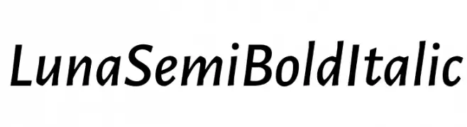
( Fonts by Cristiano Sobral - Personal-use only. For commercial use please contact owner. )
A semi-bold italic font with a modern, elegant style and medium contrast.
![Luna Semi Bold Italic フリーフォントのダウンロード]() ダウンロード 235 ダウンロード数@WebFont
ダウンロード 235 ダウンロード数@WebFont -
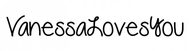
( Fonts by Vanessa Bays - bythebutterfly.com )
A playful, handwritten font with smooth, rounded edges and a casual style.
![VanessaLovesYou フリーフォントのダウンロード]() ダウンロード 235 ダウンロード数@WebFont
ダウンロード 235 ダウンロード数@WebFont


今のトップフォントは?
は、クリーンな造形と広い適用範囲で支持を集めています。 ブランディングからランディングページ、ポスターまで活躍します。
ロゴで人気のフォントは?
幾何学系の サンセリフ(例: Poppins、Gotham 系のファミリー)は、スケーラブルでクリーンな印象に最適。 親しみやすさを出すなら スクリプト や手書き系も定番です。 見出しは力強く、本文はニュートラルに──この組み合わせが認知とバランスを高めます。
人気リストはどのくらいの頻度で更新される?
ダウンロード数やエンゲージメントに基づき定期的に更新します。 こまめにチェックして、次に流行るフォントを先取りしましょう。
💡 ヒント: このページをブックマークしておくと便利です。トレンドは速く、今のトップが明日のリブランディングを導くこともあります。