人気フォント セクションへようこそ。ここでは「よくダウンロードされ、よく使われている」実績ある書体をまとめています。 ロゴ、Web、SNS のどれにも使いやすい、外さない選択肢が見つかります。
どの トップフォント も、バランス・可読性・汎用性で高評価です。 モダン・サンセリフ、エレガントなスクリプト、ヴィンテージなセリフ、ミニマルなディスプレイなどを厳選しています。
-
 ダウンロード 1076 ダウンロード数@WebFont
 -
![Blitzwing Extended フリーフォントのダウンロード]() ダウンロード 1076 ダウンロード数@WebFont
ダウンロード 1076 ダウンロード数@WebFont -
( www.extrakstudio.com )
A bold, graffiti-inspired font with thick, irregular strokes and a rebellious aesthetic.
![REBEL POWER フリーフォントのダウンロード]() ダウンロード 1076 ダウンロード数@WebFont
ダウンロード 1076 ダウンロード数@WebFont -
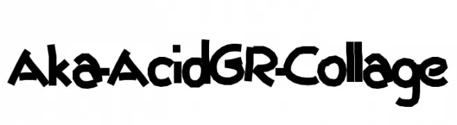
( Fonts by www.aka-acid.com )
A bold, playful, hand-drawn font with dynamic and irregular characters.
![Aka-AcidGR-Collage フリーフォントのダウンロード]() ダウンロード 1076 ダウンロード数@WebFont
ダウンロード 1076 ダウンロード数@WebFont -
![Zeal フリーフォントのダウンロード]() ダウンロード 1076 ダウンロード数@WebFont
ダウンロード 1076 ダウンロード数@WebFont -
-
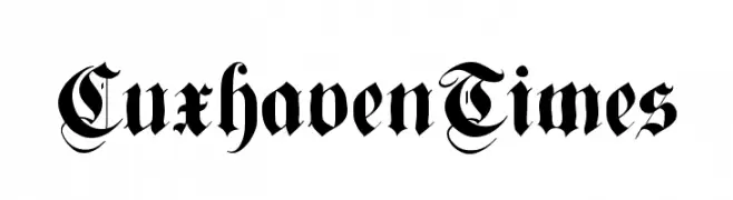
( Fonts by Manfred Klein - manfred-klein.ina-mar.com )
A bold and intricate blackletter font with gothic flourishes.
![CuxhavenTimes フリーフォントのダウンロード]() ダウンロード 1076 ダウンロード数@WebFont
ダウンロード 1076 ダウンロード数@WebFont -
![C&C Red Alert [LAN] フリーフォントのダウンロード]() ダウンロード 1076 ダウンロード数@WebFont
ダウンロード 1076 ダウンロード数@WebFont -
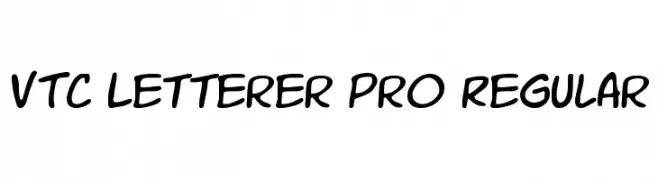
![VTC Letterer Pro Regular フリーフォントのダウンロード]() ダウンロード 1076 ダウンロード数@WebFont
ダウンロード 1076 ダウンロード数@WebFont -
フォント by defharo. For commercial use please contact the owner.
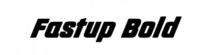
( Fastup Regular and Small Caps is available in two weights (Regular and Bold), geometric design fonts, with a rounded finish on the vertices that provides warmth, with short ascenders and descenders offers a more compact set of letters, the 22° inclination )
A bold, slanted font with a dynamic and energetic style.
![Fastup Bold フリーフォントのダウンロード]() ダウンロード 1075 ダウンロード数@WebFont
ダウンロード 1075 ダウンロード数@WebFont -
( Fonts by Pentagram / MCKL - Personal-use only. For commercial use please contact owner. )
A bold, modern sans-serif font with clean lines and balanced proportions.
![Rosa Sans Black フリーフォントのダウンロード]() ダウンロード 1075 ダウンロード数@WebFont
ダウンロード 1075 ダウンロード数@WebFont


![C&C Red Alert [LAN] フリーフォントのダウンロード](https://d144mzi0q5mijx.cloudfront.net/img/C/0/CC-Red-Alert-LAN.webp)

今のトップフォントは?
は、クリーンな造形と広い適用範囲で支持を集めています。 ブランディングからランディングページ、ポスターまで活躍します。
ロゴで人気のフォントは?
幾何学系の サンセリフ(例: Poppins、Gotham 系のファミリー)は、スケーラブルでクリーンな印象に最適。 親しみやすさを出すなら スクリプト や手書き系も定番です。 見出しは力強く、本文はニュートラルに──この組み合わせが認知とバランスを高めます。
人気リストはどのくらいの頻度で更新される?
ダウンロード数やエンゲージメントに基づき定期的に更新します。 こまめにチェックして、次に流行るフォントを先取りしましょう。
💡 ヒント: このページをブックマークしておくと便利です。トレンドは速く、今のトップが明日のリブランディングを導くこともあります。