人気フォント セクションへようこそ。ここでは「よくダウンロードされ、よく使われている」実績ある書体をまとめています。 ロゴ、Web、SNS のどれにも使いやすい、外さない選択肢が見つかります。
どの トップフォント も、バランス・可読性・汎用性で高評価です。 モダン・サンセリフ、エレガントなスクリプト、ヴィンテージなセリフ、ミニマルなディスプレイなどを厳選しています。
-
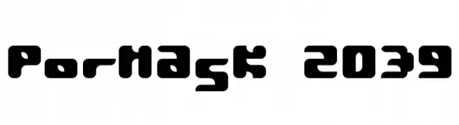
( Fonts by TarmSaft Font Factory - http://www.aska.nu/tarmsaft/ )
A bold, rounded, and futuristic font with a digital aesthetic.
 ダウンロード 221 ダウンロード数@WebFont
 -
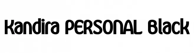
( Måns Grebäck - www.mansgreback.com )
A bold, rounded font with a modern and playful style.
![Kandira PERSONAL Black フリーフォントのダウンロード]() ダウンロード 221 ダウンロード数@WebFont
ダウンロード 221 ダウンロード数@WebFont -
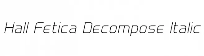
( Fonts by Graham Meade - GemFonts )
A sleek, modern italic font with geometric precision and clean lines.
![Hall Fetica Decompose Italic フリーフォントのダウンロード]() ダウンロード 221 ダウンロード数@WebFont
ダウンロード 221 ダウンロード数@WebFont -
( Fonts by Daniel Zadorozny - www.iconian.com - Personal-use only. For commercial use please contact owner. )
A bold, italicized, and expanded font with a futuristic and dynamic style.
![Neutron Dance Expanded Italic フリーフォントのダウンロード]() ダウンロード 221 ダウンロード数@WebFont
ダウンロード 221 ダウンロード数@WebFont -
( Fonts by Skiiller Studio )
A bold, playful font with rounded edges and consistent stroke width.
![Deurne フリーフォントのダウンロード]() ダウンロード 221 ダウンロード数@WebFont
ダウンロード 221 ダウンロード数@WebFont -
( Fonts by Astigmatic )
A bold, slab serif font with a Western-inspired, vintage style.
![Smokum フリーフォントのダウンロード]() ダウンロード 221 ダウンロード数@WebFont
ダウンロード 221 ダウンロード数@WebFont -
![Zipper1 Cyr フリーフォントのダウンロード]() ダウンロード 221 ダウンロード数@WebFont
ダウンロード 221 ダウンロード数@WebFont -
( Fonts by www.abecedarienne.com )
An elegant outline serif font with a light and airy feel.
![Ticket Capitals Outline Light フリーフォントのダウンロード]() ダウンロード 221 ダウンロード数@WebFont
ダウンロード 221 ダウンロード数@WebFont -
( Fonts by Pizzadude )
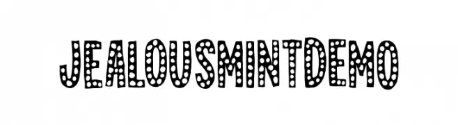
A playful, bold font with a dotted pattern inside each character, offering a whimsical and decorative style.
![JealousMintDEMO フリーフォントのダウンロード]() ダウンロード 221 ダウンロード数@WebFont
ダウンロード 221 ダウンロード数@WebFont -
( Fonts by Luedecke Design Font Co. - ldfonts.weebly.com )
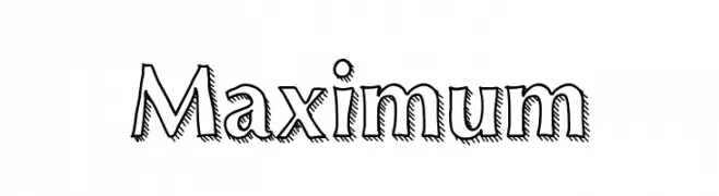
A bold, decorative font with a hand-drawn, shadowed style.
![Maximum フリーフォントのダウンロード]() ダウンロード 221 ダウンロード数@WebFont
ダウンロード 221 ダウンロード数@WebFont -
( Free for personal use - robothaus.com )
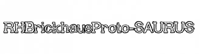
A playful, brick-patterned font with a bold, three-dimensional style.
![RHBrickhausProto-SAURUS フリーフォントのダウンロード]() ダウンロード 221 ダウンロード数@WebFont
ダウンロード 221 ダウンロード数@WebFont -
( Fonts by Darrell Flood - Personal-use only. For commercial use please contact owner. )
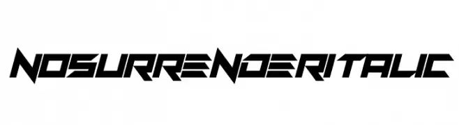
A bold, angular, and futuristic italic font with a dynamic design.
![No Surrender Italic フリーフォントのダウンロード]() ダウンロード 221 ダウンロード数@WebFont
ダウンロード 221 ダウンロード数@WebFont -
( Fonts by Apostrophic Lab )
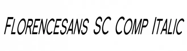
A modern, italic, condensed sans-serif font with uniform stroke width.
![Florencesans SC Comp Italic フリーフォントのダウンロード]() ダウンロード 221 ダウンロード数@WebFont
ダウンロード 221 ダウンロード数@WebFont -
( Fonts by Shara Weber )
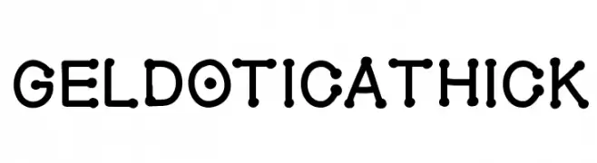
A bold, playful font with rounded edges and a bubbly appearance.
![GelDoticaThick フリーフォントのダウンロード]() ダウンロード 221 ダウンロード数@WebFont
ダウンロード 221 ダウンロード数@WebFont -
( Fonts by Omnibus Type )
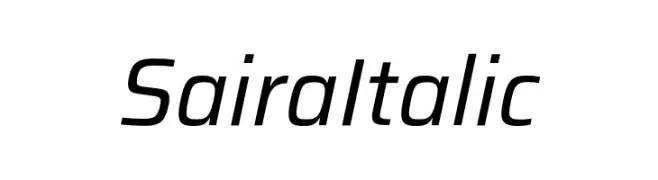
A sleek, modern sans-serif font with an italic slant and uniform stroke width.
![Saira Italic フリーフォントのダウンロード]() ダウンロード 221 ダウンロード数@WebFont
ダウンロード 221 ダウンロード数@WebFont -
![ringpin trial version フリーフォントのダウンロード]() ダウンロード 221 ダウンロード数@WebFont
ダウンロード 221 ダウンロード数@WebFont -
( Fonts by Vanessa Bays - bythebutterfly.com )
A playful, handwritten-style font with rounded edges and a casual feel.
![LilGuy フリーフォントのダウンロード]() ダウンロード 221 ダウンロード数@WebFont
ダウンロード 221 ダウンロード数@WebFont -
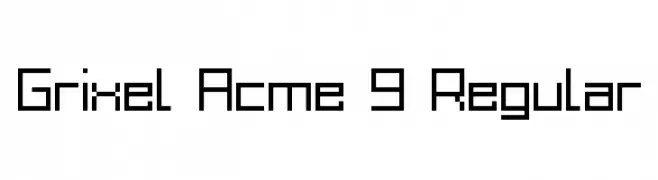
![Grixel Acme 9 Regular フリーフォントのダウンロード]() ダウンロード 221 ダウンロード数@WebFont
ダウンロード 221 ダウンロード数@WebFont -
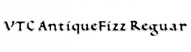
![VTC AntiqueFizz Reguar フリーフォントのダウンロード]() ダウンロード 221 ダウンロード数@WebFont
ダウンロード 221 ダウンロード数@WebFont -
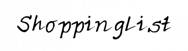
![ShoppingList フリーフォントのダウンロード]() ダウンロード 221 ダウンロード数@WebFont
ダウンロード 221 ダウンロード数@WebFont -
( Twicolabs Fontdation - Fahrizal Tawakkal - fontdation.com )
A classic serif font with strong serifs and balanced proportions.
![Haarlem Serif DEMO フリーフォントのダウンロード]() ダウンロード 221 ダウンロード数@WebFont
ダウンロード 221 ダウンロード数@WebFont -
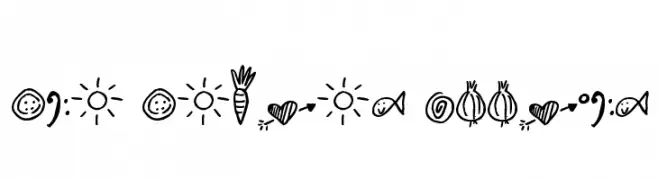
( Free for a personal use. For a commercial use please visit www.kevinandamanda.com )
A playful collection of hand-drawn doodle illustrations with a whimsical style.
![Pea Panda's Doodles フリーフォントのダウンロード]() ダウンロード 221 ダウンロード数@WebFont
ダウンロード 221 ダウンロード数@WebFont -
( Fonts by www.blambot.com )
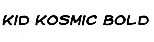
A playful, bold font with rounded edges and a dynamic, slanted style.
![Kid Kosmic Bold フリーフォントのダウンロード]() ダウンロード 221 ダウンロード数@WebFont
ダウンロード 221 ダウンロード数@WebFont -
( Twicolabs Fontdation - Fahrizal Tawakkal - fontdation.com )
A lively script font with flowing, cursive strokes and elegant connections.
![Jalisco Script Demo フリーフォントのダウンロード]() ダウンロード 221 ダウンロード数@WebFont
ダウンロード 221 ダウンロード数@WebFont -
( Fonts by Marina Sanders )
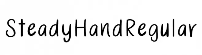
A playful handwritten font with a smooth, consistent flow and friendly appearance.
![SteadyHand Regular フリーフォントのダウンロード]() ダウンロード 221 ダウンロード数@WebFont
ダウンロード 221 ダウンロード数@WebFont -
( Fonts by Adien Gunarta - fontasticindonesia.blogspot.com )
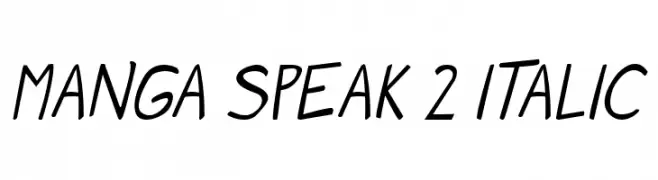
A playful, italicized font with smooth, fluid strokes and a casual vibe.
![Manga speak 2 Italic フリーフォントのダウンロード]() ダウンロード 221 ダウンロード数@WebFont
ダウンロード 221 ダウンロード数@WebFont -
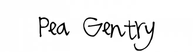
( Free for a personal use. For a commercial use please visit www.kevinandamanda.com )
A playful, handwritten font with a casual and personal touch.
![Pea Gentry フリーフォントのダウンロード]() ダウンロード 221 ダウンロード数@WebFont
ダウンロード 221 ダウンロード数@WebFont -
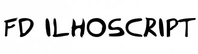
![FD Ilhoscript フリーフォントのダウンロード]() ダウンロード 221 ダウンロード数@WebFont
ダウンロード 221 ダウンロード数@WebFont -
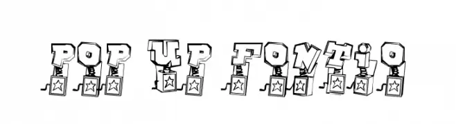
![Pop Up Fontio フリーフォントのダウンロード]() ダウンロード 221 ダウンロード数@WebFont
ダウンロード 221 ダウンロード数@WebFont -
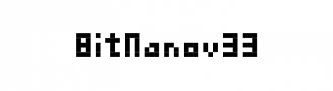
![BitNanov33 フリーフォントのダウンロード]() ダウンロード 221 ダウンロード数
ダウンロード 221 ダウンロード数 -
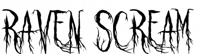
( Fonts by Sinister Fonts - Personal-use only. For commercial use please contact owner. )
A haunting, branch-like font with jagged, eerie strokes.
![Raven Scream フリーフォントのダウンロード]() ダウンロード 221 ダウンロード数@WebFont
ダウンロード 221 ダウンロード数@WebFont -
![Americana Dreams SC Upright フリーフォントのダウンロード]() ダウンロード 221 ダウンロード数@WebFont
ダウンロード 221 ダウンロード数@WebFont -
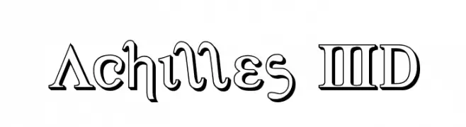
( Iconian Fonts - Daniel Zadorozny - www.iconian.com )
A bold, three-dimensional font with shadow effects and geometric styling.
![Achilles 3D フリーフォントのダウンロード]() ダウンロード 221 ダウンロード数@WebFont
ダウンロード 221 ダウンロード数@WebFont -
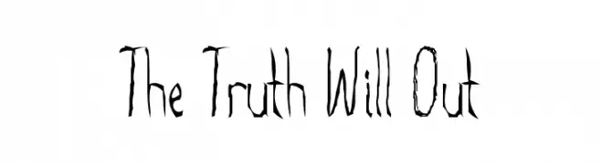
![The Truth Will Out フリーフォントのダウンロード]() ダウンロード 221 ダウンロード数@WebFont
ダウンロード 221 ダウンロード数@WebFont -
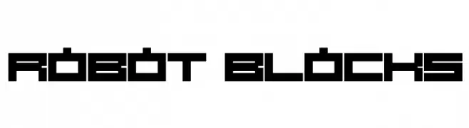
![Robot Blocks フリーフォントのダウンロード]() ダウンロード 221 ダウンロード数@WebFont
ダウンロード 221 ダウンロード数@WebFont


今のトップフォントは?
は、クリーンな造形と広い適用範囲で支持を集めています。 ブランディングからランディングページ、ポスターまで活躍します。
ロゴで人気のフォントは?
幾何学系の サンセリフ(例: Poppins、Gotham 系のファミリー)は、スケーラブルでクリーンな印象に最適。 親しみやすさを出すなら スクリプト や手書き系も定番です。 見出しは力強く、本文はニュートラルに──この組み合わせが認知とバランスを高めます。
人気リストはどのくらいの頻度で更新される?
ダウンロード数やエンゲージメントに基づき定期的に更新します。 こまめにチェックして、次に流行るフォントを先取りしましょう。
💡 ヒント: このページをブックマークしておくと便利です。トレンドは速く、今のトップが明日のリブランディングを導くこともあります。