人気フォント セクションへようこそ。ここでは「よくダウンロードされ、よく使われている」実績ある書体をまとめています。 ロゴ、Web、SNS のどれにも使いやすい、外さない選択肢が見つかります。
どの トップフォント も、バランス・可読性・汎用性で高評価です。 モダン・サンセリフ、エレガントなスクリプト、ヴィンテージなセリフ、ミニマルなディスプレイなどを厳選しています。
-
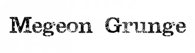
( Fonts by Leonard Posavec )
A bold, distressed slab serif font with a grunge texture for a vintage look.
 ダウンロード 1010 ダウンロード数@WebFont
 -
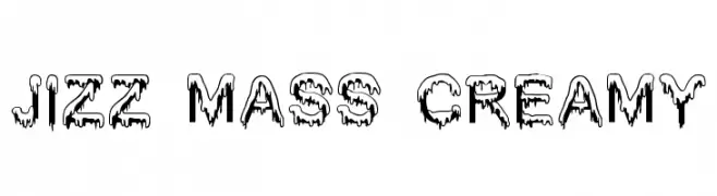
![Jizz Mass creamy フリーフォントのダウンロード]() ダウンロード 1010 ダウンロード数@WebFont
ダウンロード 1010 ダウンロード数@WebFont -
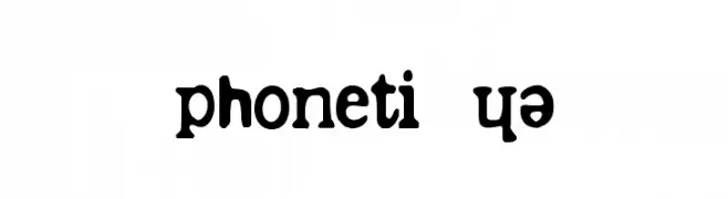
( Fonts by Philippe BLONDEL www.philing.net )
A playful and bold font with unique curves and flourishes.
![phonétique フリーフォントのダウンロード]() ダウンロード 1010 ダウンロード数@WebFont
ダウンロード 1010 ダウンロード数@WebFont -
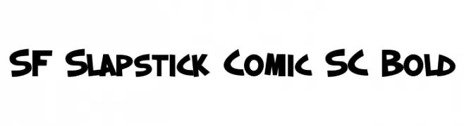
![SF Slapstick Comic SC Bold フリーフォントのダウンロード]() ダウンロード 1010 ダウンロード数@WebFont
ダウンロード 1010 ダウンロード数@WebFont -
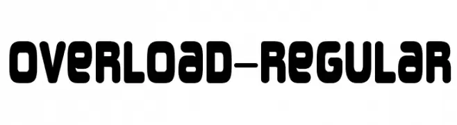
( Fonts by www.typodermicfonts.com - Ray Larabie )
A bold, rounded font with a modern and playful style.
![Overload-Regular フリーフォントのダウンロード]() ダウンロード 1010 ダウンロード数@WebFont
ダウンロード 1010 ダウンロード数@WebFont -
-
( Fonts by Small Voice Studio - smallvoice.studio/typefaces - Personal-use only. For commercial use please contact owner. )
A distressed, vintage-style font with a rubber stamp appearance.
![Rubberstamp フリーフォントのダウンロード]() ダウンロード 1010 ダウンロード数@WebFont
ダウンロード 1010 ダウンロード数@WebFont -
( Fonts by billyargel.blogspot.com - Billy Argel )
A bold, distressed font with a grunge texture and tight spacing.
![SNIPER フリーフォントのダウンロード]() ダウンロード 1010 ダウンロード数@WebFont
ダウンロード 1010 ダウンロード数@WebFont -
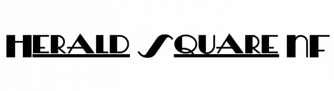
( Fonts by Nick Curtis - www.nicksfonts.com )
A bold, geometric font with high contrast and modern appeal.
![Herald Square NF フリーフォントのダウンロード]() ダウンロード 1010 ダウンロード数@WebFont
ダウンロード 1010 ダウンロード数@WebFont -
( Fonts by Manfred Klein. Free for private and charity use. Free for commercial with donation to organizations )
A playful, informal font with rounded, consistent strokes and a handwritten feel.
![WritersFont フリーフォントのダウンロード]() ダウンロード 1010 ダウンロード数@WebFont
ダウンロード 1010 ダウンロード数@WebFont -
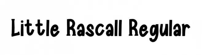
( Fonts by Inayati Thahir )
A playful, hand-drawn font with bold, irregular strokes and a whimsical style.
![Little Rascall Regular フリーフォントのダウンロード]() ダウンロード 1009 ダウンロード数@WebFont
ダウンロード 1009 ダウンロード数@WebFont


今のトップフォントは?
は、クリーンな造形と広い適用範囲で支持を集めています。 ブランディングからランディングページ、ポスターまで活躍します。
ロゴで人気のフォントは?
幾何学系の サンセリフ(例: Poppins、Gotham 系のファミリー)は、スケーラブルでクリーンな印象に最適。 親しみやすさを出すなら スクリプト や手書き系も定番です。 見出しは力強く、本文はニュートラルに──この組み合わせが認知とバランスを高めます。
人気リストはどのくらいの頻度で更新される?
ダウンロード数やエンゲージメントに基づき定期的に更新します。 こまめにチェックして、次に流行るフォントを先取りしましょう。
💡 ヒント: このページをブックマークしておくと便利です。トレンドは速く、今のトップが明日のリブランディングを導くこともあります。