人気フォント セクションへようこそ。ここでは「よくダウンロードされ、よく使われている」実績ある書体をまとめています。 ロゴ、Web、SNS のどれにも使いやすい、外さない選択肢が見つかります。
どの トップフォント も、バランス・可読性・汎用性で高評価です。 モダン・サンセリフ、エレガントなスクリプト、ヴィンテージなセリフ、ミニマルなディスプレイなどを厳選しています。
-
( Fonts by Castcraft Software - opti.netii.net - check the website before use )
A bold, modern font with thick strokes and a strong presence.
 ダウンロード 8407 ダウンロード数@WebFont
 -
![TeXGyreSchola-Bold フリーフォントのダウンロード]() ダウンロード 8406 ダウンロード数@WebFont
ダウンロード 8406 ダウンロード数@WebFont -
![Crate フリーフォントのダウンロード]() ダウンロード 8405 ダウンロード数@WebFont
ダウンロード 8405 ダウンロード数@WebFont -
( Fonts by Castcraft Software - OPTI Fonts Archive - opti.netii.net - Personal-use only. For commercial use please contact owner. )
A bold, extended font with clean lines and uniform stroke width.
![OPTITomasoBold-Extended フリーフォントのダウンロード]() ダウンロード 8404 ダウンロード数@WebFont
ダウンロード 8404 ダウンロード数@WebFont -
( Fonts by Steve Ferrera )
A bold, decorative font with intricate Western-inspired details.
![Anderson Four Feather Falls フリーフォントのダウンロード]() ダウンロード 8400 ダウンロード数@WebFont
ダウンロード 8400 ダウンロード数@WebFont -
-
( Copyright 2018 The ZCOOL XiaoWei Project Authors (https://www.github.com/googlefonts/xiaowei) )
A refined serif typeface with elegant strokes and balanced proportions.
![ZCOOL XiaoWei Regular フリーフォントのダウンロード]() ダウンロード 8393 ダウンロード数@WebFont
ダウンロード 8393 ダウンロード数@WebFont -
( Fonts by Octotype - www.foundmyfont.com - Personal-use only. For commercial use please contact owner. )
A fluid, cursive script font with a natural handwriting style.
![&Matchmaker フリーフォントのダウンロード]() ダウンロード 8391 ダウンロード数@WebFont
ダウンロード 8391 ダウンロード数@WebFont -
![Muro-Regular フリーフォントのダウンロード]() ダウンロード 8388 ダウンロード数@WebFont
ダウンロード 8388 ダウンロード数@WebFont -
![&_NearSighted Normal フリーフォントのダウンロード]() ダウンロード 8383 ダウンロード数
ダウンロード 8383 ダウンロード数 -
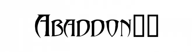
( Fonts by The Scriptorium - Dave Nalle )
A bold, gothic-inspired font with sharp serifs and a medieval aesthetic.
![Abaddon!]() ダウンロード 8376 ダウンロード数@WebFont
ダウンロード 8376 ダウンロード数@WebFont


今のトップフォントは?
は、クリーンな造形と広い適用範囲で支持を集めています。 ブランディングからランディングページ、ポスターまで活躍します。
ロゴで人気のフォントは?
幾何学系の サンセリフ(例: Poppins、Gotham 系のファミリー)は、スケーラブルでクリーンな印象に最適。 親しみやすさを出すなら スクリプト や手書き系も定番です。 見出しは力強く、本文はニュートラルに──この組み合わせが認知とバランスを高めます。
人気リストはどのくらいの頻度で更新される?
ダウンロード数やエンゲージメントに基づき定期的に更新します。 こまめにチェックして、次に流行るフォントを先取りしましょう。
💡 ヒント: このページをブックマークしておくと便利です。トレンドは速く、今のトップが明日のリブランディングを導くこともあります。