人気フォント セクションへようこそ。ここでは「よくダウンロードされ、よく使われている」実績ある書体をまとめています。 ロゴ、Web、SNS のどれにも使いやすい、外さない選択肢が見つかります。
どの トップフォント も、バランス・可読性・汎用性で高評価です。 モダン・サンセリフ、エレガントなスクリプト、ヴィンテージなセリフ、ミニマルなディスプレイなどを厳選しています。
-
( Fonts by 50Fox Studio - www.50fox.com - Personal-use only. For commercial use please contact owner. )
A dynamic, cursive script font with expressive, flowing strokes and artistic flair.
 ダウンロード 844 ダウンロード数@WebFont
 -
フォント by defharo. For commercial use please contact the owner.
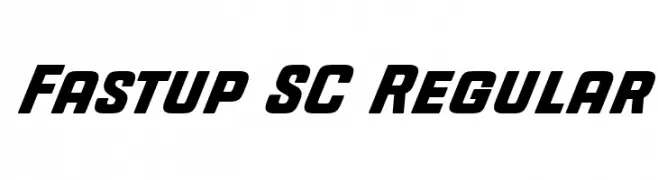
( Fastup Regular and Small Caps is available in two weights (Regular and Bold), geometric design fonts, with a rounded finish on the vertices that provides warmth, with short ascenders and descenders offers a more compact set of letters, the 22° inclination )
A bold, slanted font with thick strokes and a dynamic, energetic style.
![Fastup SC Regular フリーフォントのダウンロード]() ダウンロード 844 ダウンロード数@WebFont
ダウンロード 844 ダウンロード数@WebFont -
( Fonts by Kong Font - https://fontkong.com/ - Personal-use only. For commercial use please contact owner. )
An elegant and flowing script font with graceful curves and smooth strokes.
![White Systemattic フリーフォントのダウンロード]() ダウンロード 844 ダウンロード数@WebFont
ダウンロード 844 ダウンロード数@WebFont -
( Copyright (c) 2015 Ek Type (www.ektype.in) )
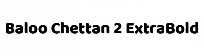
A bold, rounded font with a playful and friendly style.
![Baloo Chettan 2 ExtraBold フリーフォントのダウンロード]() ダウンロード 844 ダウンロード数@WebFont
ダウンロード 844 ダウンロード数@WebFont -
( Pat Snyder - www.patsnyderartist.com/patsnyder_fonts.html )
A bold, impactful font with thick strokes and minimal contrast, perfect for strong visual statements.
![HeavyHeavyFat Regular フリーフォントのダウンロード]() ダウンロード 844 ダウンロード数@WebFont
ダウンロード 844 ダウンロード数@WebFont -
-
( Darrell Flood )
A bold, condensed font with tall, narrow characters and high contrast.
![Slimlines フリーフォントのダウンロード]() ダウンロード 844 ダウンロード数@WebFont
ダウンロード 844 ダウンロード数@WebFont -
![Rough Sketch フリーフォントのダウンロード]() ダウンロード 844 ダウンロード数@WebFont
ダウンロード 844 ダウンロード数@WebFont -
( Fonts by Situjuh Nazara - 7ntypes.com - Personal-use only. For commercial use please contact owner. )
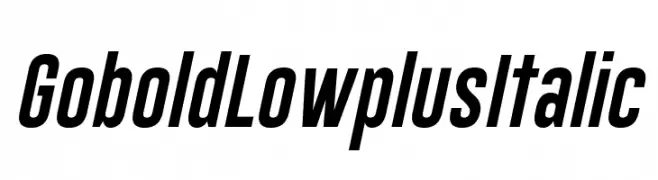
A bold, italic sans-serif font with a dynamic and modern style.
![Gobold Lowplus Italic フリーフォントのダウンロード]() ダウンロード 844 ダウンロード数@WebFont
ダウンロード 844 ダウンロード数@WebFont -
( Fonts by Situjuh Nazara - 7ntypes.com - Personal-use only. For commercial use please contact owner. )
An elegant script font with flowing, cursive letters and intricate swashes.
![Aulyars フリーフォントのダウンロード]() ダウンロード 844 ダウンロード数@WebFont
ダウンロード 844 ダウンロード数@WebFont -
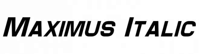
![Maximus Italic フリーフォントのダウンロード]() ダウンロード 844 ダウンロード数@WebFont
ダウンロード 844 ダウンロード数@WebFont


今のトップフォントは?
は、クリーンな造形と広い適用範囲で支持を集めています。 ブランディングからランディングページ、ポスターまで活躍します。
ロゴで人気のフォントは?
幾何学系の サンセリフ(例: Poppins、Gotham 系のファミリー)は、スケーラブルでクリーンな印象に最適。 親しみやすさを出すなら スクリプト や手書き系も定番です。 見出しは力強く、本文はニュートラルに──この組み合わせが認知とバランスを高めます。
人気リストはどのくらいの頻度で更新される?
ダウンロード数やエンゲージメントに基づき定期的に更新します。 こまめにチェックして、次に流行るフォントを先取りしましょう。
💡 ヒント: このページをブックマークしておくと便利です。トレンドは速く、今のトップが明日のリブランディングを導くこともあります。