人気フォント セクションへようこそ。ここでは「よくダウンロードされ、よく使われている」実績ある書体をまとめています。 ロゴ、Web、SNS のどれにも使いやすい、外さない選択肢が見つかります。
どの トップフォント も、バランス・可読性・汎用性で高評価です。 モダン・サンセリフ、エレガントなスクリプト、ヴィンテージなセリフ、ミニマルなディスプレイなどを厳選しています。
-
 ダウンロード 170 ダウンロード数@WebFont
 -
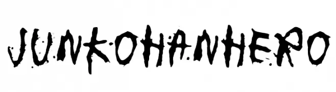
( Fonts by www.junkohanhero.com )
A bold, hand-drawn font with irregular strokes and an artistic, expressive style.
![junkohanhero フリーフォントのダウンロード]() ダウンロード 170 ダウンロード数@WebFont
ダウンロード 170 ダウンロード数@WebFont -
![Armand_Extra フリーフォントのダウンロード]() ダウンロード 170 ダウンロード数@WebFont
ダウンロード 170 ダウンロード数@WebFont -
( Fonts by a Max Infeld - XEROGRAPHER FONTS - xerographer.blogspot.com . Personal-use only. For commercial use please contact owner. )
A bold, brushstroke-style font with textured, expressive characters.
![TotalEclipse フリーフォントのダウンロード]() ダウンロード 170 ダウンロード数@WebFont
ダウンロード 170 ダウンロード数@WebFont -
( Fonts by Fikry Alif - Fikryal studio - https://www.creativefabrica.com/designer/mfikryalif/ref/222304/ - Personal-use only. For commercial use please contact owner. )
A playful and flowing script font with smooth, rounded edges and elegant curves.
![Winter Creative フリーフォントのダウンロード]() ダウンロード 170 ダウンロード数@WebFont
ダウンロード 170 ダウンロード数@WebFont -
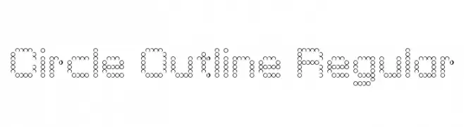
![RSUltraLine フリーフォントのダウンロード]() ダウンロード 170 ダウンロード数
ダウンロード 170 ダウンロード数 -
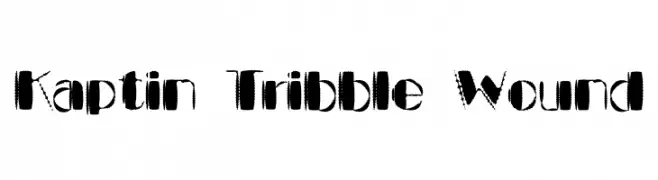
![Kaptin Tribble Wound フリーフォントのダウンロード]() ダウンロード 170 ダウンロード数@WebFont
ダウンロード 170 ダウンロード数@WebFont -
( Fonts by Moreltype - Hermawan Hermawan - Personal-use only. For commercial use please contact owner. )
A modern serif font with clean lines and balanced forms.
![Leorio フリーフォントのダウンロード]() ダウンロード 170 ダウンロード数@WebFont
ダウンロード 170 ダウンロード数@WebFont -
( Ryan Williamson )
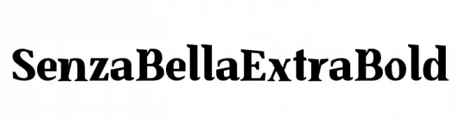
A bold, high-contrast serif font with a dramatic and modern style.
![SenzaBella ExtraBold フリーフォントのダウンロード]() ダウンロード 170 ダウンロード数@WebFont
ダウンロード 170 ダウンロード数@WebFont -
( David Holm - www.stompstock.com )
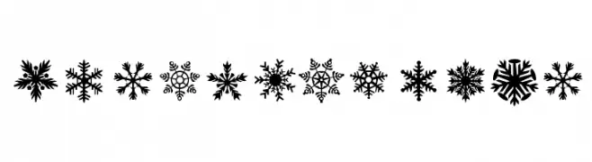
A decorative snowflake dingbat set with diverse, intricate designs.
![DH Snowflakes フリーフォントのダウンロード]() ダウンロード 170 ダウンロード数@WebFont
ダウンロード 170 ダウンロード数@WebFont -
( Fonts by Almarkhatype - Abdul Malik Wisnu - Personal-use only. For commercial use please contact owner. )
A modern, geometric outline font inspired by neon lights, perfect for bold headlines and logos.
![Neonblitz フリーフォントのダウンロード]() ダウンロード 170 ダウンロード数@WebFont
ダウンロード 170 ダウンロード数@WebFont -
( Personal-use only. For commercial use please contact owner. )
A bold, italicized font with a modern, compact style and medium contrast.
![Cactron Bold Italic フリーフォントのダウンロード]() ダウンロード 170 ダウンロード数@WebFont
ダウンロード 170 ダウンロード数@WebFont -
( Fonts by www.junkohanhero.com )
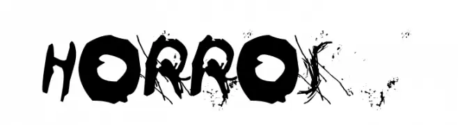
A chaotic, distressed font with bold, jagged strokes and a grunge aesthetic.
![Horros フリーフォントのダウンロード]() ダウンロード 170 ダウンロード数@WebFont
ダウンロード 170 ダウンロード数@WebFont -
( Fonts by Hanken Design Co. - Personal-use only. For commercial use please contact owner. )
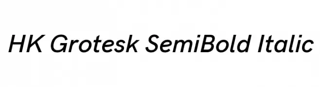
A modern, italic sans-serif font with a clean and dynamic style.
![HK Grotesk SemiBold Italic フリーフォントのダウンロード]() ダウンロード 170 ダウンロード数@WebFont
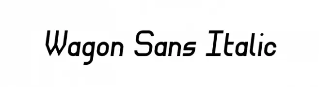
ダウンロード 170 ダウンロード数@WebFont -
![Wagon Sans Italic フリーフォントのダウンロード]() ダウンロード 170 ダウンロード数@WebFont
ダウンロード 170 ダウンロード数@WebFont -
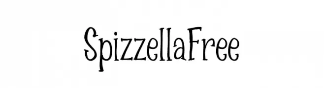
( Spizzella Fancy )
A playful, hand-drawn serif font with whimsical and artistic characteristics.
![SpizzellaFree フリーフォントのダウンロード]() ダウンロード 170 ダウンロード数@WebFont
ダウンロード 170 ダウンロード数@WebFont -
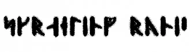
( Fonts by David Kerkhoff - www.hanodedphotography.com )
A bold, runic-style font with a rugged, ancient appearance.
![Skraeling Runic フリーフォントのダウンロード]() ダウンロード 170 ダウンロード数@WebFont
ダウンロード 170 ダウンロード数@WebFont -
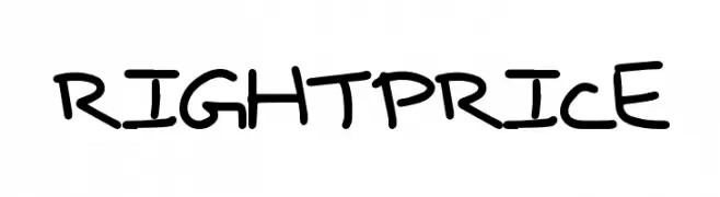
( Fonts by a Max Infeld - XEROGRAPHER FONTS - xerographer.blogspot.com . Personal-use only. For commercial use please contact owner. )
A playful, casual handwritten font with irregular strokes.
![RightPrice フリーフォントのダウンロード]() ダウンロード 170 ダウンロード数@WebFont
ダウンロード 170 ダウンロード数@WebFont -
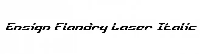
![Ensign Flandry Laser Italic フリーフォントのダウンロード]() ダウンロード 170 ダウンロード数@WebFont
ダウンロード 170 ダウンロード数@WebFont -
( Fonts by Iconian Fonts )
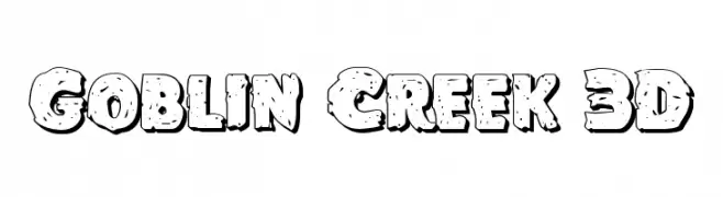
A bold, playful 3D font with a whimsical, irregular outline and scattered dot details.
![Goblin Creek 3D フリーフォントのダウンロード]() ダウンロード 170 ダウンロード数@WebFont
ダウンロード 170 ダウンロード数@WebFont -
( Fonts by Samuel Park - Personal-use only. For commercial use please contact owner. )
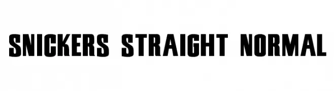
A bold, blocky font ideal for impactful headlines and logos.
![Snickers Straight Normal フリーフォントのダウンロード]() ダウンロード 170 ダウンロード数@WebFont
ダウンロード 170 ダウンロード数@WebFont -
![Puffy Regular フリーフォントのダウンロード]() ダウンロード 170 ダウンロード数@WebFont
ダウンロード 170 ダウンロード数@WebFont -
![SamtolThick フリーフォントのダウンロード]() ダウンロード 170 ダウンロード数@WebFont
ダウンロード 170 ダウンロード数@WebFont -
( Joorgemoron@gmail.com )
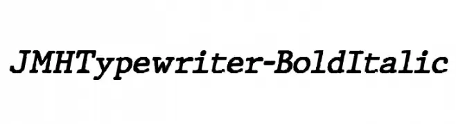
A bold, italicized typewriter-style font with a classic, monospaced design.
![JMHTypewriter-BoldItalic フリーフォントのダウンロード]() ダウンロード 170 ダウンロード数@WebFont
ダウンロード 170 ダウンロード数@WebFont -
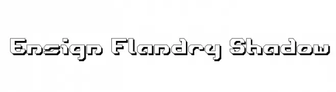
![Ensign Flandry Shadow フリーフォントのダウンロード]() ダウンロード 170 ダウンロード数@WebFont
ダウンロード 170 ダウンロード数@WebFont -
( Fonts by Apostrophic Lab )
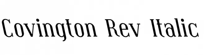
A modern serif font with an elegant italic slant and medium contrast.
![Covington Rev Italic フリーフォントのダウンロード]() ダウンロード 170 ダウンロード数@WebFont
ダウンロード 170 ダウンロード数@WebFont -
( Fonts by Daniel Zadorozny - www.iconian.com )
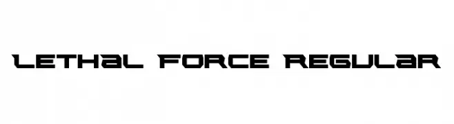
A bold, futuristic font with sharp, angular edges and a geometric style.
![Lethal Force Regular フリーフォントのダウンロード]() ダウンロード 170 ダウンロード数@WebFont
ダウンロード 170 ダウンロード数@WebFont -
( LJ Design Studios - www.ljdesignstudios.com )
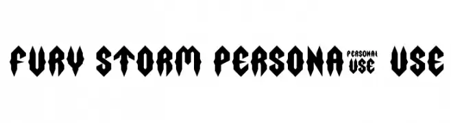
A bold, angular font with a modern, edgy design.
![Fury Storm Personal Use フリーフォントのダウンロード]() ダウンロード 170 ダウンロード数@WebFont
ダウンロード 170 ダウンロード数@WebFont -
( Fonts by Vladimir Nikolic )
A bold, mechanical font with modular segments and rivet-like details.
![Canal Flat Regular フリーフォントのダウンロード]() ダウンロード 170 ダウンロード数@WebFont
ダウンロード 170 ダウンロード数@WebFont -
フォント by Gon. For commercial use please contact the owner.
( Free font license )
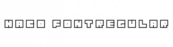
A bold, geometric font with a modern, blocky design.
![Haco Font-Regular フリーフォントのダウンロード]() ダウンロード 170 ダウンロード数@WebFont
ダウンロード 170 ダウンロード数@WebFont -
( Fonts by a Des Gomez. Personal-use only. For commercial use please contact owner. )
A playful, handwritten font with decorative elements and a whimsical style.
![GoodNeighbor フリーフォントのダウンロード]() ダウンロード 170 ダウンロード数@WebFont
ダウンロード 170 ダウンロード数@WebFont -
( Fonts by Peter Wiegel - www.peter-wiegel.de - Personal-use only. For commercial use please contact owner. )
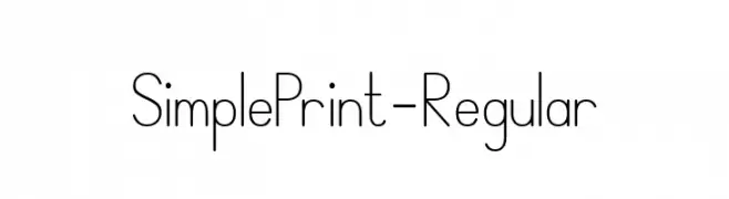
A clean, modern font with uniform stroke width and balanced spacing.
![SimplePrint-Regular フリーフォントのダウンロード]() ダウンロード 170 ダウンロード数@WebFont
ダウンロード 170 ダウンロード数@WebFont -
( David Ortega - www.betatres.com )
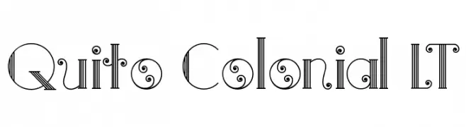
An elegant and whimsical decorative font with intricate line work and playful curls.
![Quito Colonial LT フリーフォントのダウンロード]() ダウンロード 170 ダウンロード数@WebFont
ダウンロード 170 ダウンロード数@WebFont -
( Free for a personal use. For a commercial use please visit www.kevinandamanda.com )
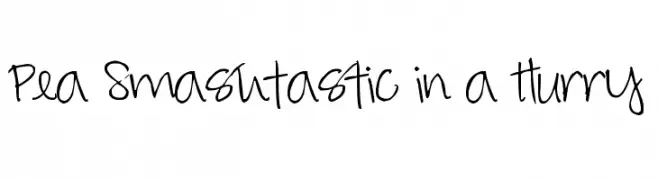
A lively, handwritten font with a playful and informal style.
![Pea Smashtastic in a Hurry フリーフォントのダウンロード]() ダウンロード 170 ダウンロード数@WebFont
ダウンロード 170 ダウンロード数@WebFont -
( Personal-use only. For commercial use please contact owner. )
A modern, bold font with geometric shapes and clean lines.
![Vazir Medium FD-WOL フリーフォントのダウンロード]() ダウンロード 170 ダウンロード数@WebFont
ダウンロード 170 ダウンロード数@WebFont


今のトップフォントは?
は、クリーンな造形と広い適用範囲で支持を集めています。 ブランディングからランディングページ、ポスターまで活躍します。
ロゴで人気のフォントは?
幾何学系の サンセリフ(例: Poppins、Gotham 系のファミリー)は、スケーラブルでクリーンな印象に最適。 親しみやすさを出すなら スクリプト や手書き系も定番です。 見出しは力強く、本文はニュートラルに──この組み合わせが認知とバランスを高めます。
人気リストはどのくらいの頻度で更新される?
ダウンロード数やエンゲージメントに基づき定期的に更新します。 こまめにチェックして、次に流行るフォントを先取りしましょう。
💡 ヒント: このページをブックマークしておくと便利です。トレンドは速く、今のトップが明日のリブランディングを導くこともあります。