人気フォント セクションへようこそ。ここでは「よくダウンロードされ、よく使われている」実績ある書体をまとめています。 ロゴ、Web、SNS のどれにも使いやすい、外さない選択肢が見つかります。
どの トップフォント も、バランス・可読性・汎用性で高評価です。 モダン・サンセリフ、エレガントなスクリプト、ヴィンテージなセリフ、ミニマルなディスプレイなどを厳選しています。
-
( Fonts by Manfred Klein. Free for private and charity use. Free for commercial with donation to organizations )
A modern sans-serif font with clean lines and geometric shapes.
 ダウンロード 790 ダウンロード数@WebFont
 -
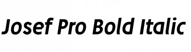
![Josef Pro Bold Italic フリーフォントのダウンロード]() ダウンロード 790 ダウンロード数@WebFont
ダウンロード 790 ダウンロード数@WebFont -
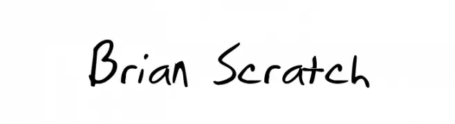
![Brian Scratch フリーフォントのダウンロード]() ダウンロード 790 ダウンロード数@WebFont
ダウンロード 790 ダウンロード数@WebFont -
![defatted milk フリーフォントのダウンロード]() ダウンロード 790 ダウンロード数@WebFont
ダウンロード 790 ダウンロード数@WebFont -
( Fonts by Koczman Balint - magiquefonts.gportal.hu )
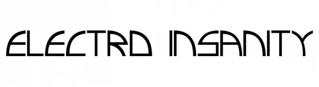
A futuristic, geometric font with sharp angles and clean lines.
![Electro insanity フリーフォントのダウンロード]() ダウンロード 790 ダウンロード数@WebFont
ダウンロード 790 ダウンロード数@WebFont -
-
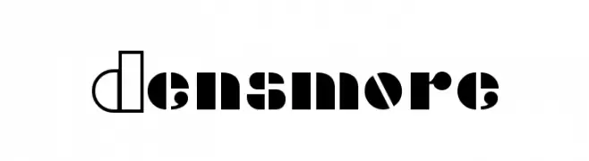
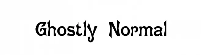
( Fonts by www.typodermicfonts.com - Ray Larabie )
A bold, modern font with geometric shapes and contrasting solid and outlined segments.
![Densmore フリーフォントのダウンロード]() ダウンロード 790 ダウンロード数@WebFont
ダウンロード 790 ダウンロード数@WebFont -
![Ghostly Normal フリーフォントのダウンロード]() ダウンロード 790 ダウンロード数@WebFont
ダウンロード 790 ダウンロード数@WebFont -
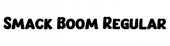
( Fonts by Bangkit Tri Setiadi )
A bold, rounded font with a playful and cartoonish style.
![Smack Boom Regular フリーフォントのダウンロード]() ダウンロード 789 ダウンロード数@WebFont
ダウンロード 789 ダウンロード数@WebFont -
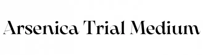
( Fonts by Zetafonts - Personal-use only. For commercial use please contact owner. )
A high-contrast serif font with elegant, sharp serifs and a modern aesthetic.
![Arsenica Trial Medium フリーフォントのダウンロード]() ダウンロード 789 ダウンロード数@WebFont
ダウンロード 789 ダウンロード数@WebFont -
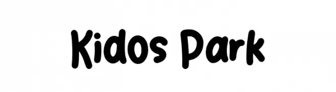
( Fonts by Creatype Studio )
A playful, bold font with rounded, thick strokes and a whimsical style.
![Kidos Park フリーフォントのダウンロード]() ダウンロード 789 ダウンロード数@WebFont
ダウンロード 789 ダウンロード数@WebFont

今のトップフォントは?
は、クリーンな造形と広い適用範囲で支持を集めています。 ブランディングからランディングページ、ポスターまで活躍します。
ロゴで人気のフォントは?
幾何学系の サンセリフ(例: Poppins、Gotham 系のファミリー)は、スケーラブルでクリーンな印象に最適。 親しみやすさを出すなら スクリプト や手書き系も定番です。 見出しは力強く、本文はニュートラルに──この組み合わせが認知とバランスを高めます。
人気リストはどのくらいの頻度で更新される?
ダウンロード数やエンゲージメントに基づき定期的に更新します。 こまめにチェックして、次に流行るフォントを先取りしましょう。
💡 ヒント: このページをブックマークしておくと便利です。トレンドは速く、今のトップが明日のリブランディングを導くこともあります。