人気フォント セクションへようこそ。ここでは「よくダウンロードされ、よく使われている」実績ある書体をまとめています。 ロゴ、Web、SNS のどれにも使いやすい、外さない選択肢が見つかります。
どの トップフォント も、バランス・可読性・汎用性で高評価です。 モダン・サンセリフ、エレガントなスクリプト、ヴィンテージなセリフ、ミニマルなディスプレイなどを厳選しています。
-
( Fonts by Daniel Zadorozny - www.iconian.com - Personal-use only. For commercial use please contact owner. )
A bold, geometric font with expanded width and high contrast, perfect for impactful headlines.
 ダウンロード 781 ダウンロード数@WebFont
 -
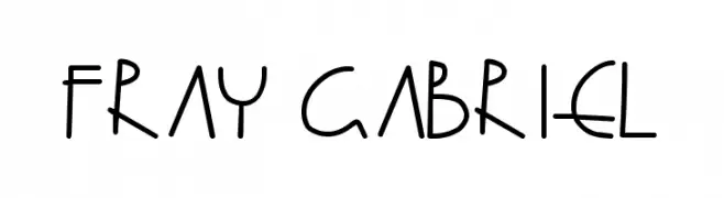
( Fonts by Fray Gabriel Chavez de la Mora - Personal-use only. For commercial use please contact owner. )
A playful, handwritten font with uniform strokes and rounded edges.
![Fray Gabriel フリーフォントのダウンロード]() ダウンロード 781 ダウンロード数@WebFont
ダウンロード 781 ダウンロード数@WebFont -
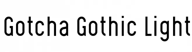
( Levi Szekeres - www.loremipsum.ro )
A modern, geometric sans-serif font with a sleek and narrow design.
![Gotcha Gothic Light フリーフォントのダウンロード]() ダウンロード 781 ダウンロード数@WebFont
ダウンロード 781 ダウンロード数@WebFont -
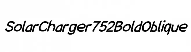
( Fonts by CannotIntoSpaceFonts - KineticPlasma Fonts - Personal-use only. For commercial use please contact owner. )
Bold and oblique font with a dynamic, modern style.
![SolarCharger 752 Bold Oblique フリーフォントのダウンロード]() ダウンロード 781 ダウンロード数@WebFont
ダウンロード 781 ダウンロード数@WebFont -
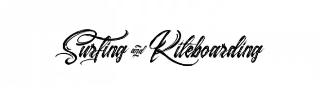
( Fonts by Agathe M.Joyce - www.foundmyfont.com - Personal-use only. For commercial use please contact owner. )
A dynamic and fluid script font with elegant, flowing curves.
![Surfing & Kiteboarding フリーフォントのダウンロード]() ダウンロード 781 ダウンロード数@WebFont
ダウンロード 781 ダウンロード数@WebFont -
-
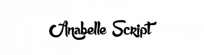
( Fonts by Maelle.K - Thomas Boucherie )
A playful, cursive script font with flowing, interconnected letters.
![Anabelle Script フリーフォントのダウンロード]() ダウンロード 781 ダウンロード数@WebFont
ダウンロード 781 ダウンロード数@WebFont -
( Fonts by Press Gang Studios - Andeh Pinkard - www.pressgang-studios.com )
A playful, casual handwritten font with fluid, slightly irregular strokes.
![autumn whispers フリーフォントのダウンロード]() ダウンロード 781 ダウンロード数@WebFont
ダウンロード 781 ダウンロード数@WebFont -
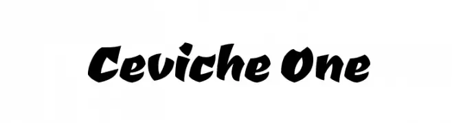
( Copyright (c) 2011 by LatinoType Limitada (luciano@latinotype.com) )
A bold, dynamic font with angular strokes and a playful slant.
![Ceviche One フリーフォントのダウンロード]() ダウンロード 781 ダウンロード数@WebFont
ダウンロード 781 ダウンロード数@WebFont -
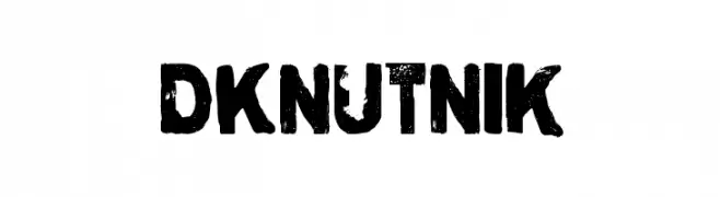
( Fonts by David Kerkhoff - www.hanodedphotography.com )
A bold, distressed font with a grunge texture and rugged appearance.
![DKNutnik フリーフォントのダウンロード]() ダウンロード 781 ダウンロード数@WebFont
ダウンロード 781 ダウンロード数@WebFont -
( Fonts by Florian Bambhout - www.bambootypes.net )
A modern, geometric font with rounded edges and consistent stroke width.
![Bambhout Connect Trial フリーフォントのダウンロード]() ダウンロード 781 ダウンロード数@WebFont
ダウンロード 781 ダウンロード数@WebFont


今のトップフォントは?
は、クリーンな造形と広い適用範囲で支持を集めています。 ブランディングからランディングページ、ポスターまで活躍します。
ロゴで人気のフォントは?
幾何学系の サンセリフ(例: Poppins、Gotham 系のファミリー)は、スケーラブルでクリーンな印象に最適。 親しみやすさを出すなら スクリプト や手書き系も定番です。 見出しは力強く、本文はニュートラルに──この組み合わせが認知とバランスを高めます。
人気リストはどのくらいの頻度で更新される?
ダウンロード数やエンゲージメントに基づき定期的に更新します。 こまめにチェックして、次に流行るフォントを先取りしましょう。
💡 ヒント: このページをブックマークしておくと便利です。トレンドは速く、今のトップが明日のリブランディングを導くこともあります。