人気フォント セクションへようこそ。ここでは「よくダウンロードされ、よく使われている」実績ある書体をまとめています。 ロゴ、Web、SNS のどれにも使いやすい、外さない選択肢が見つかります。
どの トップフォント も、バランス・可読性・汎用性で高評価です。 モダン・サンセリフ、エレガントなスクリプト、ヴィンテージなセリフ、ミニマルなディスプレイなどを厳選しています。
-
( Fonts by Eknoji Studio - www.eknojistudio.com - Personal-use only. For commercial use please contact owner. )
A playful, elegant script font with a handwritten touch.
 ダウンロード 153 ダウンロード数@WebFont
 -
( 211178 Creative Agency - Morten Talleivsen - www.211178.no )
A modern, bold sans-serif font with geometric shapes and uniform strokes.
![CWG Sans フリーフォントのダウンロード]() ダウンロード 153 ダウンロード数@WebFont
ダウンロード 153 ダウンロード数@WebFont -
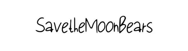
![Save_the_Moon_Bears フリーフォントのダウンロード]() ダウンロード 153 ダウンロード数@WebFont
ダウンロード 153 ダウンロード数@WebFont -
( Fonts by Missy Meyer - Personal-use only. For commercial use please contact owner. )
A playful, hand-drawn serif font with a sketch-like, artistic style.
![Skrawk Serif フリーフォントのダウンロード]() ダウンロード 153 ダウンロード数@WebFont
ダウンロード 153 ダウンロード数@WebFont -
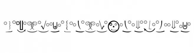
( Fonts by Manfred Klein. Free for private and charity use. Free for commercial with donation to organizations )
A playful and whimsical set of characters combining mathematical symbols and emoticons.
![MathEmoticonsOne フリーフォントのダウンロード]() ダウンロード 153 ダウンロード数@WebFont
ダウンロード 153 ダウンロード数@WebFont -
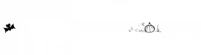
( Fonts by Maelle.K - Thomas Boucherie )
A decorative font with playful Halloween-themed icons.
![Halloween Trick フリーフォントのダウンロード]() ダウンロード 153 ダウンロード数@WebFont
ダウンロード 153 ダウンロード数@WebFont -
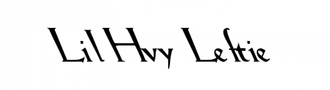
( Fonts by David Rakowski )
A dynamic, angular font with sharp lines and a bold, artistic flair.
![Lil Hvy Leftie フリーフォントのダウンロード]() ダウンロード 153 ダウンロード数@WebFont
ダウンロード 153 ダウンロード数@WebFont -
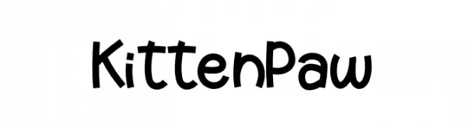
( Fonts by Raditya Type Studio )
A playful, handwritten font with a whimsical and friendly style.
![KittenPaw フリーフォントのダウンロード]() ダウンロード 153 ダウンロード数@WebFont
ダウンロード 153 ダウンロード数@WebFont -
( Fonts by Daniel Zadorozny - www.iconian.com - Free for personal use )
A bold, geometric font with high contrast and modern style.
![Nathan Brazil Regular フリーフォントのダウンロード]() ダウンロード 153 ダウンロード数@WebFont
ダウンロード 153 ダウンロード数@WebFont -
( Fonts by Kong Font - fontkong.com - Personal-use only. For commercial use please contact owner. )
A bold, italic script font with fluid, connected strokes and strong visual impact.
![The Galaxy Italic フリーフォントのダウンロード]() ダウンロード 153 ダウンロード数@WebFont
ダウンロード 153 ダウンロード数@WebFont -
![Stylish I Regular フリーフォントのダウンロード]() ダウンロード 153 ダウンロード数@WebFont
ダウンロード 153 ダウンロード数@WebFont -
( Fonts by Situjuh Nazara - 7ntypes.com - Personal-use only. For commercial use please contact owner. )
A modern, elegant font with clean lines and balanced proportions.
![Cruncho フリーフォントのダウンロード]() ダウンロード 153 ダウンロード数@WebFont
ダウンロード 153 ダウンロード数@WebFont -
( Fonts by Maulana Creative - Gilang Maulana - Personal-use only. For commercial use please contact owner. )
An elegant script font with flowing, cursive letterforms and a classic, refined style.
![Lany Jesty Free フリーフォントのダウンロード]() ダウンロード 153 ダウンロード数@WebFont
ダウンロード 153 ダウンロード数@WebFont -
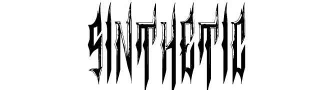
( Fonts by Chris Vile - fontmonger.com - Personal-use only. For commercial use please contact owner. )
A bold, decorative font with sharp, elongated letterforms and high contrast.
![Sinthetic フリーフォントのダウンロード]() ダウンロード 153 ダウンロード数@WebFont
ダウンロード 153 ダウンロード数@WebFont -
( Fonts by Kong Font - fontkong.com - Personal-use only. For commercial use please contact owner. )
A bold, industrial font with geometric shapes and sharp edges.
![Red Steel フリーフォントのダウンロード]() ダウンロード 153 ダウンロード数@WebFont
ダウンロード 153 ダウンロード数@WebFont -
( Fonts by Daniel Zadorozny - www.iconian.com )
A bold, italic, and distressed font with an expanded width and dynamic style.
![Berserker Expanded Italic フリーフォントのダウンロード]() ダウンロード 153 ダウンロード数@WebFont
ダウンロード 153 ダウンロード数@WebFont -
( Fonts by Manfred Klein. Free for private and charity use. Free for commercial with donation to organizations )
A modern, geometric sans-serif font with a clean and professional look.
![DisPropSans フリーフォントのダウンロード]() ダウンロード 153 ダウンロード数@WebFont
ダウンロード 153 ダウンロード数@WebFont -
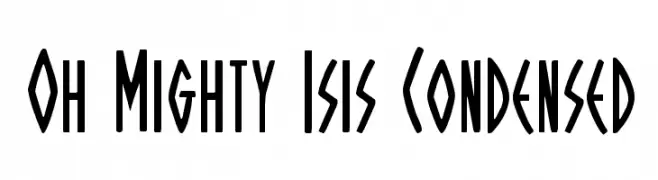
( Fonts by Daniel Zadorozny - www.iconian.com )
Bold, condensed font with tall, narrow characters and a modern, edgy style.
![Oh Mighty Isis Condensed フリーフォントのダウンロード]() ダウンロード 153 ダウンロード数@WebFont
ダウンロード 153 ダウンロード数@WebFont -
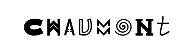
( Fonts by Velvetyne Type Foundry - Personal-use only. For commercial use please contact owner. )
A decorative and eclectic font with unique, artistic characters.
![Chaumont フリーフォントのダウンロード]() ダウンロード 153 ダウンロード数@WebFont
ダウンロード 153 ダウンロード数@WebFont -
( Fonts by Jecko Development )
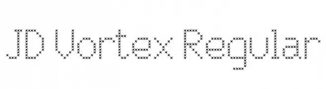
A decorative font composed of star-like shapes forming each character.
![JD Vortex Regular フリーフォントのダウンロード]() ダウンロード 153 ダウンロード数@WebFont
ダウンロード 153 ダウンロード数@WebFont -
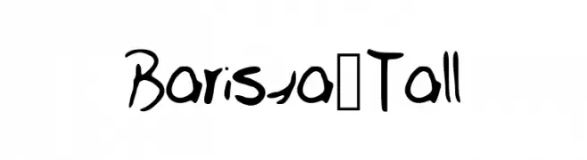
![Barista_Tall フリーフォントのダウンロード]() ダウンロード 153 ダウンロード数@WebFont
ダウンロード 153 ダウンロード数@WebFont -
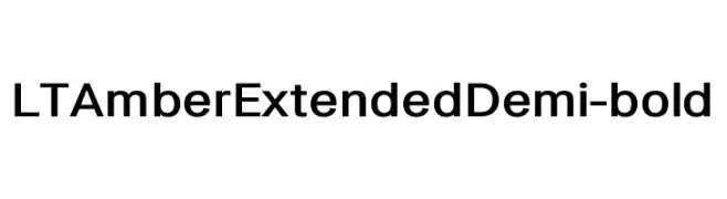
( Fonts by LyonsType - Daniel Lyons - Personal-use only. For commercial use please contact owner. )
A modern, extended sans-serif font with a bold and clean appearance.
![LT Amber Extended Demi-bold フリーフォントのダウンロード]() ダウンロード 153 ダウンロード数@WebFont
ダウンロード 153 ダウンロード数@WebFont -
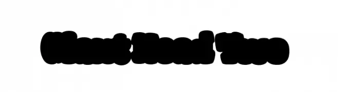
( Fonts by Blue Vinyl - Jess Latham - www.bvfonts.com )
A bold, playful, and decorative font with thick, rounded letters.
![Giant Head Two フリーフォントのダウンロード]() ダウンロード 153 ダウンロード数@WebFont
ダウンロード 153 ダウンロード数@WebFont -
![Alternation Italic フリーフォントのダウンロード]() ダウンロード 153 ダウンロード数@WebFont
ダウンロード 153 ダウンロード数@WebFont -
( Fonts by Jacob Fisher - www.pizzadude.dk )
A bold, geometric font with a futuristic and angular design.
![Nonfiction フリーフォントのダウンロード]() ダウンロード 153 ダウンロード数@WebFont
ダウンロード 153 ダウンロード数@WebFont -
( Fonts by Manfred Klein. Free for private and charity use. Free for commercial with donation to organizations )
A bold, decorative blackletter font with circular borders and high contrast strokes.
![CuxhavenInitialsRound フリーフォントのダウンロード]() ダウンロード 153 ダウンロード数@WebFont
ダウンロード 153 ダウンロード数@WebFont -
( Fonts by Apostrophic Lab )
A modern, italicized outline font with a futuristic and expanded design.
![Republika IV Exp - Outline Italic フリーフォントのダウンロード]() ダウンロード 153 ダウンロード数@WebFont
ダウンロード 153 ダウンロード数@WebFont -
( Fonts by a Neale Davidson - www.pixelsagas.com. Personal-use only. For commercial use please contact owner. )
A dynamic italic font with high contrast and elegant slanted characters.
![Resavy Italic フリーフォントのダウンロード]() ダウンロード 153 ダウンロード数@WebFont
ダウンロード 153 ダウンロード数@WebFont -
( www.woodcutter.es )
A bold, playful font with a hand-drawn, negative space style.
![Woodcutter Negative フリーフォントのダウンロード]() ダウンロード 153 ダウンロード数@WebFont
ダウンロード 153 ダウンロード数@WebFont -
![oceanography フリーフォントのダウンロード]() ダウンロード 153 ダウンロード数@WebFont
ダウンロード 153 ダウンロード数@WebFont -
( Fonts by Andy Krahling - Sunwalk )
A decorative and artistic font with intricate, whimsical letterforms.
![Cyprian フリーフォントのダウンロード]() ダウンロード 153 ダウンロード数@WebFont
ダウンロード 153 ダウンロード数@WebFont -
( Fonts by Mans Greback - www.mawns.com )
An elegant, expanded italic serif font with a light weight and modern style.
![Rider Wide Expanded Light Italic フリーフォントのダウンロード]() ダウンロード 153 ダウンロード数@WebFont
ダウンロード 153 ダウンロード数@WebFont -
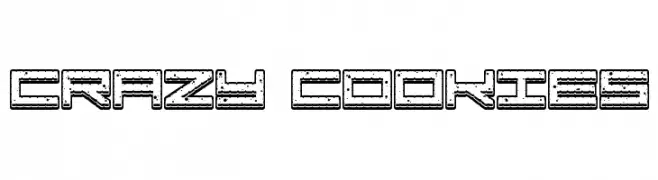
( www.qkila.com/font )
A playful, cookie-themed decorative font with a textured, outlined style.
![Crazy COokies フリーフォントのダウンロード]() ダウンロード 153 ダウンロード数@WebFont
ダウンロード 153 ダウンロード数@WebFont -
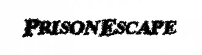
( Fonts by a Max Infeld - XEROGRAPHER FONTS - xerographer.blogspot.com . Personal-use only. For commercial use please contact owner. )
A bold, textured font with a jagged, hand-drawn appearance.
![PrisonEscape フリーフォントのダウンロード]() ダウンロード 153 ダウンロード数@WebFont
ダウンロード 153 ダウンロード数@WebFont -
( Fonts by Manfred Klein. Free for private and charity use. Free for commercial with donation to organizations )
An artistic and decorative font with abstract, bold designs and unique patterns.
![DeKonitials フリーフォントのダウンロード]() ダウンロード 153 ダウンロード数@WebFont
ダウンロード 153 ダウンロード数@WebFont


今のトップフォントは?
は、クリーンな造形と広い適用範囲で支持を集めています。 ブランディングからランディングページ、ポスターまで活躍します。
ロゴで人気のフォントは?
幾何学系の サンセリフ(例: Poppins、Gotham 系のファミリー)は、スケーラブルでクリーンな印象に最適。 親しみやすさを出すなら スクリプト や手書き系も定番です。 見出しは力強く、本文はニュートラルに──この組み合わせが認知とバランスを高めます。
人気リストはどのくらいの頻度で更新される?
ダウンロード数やエンゲージメントに基づき定期的に更新します。 こまめにチェックして、次に流行るフォントを先取りしましょう。
💡 ヒント: このページをブックマークしておくと便利です。トレンドは速く、今のトップが明日のリブランディングを導くこともあります。