人気フォント セクションへようこそ。ここでは「よくダウンロードされ、よく使われている」実績ある書体をまとめています。 ロゴ、Web、SNS のどれにも使いやすい、外さない選択肢が見つかります。
どの トップフォント も、バランス・可読性・汎用性で高評価です。 モダン・サンセリフ、エレガントなスクリプト、ヴィンテージなセリフ、ミニマルなディスプレイなどを厳選しています。
-
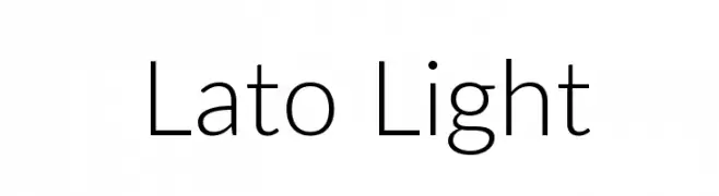
( Copyright (c) 2010-2014 by tyPoland Lukasz Dziedzic (team@latofonts.com) with Reserved Font Name "Lato" )
A modern, light sans-serif font with clean lines and excellent readability.
 ダウンロード 38007 ダウンロード数@WebFont
 -
![06 29 フリーフォントのダウンロード]() ダウンロード 37980 ダウンロード数@WebFont
ダウンロード 37980 ダウンロード数@WebFont -
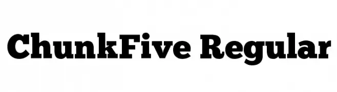
( Fonts by The League of Moveable Type - theleagueofmoveabletype.com )
A bold, slab serif font with strong, thick strokes for impactful designs.
![ChunkFive Regular フリーフォントのダウンロード]() ダウンロード 37915 ダウンロード数@WebFont
ダウンロード 37915 ダウンロード数@WebFont -
フォント by spideraysfonts. For commercial use please contact the owner.
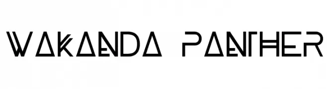
( WAKANDA PANTHER )
A bold, geometric font inspired by African tribal art with a modern twist.
![WAKANDA PANTHER フリーフォントのダウンロード]() ダウンロード 37797 ダウンロード数@WebFont
ダウンロード 37797 ダウンロード数@WebFont -
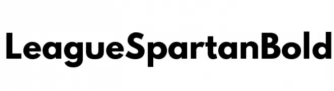
( Fonts by The League of Moveable Type - Personal-use only. For commercial use please contact owner. )
A bold, geometric sans-serif font with clean lines and modern appeal.
![League Spartan Bold フリーフォントのダウンロード]() ダウンロード 37781 ダウンロード数@WebFont
ダウンロード 37781 ダウンロード数@WebFont -
-
![Forte フリーフォントのダウンロード]() ダウンロード 37696 ダウンロード数@WebFont
ダウンロード 37696 ダウンロード数@WebFont -
![Compacta BT フリーフォントのダウンロード]() ダウンロード 37690 ダウンロード数@WebFont
ダウンロード 37690 ダウンロード数@WebFont -
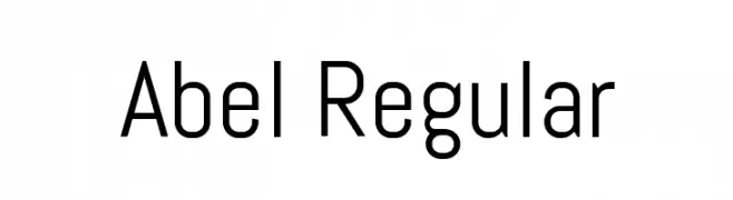
( Copyright (c) 2011, Matthew Desmond (http://www.madtype.com | mattdesmond@gmail.com),with Reserved Font Name Abel. )
A modern, geometric sans-serif font with clean lines and balanced spacing.
![Abel Regular フリーフォントのダウンロード]() ダウンロード 37672 ダウンロード数@WebFont
ダウンロード 37672 ダウンロード数@WebFont -
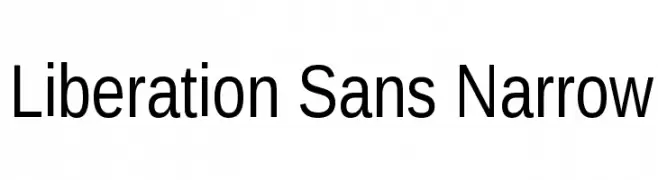
![Liberation Sans Narrow フリーフォントのダウンロード]() ダウンロード 37607 ダウンロード数@WebFont
ダウンロード 37607 ダウンロード数@WebFont -
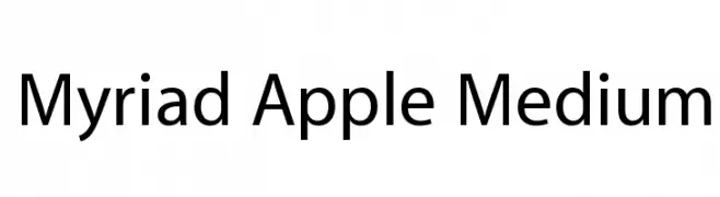
![Myriad Apple Medium フリーフォントのダウンロード]() ダウンロード 37534 ダウンロード数@WebFont
ダウンロード 37534 ダウンロード数@WebFont


今のトップフォントは?
は、クリーンな造形と広い適用範囲で支持を集めています。 ブランディングからランディングページ、ポスターまで活躍します。
ロゴで人気のフォントは?
幾何学系の サンセリフ(例: Poppins、Gotham 系のファミリー)は、スケーラブルでクリーンな印象に最適。 親しみやすさを出すなら スクリプト や手書き系も定番です。 見出しは力強く、本文はニュートラルに──この組み合わせが認知とバランスを高めます。
人気リストはどのくらいの頻度で更新される?
ダウンロード数やエンゲージメントに基づき定期的に更新します。 こまめにチェックして、次に流行るフォントを先取りしましょう。
💡 ヒント: このページをブックマークしておくと便利です。トレンドは速く、今のトップが明日のリブランディングを導くこともあります。