人気フォント セクションへようこそ。ここでは「よくダウンロードされ、よく使われている」実績ある書体をまとめています。 ロゴ、Web、SNS のどれにも使いやすい、外さない選択肢が見つかります。
どの トップフォント も、バランス・可読性・汎用性で高評価です。 モダン・サンセリフ、エレガントなスクリプト、ヴィンテージなセリフ、ミニマルなディスプレイなどを厳選しています。
-
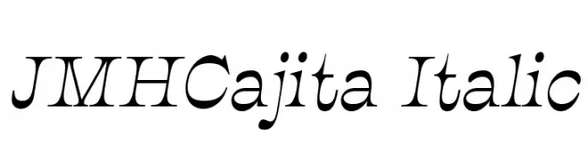
フォント by joorgemoron. For commercial use please contact the owner.
( Free for personal use. )
An elegant italic serif font with dynamic curves and sharp serifs.
 ダウンロード 749 ダウンロード数@WebFont
 -
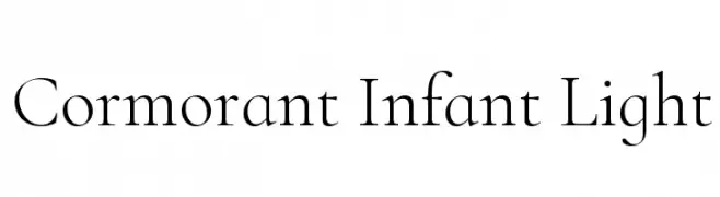
( Copyright (c) 2015, Christian Thalmann and the Cormorant Project Authors (github.com/CatharsisFonts/Cormorant) )
A refined serif font with elegant, thin strokes and classic proportions.
![Cormorant Infant Light フリーフォントのダウンロード]() ダウンロード 749 ダウンロード数@WebFont
ダウンロード 749 ダウンロード数@WebFont -
![Km Standard TT Bold フリーフォントのダウンロード]() ダウンロード 749 ダウンロード数@WebFont
ダウンロード 749 ダウンロード数@WebFont -
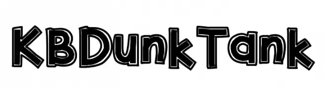
( Fonts by Khrys Bosland )
A bold, playful font with a three-dimensional shadow effect.
![KBDunkTank フリーフォントのダウンロード]() ダウンロード 749 ダウンロード数@WebFont
ダウンロード 749 ダウンロード数@WebFont -
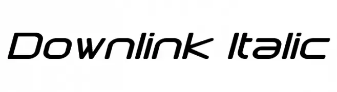
( Fonts by a Neale Davidson - www.pixelsagas.com. Personal-use only. For commercial use please contact owner. )
A modern, italic font with geometric precision and a futuristic aesthetic.
![Downlink Italic フリーフォントのダウンロード]() ダウンロード 749 ダウンロード数@WebFont
ダウンロード 749 ダウンロード数@WebFont -
-
( Fonts by Steve Cloutier - www.cloutierfontes.ca )
A distressed, grungy font with a hand-drawn, eerie appearance.
![CF Zombie Party Regular フリーフォントのダウンロード]() ダウンロード 749 ダウンロード数@WebFont
ダウンロード 749 ダウンロード数@WebFont -
![Maya フリーフォントのダウンロード]() ダウンロード 749 ダウンロード数@WebFont
ダウンロード 749 ダウンロード数@WebFont -
( Fonts by Mans Greback - www.mawns.com )
A bold and expressive script font with dynamic curves and strong visual impact.
![Clipper Script Fat [Personal Use] フリーフォントのダウンロード]() ダウンロード 749 ダウンロード数@WebFont
ダウンロード 749 ダウンロード数@WebFont -
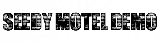
![Seedy Motel DEMO フリーフォントのダウンロード]() ダウンロード 749 ダウンロード数@WebFont
ダウンロード 749 ダウンロード数@WebFont -
( Fonts by www.typodermicfonts.com - Ray Larabie )
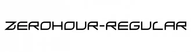
A futuristic, geometric font with angular and sleek letterforms.
![ZeroHour-Regular フリーフォントのダウンロード]() ダウンロード 749 ダウンロード数@WebFont
ダウンロード 749 ダウンロード数@WebFont


![Clipper Script Fat [Personal Use] フリーフォントのダウンロード](https://d144mzi0q5mijx.cloudfront.net/img/C/L/Clipper-Script-Fat-Personal-Use.webp)
今のトップフォントは?
は、クリーンな造形と広い適用範囲で支持を集めています。 ブランディングからランディングページ、ポスターまで活躍します。
ロゴで人気のフォントは?
幾何学系の サンセリフ(例: Poppins、Gotham 系のファミリー)は、スケーラブルでクリーンな印象に最適。 親しみやすさを出すなら スクリプト や手書き系も定番です。 見出しは力強く、本文はニュートラルに──この組み合わせが認知とバランスを高めます。
人気リストはどのくらいの頻度で更新される?
ダウンロード数やエンゲージメントに基づき定期的に更新します。 こまめにチェックして、次に流行るフォントを先取りしましょう。
💡 ヒント: このページをブックマークしておくと便利です。トレンドは速く、今のトップが明日のリブランディングを導くこともあります。