人気フォント セクションへようこそ。ここでは「よくダウンロードされ、よく使われている」実績ある書体をまとめています。 ロゴ、Web、SNS のどれにも使いやすい、外さない選択肢が見つかります。
どの トップフォント も、バランス・可読性・汎用性で高評価です。 モダン・サンセリフ、エレガントなスクリプト、ヴィンテージなセリフ、ミニマルなディスプレイなどを厳選しています。
-
( Font by Sven Stuber - www.superlooper.de )
A futuristic, geometric font with clean lines and unique cutouts.
 ダウンロード 709 ダウンロード数@WebFont
 -
( Fonts by Dieter Steffmann )
A bold, three-dimensional serif font with a striking and modern design.
![Plastische Plakat-Antiqua フリーフォントのダウンロード]() ダウンロード 709 ダウンロード数@WebFont
ダウンロード 709 ダウンロード数@WebFont -
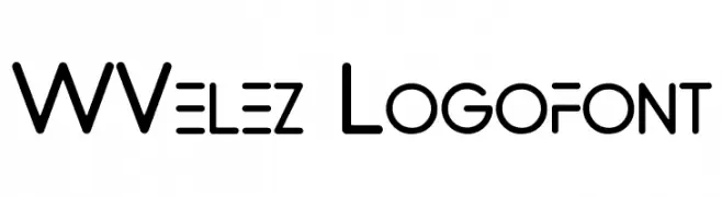
( Fonts by www.waltervelezart.com )
A modern, geometric font with rounded edges and consistent stroke width.
![WVelez Logofont フリーフォントのダウンロード]() ダウンロード 709 ダウンロード数@WebFont
ダウンロード 709 ダウンロード数@WebFont -
( Paul Lloyd Fonts )
An ornate, calligraphic font with sharp, angular strokes and elegant flourishes.
![Louvaine フリーフォントのダウンロード]() ダウンロード 709 ダウンロード数
ダウンロード 709 ダウンロード数 -
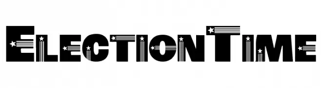
( Fonts by www.houseoflime.com )
A bold, decorative font with stars and stripes, ideal for patriotic themes.
![ElectionTime フリーフォントのダウンロード]() ダウンロード 709 ダウンロード数@WebFont
ダウンロード 709 ダウンロード数@WebFont -
-
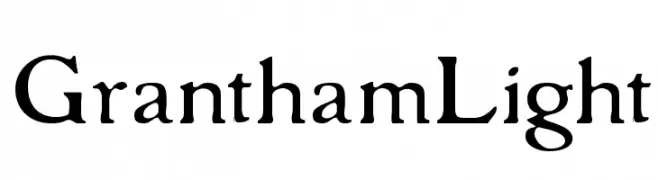
( Fonts by Paul Lloyd )
A classic serif font with elegant, flowing lines and medium contrast.
![GranthamLight フリーフォントのダウンロード]() ダウンロード 709 ダウンロード数
ダウンロード 709 ダウンロード数 -
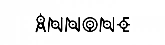
![annone フリーフォントのダウンロード]() ダウンロード 709 ダウンロード数@WebFont
ダウンロード 709 ダウンロード数@WebFont -
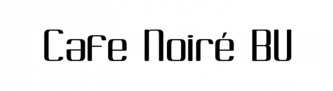
![Cafe Noiré BV フリーフォントのダウンロード]() ダウンロード 709 ダウンロード数@WebFont
ダウンロード 709 ダウンロード数@WebFont -
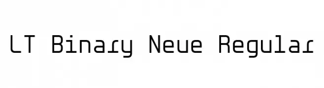
( Fonts by LyonsType )
A modern, geometric font with uniform stroke widths and a monospaced appearance.
![LT Binary Neue Regular フリーフォントのダウンロード]() ダウンロード 708 ダウンロード数@WebFont
ダウンロード 708 ダウンロード数@WebFont -
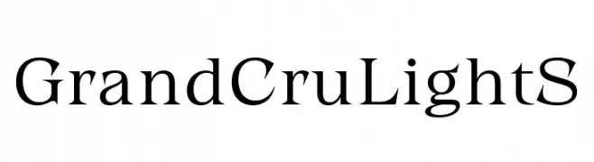
( Fonts by Fenotype - Emil Bertell - Personal-use only. For commercial use please contact owner. )
A classic serif font with elegant strokes and refined proportions.
![Grand Cru Light S フリーフォントのダウンロード]() ダウンロード 708 ダウンロード数@WebFont
ダウンロード 708 ダウンロード数@WebFont


今のトップフォントは?
は、クリーンな造形と広い適用範囲で支持を集めています。 ブランディングからランディングページ、ポスターまで活躍します。
ロゴで人気のフォントは?
幾何学系の サンセリフ(例: Poppins、Gotham 系のファミリー)は、スケーラブルでクリーンな印象に最適。 親しみやすさを出すなら スクリプト や手書き系も定番です。 見出しは力強く、本文はニュートラルに──この組み合わせが認知とバランスを高めます。
人気リストはどのくらいの頻度で更新される?
ダウンロード数やエンゲージメントに基づき定期的に更新します。 こまめにチェックして、次に流行るフォントを先取りしましょう。
💡 ヒント: このページをブックマークしておくと便利です。トレンドは速く、今のトップが明日のリブランディングを導くこともあります。