人気フォント セクションへようこそ。ここでは「よくダウンロードされ、よく使われている」実績ある書体をまとめています。 ロゴ、Web、SNS のどれにも使いやすい、外さない選択肢が見つかります。
どの トップフォント も、バランス・可読性・汎用性で高評価です。 モダン・サンセリフ、エレガントなスクリプト、ヴィンテージなセリフ、ミニマルなディスプレイなどを厳選しています。
-
( Fonts by www.aenigmafonts.com )
A bold, futuristic font with rounded, geometric letterforms and dynamic cut-out sections.
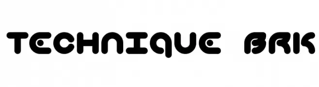 ダウンロード 707 ダウンロード数@WebFont
 -
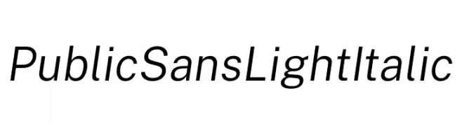
( Fonts by U.S. Web Design System )
A modern, light, italic sans-serif font with balanced spacing and clean lines.
![Public Sans Light Italic フリーフォントのダウンロード]() ダウンロード 706 ダウンロード数@WebFont
ダウンロード 706 ダウンロード数@WebFont -
( Fonts by StereoType - Clément Nicolle - Personal-use only. For commercial use please contact owner. )
A bold, dynamic script font with elegant, flowing cursive strokes.
![Madame フリーフォントのダウンロード]() ダウンロード 706 ダウンロード数@WebFont
ダウンロード 706 ダウンロード数@WebFont -
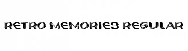
( Fonts by Vladimir Nikolic )
A bold, retro-inspired font with a three-dimensional effect and vintage appeal.
![Retro Memories Regular フリーフォントのダウンロード]() ダウンロード 706 ダウンロード数@WebFont
ダウンロード 706 ダウンロード数@WebFont -
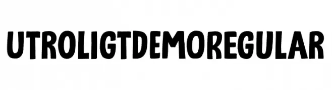
( Fonts by Hanoded )
A bold, playful font with a cartoonish, hand-drawn style.
![Utroligt DEMO Regular フリーフォントのダウンロード]() ダウンロード 706 ダウンロード数@WebFont
ダウンロード 706 ダウンロード数@WebFont -
-
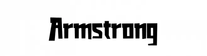
( Fonts by Kong Font - https://fontkong.com/ - Personal-use only. For commercial use please contact owner. )
A bold, angular font with sharp edges and a modern, geometric style.
![Armstrong フリーフォントのダウンロード]() ダウンロード 706 ダウンロード数@WebFont
ダウンロード 706 ダウンロード数@WebFont -
( Fonts by Kotak Kuning Studio - kotakkuning.com - Personal-use only. For commercial use please contact owner. )
An elegant script font with flowing, interconnected letters and graceful swashes.
![Asmelina Harley フリーフォントのダウンロード]() ダウンロード 706 ダウンロード数@WebFont
ダウンロード 706 ダウンロード数@WebFont -
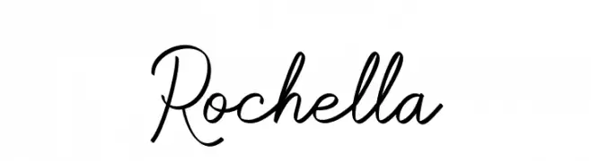
( Fonts by Fajar Abdul Fattah - https://fontbundles.net/sibelumpagi-studio - Personal-use only. For commercial use please contact owner. )
A graceful script font with flowing, connected strokes and elegant curves.
![Rochella フリーフォントのダウンロード]() ダウンロード 706 ダウンロード数@WebFont
ダウンロード 706 ダウンロード数@WebFont -
( Fonts by Guillaume )
A bold, geometric font with a futuristic and digital aesthetic.
![Colony Bold フリーフォントのダウンロード]() ダウンロード 706 ダウンロード数@WebFont
ダウンロード 706 ダウンロード数@WebFont -
( Fonts by Tino Mendes - www.behance.net/tinomendes - Personal-use only. For commercial use please contact owner. )
A bold, modern, and condensed font with clean lines and geometric structure.
![GRAND FINALE Bold フリーフォントのダウンロード]() ダウンロード 706 ダウンロード数@WebFont
ダウンロード 706 ダウンロード数@WebFont


今のトップフォントは?
は、クリーンな造形と広い適用範囲で支持を集めています。 ブランディングからランディングページ、ポスターまで活躍します。
ロゴで人気のフォントは?
幾何学系の サンセリフ(例: Poppins、Gotham 系のファミリー)は、スケーラブルでクリーンな印象に最適。 親しみやすさを出すなら スクリプト や手書き系も定番です。 見出しは力強く、本文はニュートラルに──この組み合わせが認知とバランスを高めます。
人気リストはどのくらいの頻度で更新される?
ダウンロード数やエンゲージメントに基づき定期的に更新します。 こまめにチェックして、次に流行るフォントを先取りしましょう。
💡 ヒント: このページをブックマークしておくと便利です。トレンドは速く、今のトップが明日のリブランディングを導くこともあります。