人気フォント セクションへようこそ。ここでは「よくダウンロードされ、よく使われている」実績ある書体をまとめています。 ロゴ、Web、SNS のどれにも使いやすい、外さない選択肢が見つかります。
どの トップフォント も、バランス・可読性・汎用性で高評価です。 モダン・サンセリフ、エレガントなスクリプト、ヴィンテージなセリフ、ミニマルなディスプレイなどを厳選しています。
-
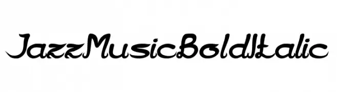
( weknow - Wino S Kadir - www.creativefabrica.com/designer/weknow/ )
A bold, italicized font with a flowing, cursive-like design.
 ダウンロード 694 ダウンロード数@WebFont
 -
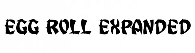
( Iconian Fonts - Daniel Zadorozny - www.iconian.com )
A bold, high-contrast decorative font with sharp edges and tight spacing.
![Egg Roll Expanded フリーフォントのダウンロード]() ダウンロード 694 ダウンロード数@WebFont
ダウンロード 694 ダウンロード数@WebFont -
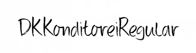
( Hanoded - David Kerkhoff - www.hanodedfonts.com )
A playful, brushstroke-style font with a handcrafted appearance.
![DK Konditorei Regular フリーフォントのダウンロード]() ダウンロード 694 ダウンロード数@WebFont
ダウンロード 694 ダウンロード数@WebFont -
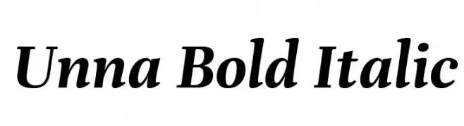
( Copyright 2016 The Unna Project Authors (omnibus.type@gmail.com) )
A bold, italic serif font with classic elegance and modern flair.
![Unna Bold Italic フリーフォントのダウンロード]() ダウンロード 694 ダウンロード数@WebFont
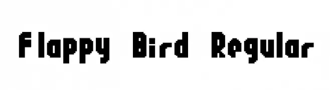
ダウンロード 694 ダウンロード数@WebFont -
![Flappy Bird Regular フリーフォントのダウンロード]() ダウンロード 694 ダウンロード数@WebFont
ダウンロード 694 ダウンロード数@WebFont -
-
( Fonts by www.gliphmaker.com. Personal-use only. For commercial use please contact owner. )
An elegant script font with intricate, flowing letterforms and high contrast.
![Monte-Kristo フリーフォントのダウンロード]() ダウンロード 694 ダウンロード数@WebFont
ダウンロード 694 ダウンロード数@WebFont -
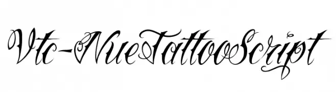
( Fonts by Vigilante Typeface Corporation Larry Yerkes. Personal-use only. For commercial use please contact owner. )
An ornate script font with flowing, interconnected letterforms and decorative flourishes.
![Vtc-NueTattooScript フリーフォントのダウンロード]() ダウンロード 694 ダウンロード数@WebFont
ダウンロード 694 ダウンロード数@WebFont -
( Fonts by Jonathan S. Harris - www.tattoowoo.com. Personal-use only. For commercial use please contact owner. )
An elegant, intricate script font with flowing cursive letters and elaborate swashes.
![Everything Holiday フリーフォントのダウンロード]() ダウンロード 694 ダウンロード数@WebFont
ダウンロード 694 ダウンロード数@WebFont -
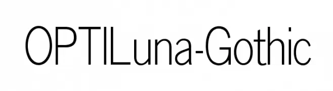
( Fonts by Castcraft Software - opti.netii.net - check the website before use )
A modern, geometric sans-serif font with clean lines and balanced spacing.
![OPTILuna-Gothic フリーフォントのダウンロード]() ダウンロード 694 ダウンロード数@WebFont
ダウンロード 694 ダウンロード数@WebFont -
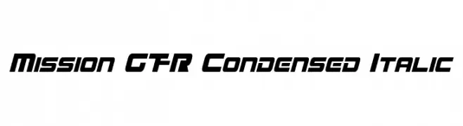
( Fonts by a Neale Davidson - www.pixelsagas.com. Personal-use only. For commercial use please contact owner. )
A bold, condensed, and italicized font with a modern, futuristic style.
![Mission GT-R Condensed Italic フリーフォントのダウンロード]() ダウンロード 694 ダウンロード数@WebFont
ダウンロード 694 ダウンロード数@WebFont


今のトップフォントは?
は、クリーンな造形と広い適用範囲で支持を集めています。 ブランディングからランディングページ、ポスターまで活躍します。
ロゴで人気のフォントは?
幾何学系の サンセリフ(例: Poppins、Gotham 系のファミリー)は、スケーラブルでクリーンな印象に最適。 親しみやすさを出すなら スクリプト や手書き系も定番です。 見出しは力強く、本文はニュートラルに──この組み合わせが認知とバランスを高めます。
人気リストはどのくらいの頻度で更新される?
ダウンロード数やエンゲージメントに基づき定期的に更新します。 こまめにチェックして、次に流行るフォントを先取りしましょう。
💡 ヒント: このページをブックマークしておくと便利です。トレンドは速く、今のトップが明日のリブランディングを導くこともあります。