人気フォント セクションへようこそ。ここでは「よくダウンロードされ、よく使われている」実績ある書体をまとめています。 ロゴ、Web、SNS のどれにも使いやすい、外さない選択肢が見つかります。
どの トップフォント も、バランス・可読性・汎用性で高評価です。 モダン・サンセリフ、エレガントなスクリプト、ヴィンテージなセリフ、ミニマルなディスプレイなどを厳選しています。
-
( Fonts by Zanatlija - Personal-use only. For commercial use please contact owner. )
A bold, three-dimensional serif font with a vintage shadow effect.
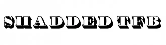 ダウンロード 134 ダウンロード数@WebFont
 -
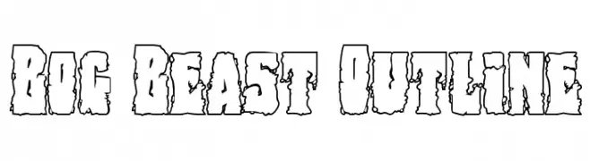
( Fonts by Daniel Zadorozny - www.iconian.com - Free for personal use )
A bold, rugged outline font with a distressed, organic appearance.
![Bog Beast Outline フリーフォントのダウンロード]() ダウンロード 134 ダウンロード数@WebFont
ダウンロード 134 ダウンロード数@WebFont -
( Fonts by Typefar - Farul Arjianto - Personal-use only. For commercial use please contact owner. )
A bold, modern sans-serif font with clean lines and uniform strokes.
![Romedhal Sans フリーフォントのダウンロード]() ダウンロード 134 ダウンロード数@WebFont
ダウンロード 134 ダウンロード数@WebFont -
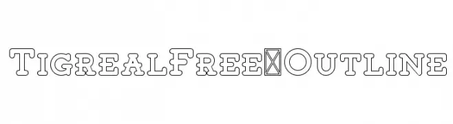
( Craft Supply Co. - creativemarket.com/craftsupplyco )
A bold, outlined serif font with a modern and impactful design.
![TigrealFree-Outline フリーフォントのダウンロード]() ダウンロード 134 ダウンロード数@WebFont
ダウンロード 134 ダウンロード数@WebFont -
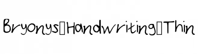
( Fonts by Bryony Simpson )
A casual, handwritten font with thin, fluid strokes and a friendly appearance.
![Bryonys_Handwriting_Thin フリーフォントのダウンロード]() ダウンロード 134 ダウンロード数@WebFont
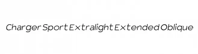
ダウンロード 134 ダウンロード数@WebFont -
![Charger Sport Extralight Extended Oblique フリーフォントのダウンロード]() ダウンロード 134 ダウンロード数@WebFont
ダウンロード 134 ダウンロード数@WebFont -
![Last Day On Earth フリーフォントのダウンロード]() ダウンロード 134 ダウンロード数@WebFont
ダウンロード 134 ダウンロード数@WebFont -
![LaMorte7 フリーフォントのダウンロード]() ダウンロード 134 ダウンロード数@WebFont
ダウンロード 134 ダウンロード数@WebFont -
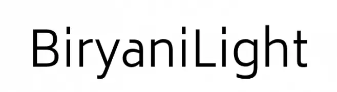
( Fonts by TypeOff )
A modern, light sans-serif font with clean lines and excellent readability.
![Biryani Light フリーフォントのダウンロード]() ダウンロード 134 ダウンロード数@WebFont
ダウンロード 134 ダウンロード数@WebFont -
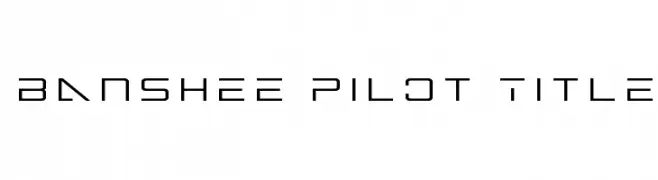
( Fonts by Iconian Fonts )
A futuristic, geometric font with sharp edges and a tech-inspired design.
![Banshee Pilot Title フリーフォントのダウンロード]() ダウンロード 134 ダウンロード数@WebFont
ダウンロード 134 ダウンロード数@WebFont -
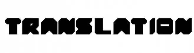
( fontm.com/author/weknow/ )
A bold, geometric font with a futuristic and industrial design.
![translation フリーフォントのダウンロード]() ダウンロード 134 ダウンロード数@WebFont
ダウンロード 134 ダウンロード数@WebFont -
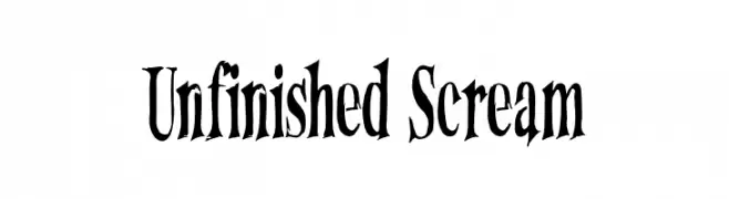
( Fonts by Wingsart Studio - Christopher King - Personal-use only. For commercial use please contact owner. )
A dramatic, hand-drawn font with sharp, uneven edges and a unique, eerie aesthetic.
![Unfinished Scream フリーフォントのダウンロード]() ダウンロード 134 ダウンロード数@WebFont
ダウンロード 134 ダウンロード数@WebFont -
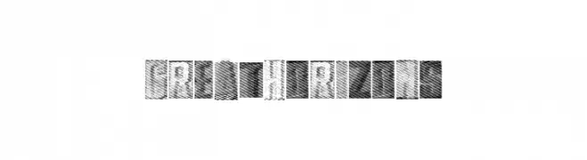
( Fonts by a Max Infeld - XEROGRAPHER FONTS - xerographer.blogspot.com . Personal-use only. For commercial use please contact owner. )
A bold, textured font with a vintage, hand-drawn appearance.
![GreatHorizons フリーフォントのダウンロード]() ダウンロード 134 ダウンロード数@WebFont
ダウンロード 134 ダウンロード数@WebFont -
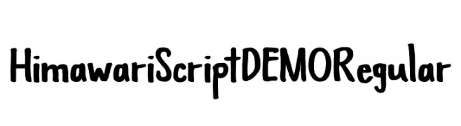
( Fonts by Hanoded - David Kerkhoff - Personal-use only. For commercial use please contact owner. )
A playful, hand-drawn font with bold, rounded strokes and a whimsical style.
![Himawari Script DEMO Regular フリーフォントのダウンロード]() ダウンロード 134 ダウンロード数@WebFont
ダウンロード 134 ダウンロード数@WebFont -
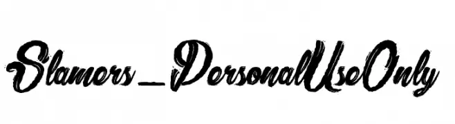
( dcoxy - Greg Medina - www.dcoxy.com/ )
A bold, brush-style script font with dynamic and expressive strokes.
![Slamers_PersonalUseOnly フリーフォントのダウンロード]() ダウンロード 134 ダウンロード数@WebFont
ダウンロード 134 ダウンロード数@WebFont -
( Perry Mason )
A bold, stencil-style font with a vintage military aesthetic.
![AustralianFlyingCorpsStencilSh フリーフォントのダウンロード]() ダウンロード 134 ダウンロード数@WebFont
ダウンロード 134 ダウンロード数@WebFont -
( Fonts by David Kerkhoff - www.hanodedphotography.com )
A bold, distressed font with a rugged, vintage style.
![DKRustyCage フリーフォントのダウンロード]() ダウンロード 134 ダウンロード数@WebFont
ダウンロード 134 ダウンロード数@WebFont -
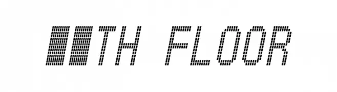
( 11th Floor - formerly www.xs4all.nl/~buro )
A pixelated, retro-style font with a digital, geometric appearance.
![11th floor フリーフォントのダウンロード]() ダウンロード 134 ダウンロード数@WebFont
ダウンロード 134 ダウンロード数@WebFont -
![Poste Wired フリーフォントのダウンロード]() ダウンロード 134 ダウンロード数@WebFont
ダウンロード 134 ダウンロード数@WebFont -
( Fonts by Typodermic Fonts )
A bold, italic serif font with strong strokes and a dynamic slant.
![KingsbridgeScRg-BoldItalic フリーフォントのダウンロード]() ダウンロード 134 ダウンロード数@WebFont
ダウンロード 134 ダウンロード数@WebFont -
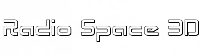
( Iconian Fonts - Daniel Zadorozny - www.iconian.com )
A futuristic, geometric font with a 3D outlined style.
![Radio Space 3D フリーフォントのダウンロード]() ダウンロード 134 ダウンロード数@WebFont
ダウンロード 134 ダウンロード数@WebFont -
![Destiny's Cherubs Ding フリーフォントのダウンロード]() ダウンロード 134 ダウンロード数@WebFont
ダウンロード 134 ダウンロード数@WebFont -
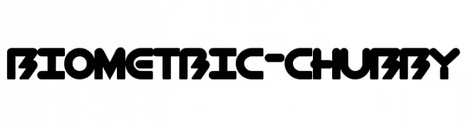
( Fonts by a Max Infeld - XEROGRAPHER FONTS - xerographer.blogspot.com . Personal-use only. For commercial use please contact owner. )
A bold, playful font with rounded, chubby characters and a modern geometric style.
![BioMetric-Chubby フリーフォントのダウンロード]() ダウンロード 134 ダウンロード数@WebFont
ダウンロード 134 ダウンロード数@WebFont -
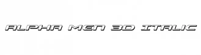
( Fonts by Daniel Zadorozny - www.iconian.com - Free for personal use )
A bold, 3D italic font with a futuristic and dynamic style.
![Alpha Men 3D Italic フリーフォントのダウンロード]() ダウンロード 134 ダウンロード数@WebFont
ダウンロード 134 ダウンロード数@WebFont -
![Penitentiary Gothic Hilite フリーフォントのダウンロード]() ダウンロード 134 ダウンロード数@WebFont
ダウンロード 134 ダウンロード数@WebFont -
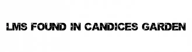
( London's Letters - www.londonsletters.com/ )
A bold, decorative font with floral patterns integrated into each character.
![LMS Found In Candice's Garden フリーフォントのダウンロード]() ダウンロード 134 ダウンロード数@WebFont
ダウンロード 134 ダウンロード数@WebFont -
( Fonts by www.alphabetype.it )
A bold, futuristic font with a digital, geometric style.
![ElectricDreams フリーフォントのダウンロード]() ダウンロード 134 ダウンロード数@WebFont
ダウンロード 134 ダウンロード数@WebFont -
( Fonts by Yadhie Setiawan - typelinestudio.com - Personal-use only. For commercial use please contact owner. )
A bold, flowing script font with elegant cursive letterforms.
![Maddison フリーフォントのダウンロード]() ダウンロード 134 ダウンロード数@WebFont
ダウンロード 134 ダウンロード数@WebFont -
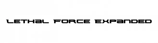
( Fonts by Daniel Zadorozny - www.iconian.com )
A bold, futuristic font with sharp, angular edges and expanded width.
![Lethal Force Expanded フリーフォントのダウンロード]() ダウンロード 134 ダウンロード数@WebFont
ダウンロード 134 ダウンロード数@WebFont -
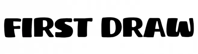
( Fonts by Khurasan )
A bold, playful font with rounded edges and a hand-drawn style.
![First Draw フリーフォントのダウンロード]() ダウンロード 134 ダウンロード数@WebFont
ダウンロード 134 ダウンロード数@WebFont -
( Free for a personal use. For a commercial use please visit www.kevinandamanda.com )
A playful, casual handwritten font with dynamic, irregular strokes.
![Pea Kadee's Blog フリーフォントのダウンロード]() ダウンロード 134 ダウンロード数@WebFont
ダウンロード 134 ダウンロード数@WebFont -
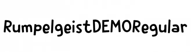
( Fonts by Hanoded )
A playful, hand-drawn font with a whimsical and friendly style.
![Rumpelgeist DEMO Regular フリーフォントのダウンロード]() ダウンロード 134 ダウンロード数@WebFont
ダウンロード 134 ダウンロード数@WebFont -
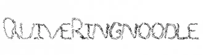
( Fonts by a Max Infeld - XEROGRAPHER FONTS - xerographer.blogspot.com . Personal-use only. For commercial use please contact owner. )
A playful, curly font with noodle-like strokes and a whimsical appearance.
![QuiveringNoodle フリーフォントのダウンロード]() ダウンロード 134 ダウンロード数@WebFont
ダウンロード 134 ダウンロード数@WebFont -
( Fonts by Manuel Ramos - www.infinitismo.com - Personal-use only. For commercial use please contact owner. )
A modern, thin sans-serif font with a tall, narrow structure and rounded edges.
![Cristal フリーフォントのダウンロード]() ダウンロード 134 ダウンロード数@WebFont
ダウンロード 134 ダウンロード数@WebFont -
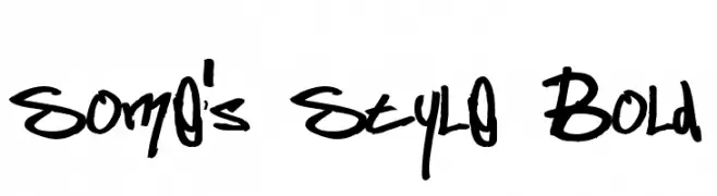
( Fonts by Samuel Park - Personal-use only. For commercial use please contact owner. )
A bold, expressive handwritten font with a graffiti-like style.
![Some's Style Bold フリーフォントのダウンロード]() ダウンロード 134 ダウンロード数@WebFont
ダウンロード 134 ダウンロード数@WebFont


今のトップフォントは?
は、クリーンな造形と広い適用範囲で支持を集めています。 ブランディングからランディングページ、ポスターまで活躍します。
ロゴで人気のフォントは?
幾何学系の サンセリフ(例: Poppins、Gotham 系のファミリー)は、スケーラブルでクリーンな印象に最適。 親しみやすさを出すなら スクリプト や手書き系も定番です。 見出しは力強く、本文はニュートラルに──この組み合わせが認知とバランスを高めます。
人気リストはどのくらいの頻度で更新される?
ダウンロード数やエンゲージメントに基づき定期的に更新します。 こまめにチェックして、次に流行るフォントを先取りしましょう。
💡 ヒント: このページをブックマークしておくと便利です。トレンドは速く、今のトップが明日のリブランディングを導くこともあります。