人気フォント セクションへようこそ。ここでは「よくダウンロードされ、よく使われている」実績ある書体をまとめています。 ロゴ、Web、SNS のどれにも使いやすい、外さない選択肢が見つかります。
どの トップフォント も、バランス・可読性・汎用性で高評価です。 モダン・サンセリフ、エレガントなスクリプト、ヴィンテージなセリフ、ミニマルなディスプレイなどを厳選しています。
-
( Copyright (c) 2011, Cyreal (www.cyreal.org) )
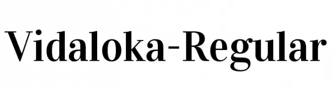
A classic serif font with high contrast and elegant strokes.
 ダウンロード 6851 ダウンロード数@WebFont
 -
( Copyright (c) 2014, Indian Type Foundry (info@indiantypefoundry.com). )
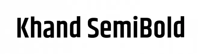
A modern, semi-bold sans-serif font with clean lines and excellent readability.
![Khand SemiBold フリーフォントのダウンロード]() ダウンロード 6848 ダウンロード数@WebFont
ダウンロード 6848 ダウンロード数@WebFont -
![.VnLincolnH フリーフォントのダウンロード]() ダウンロード 6847 ダウンロード数
ダウンロード 6847 ダウンロード数 -
( Copyright 2015 The Rubik Project Authors (https://github.com/googlefonts/rubik) )
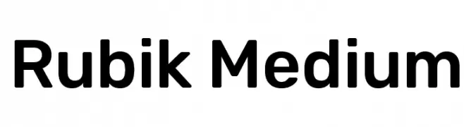
A modern, geometric sans-serif font with a clean and balanced design.
![Rubik Medium フリーフォントのダウンロード]() ダウンロード 6845 ダウンロード数@WebFont
ダウンロード 6845 ダウンロード数@WebFont -
![Kfon フリーフォントのダウンロード]() ダウンロード 6845 ダウンロード数@WebFont
ダウンロード 6845 ダウンロード数@WebFont -
-
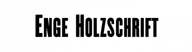
( Fonts by Dieter Steffmann )
A bold, condensed font with strong, uniform strokes ideal for impactful headlines.
![Enge Holzschrift フリーフォントのダウンロード]() ダウンロード 6844 ダウンロード数@WebFont
ダウンロード 6844 ダウンロード数@WebFont -
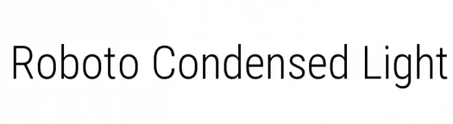
( Fonts by Christian Robertson - Personal-use only. For commercial use please contact owner. )
A modern, condensed sans-serif font with a light and clean design.
![Roboto Condensed Light フリーフォントのダウンロード]() ダウンロード 6842 ダウンロード数@WebFont
ダウンロード 6842 ダウンロード数@WebFont -
![ObelixPro フリーフォントのダウンロード]() ダウンロード 6839 ダウンロード数@WebFont
ダウンロード 6839 ダウンロード数@WebFont -
![Decker-Bold フリーフォントのダウンロード]() ダウンロード 6830 ダウンロード数@WebFont
ダウンロード 6830 ダウンロード数@WebFont -
![Coverface SE フリーフォントのダウンロード]() ダウンロード 6828 ダウンロード数@WebFont
ダウンロード 6828 ダウンロード数@WebFont

今のトップフォントは?
は、クリーンな造形と広い適用範囲で支持を集めています。 ブランディングからランディングページ、ポスターまで活躍します。
ロゴで人気のフォントは?
幾何学系の サンセリフ(例: Poppins、Gotham 系のファミリー)は、スケーラブルでクリーンな印象に最適。 親しみやすさを出すなら スクリプト や手書き系も定番です。 見出しは力強く、本文はニュートラルに──この組み合わせが認知とバランスを高めます。
人気リストはどのくらいの頻度で更新される?
ダウンロード数やエンゲージメントに基づき定期的に更新します。 こまめにチェックして、次に流行るフォントを先取りしましょう。
💡 ヒント: このページをブックマークしておくと便利です。トレンドは速く、今のトップが明日のリブランディングを導くこともあります。